The unusual logo of Virgin symbolizes the conglomerate’s desire to go against the stream in all business areas, from air travel to the music industry. At the same time, the designed emblem stresses the seriousness and reliability of a brand that aims to provide quality products and services.
Virgin: Brand overview
| Founded: | February 1970 |
| Founder: | Richard Branson, Nik Powell |
| Headquarters: | London, England |
| Website: | virgin.com |
Virgin is a British conglomerate with revenues of 17 billion pounds, operating in different directions in 35 countries on five continents. It employs 69,000 people. The Virgin logo can be seen in industrial, aerospace, food, clothing, and media companies.
Richard Branson started with a magazine in 1967. In 1970, he invented the Virgin brand and opened a record store under it. In 1972, he recorded them himself by creating a studio. And further, he simply could not stop games (1981), airlines (1984), condoms (1985), balloons for flights (1987), publishing (1991), radio stations (1993), etc. New companies in different directions opened almost every year until the giant conglomerate Virgin emerged.
Meaning and History
For all its diversity, the company’s logo is relatively constant. He radically changed once. From then on, only minor adjustments. The image perfectly reveals the values and spirit of the Virgin.
Because the Virgin Group comprises many companies specializing in different types of products and services, it needed a universal logo. It is not associated with anything other than the British conglomerate itself. Nevertheless, this sign appeared back in the years when the Virgin brand belonged to a music store. The red lettering, created in the 1970s, drew attention with a large “V.” According to Sir Richard Charles Nicholas Branson, it is a stylized check mark, a symbol of approval. It was based on a word scrawled on a napkin.
What is Virgin?
A large private conglomerate from the UK. Owns or 100% of shares in 40 companies involved in music, travel, communications, industry, sports, banking, etc.
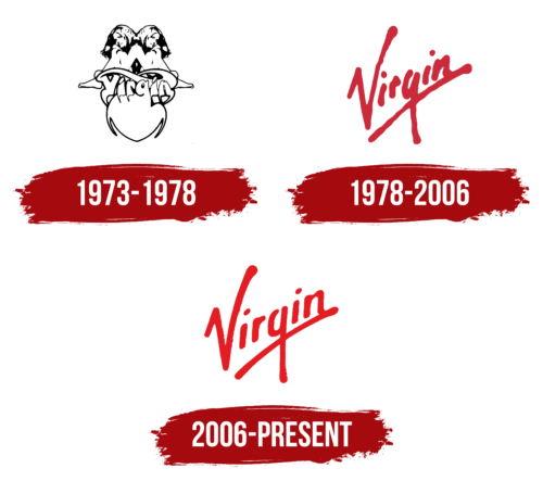
1973 – 1978
According to the founder, business is fun and creativity. This is what sets his approach apart from other companies. Not surprisingly, the development of the first visual sign was entrusted to a visionary. Roger Dean came up with the original label, which later became known as Gemini. It was created for the record company Virgin Records, which opened in 1972.
Two young girls sit unclothed with their arms around their knees. They are turned in different directions, and their bodies are superimposed, one on top of the other (a prototype of Siamese fusion), so that only their heads, legs, and small sections of their arms are visible. Their seat is the sign of infinity (the symbol of the equestrian twins Ashvins in Indian mythology). Beneath the sign is the label’s name, carved from the top of the heart as if born from it.
Branson chose the name on the advice of an acquaintance, alluding to his young age and inexperience in the business. He began publishing a magazine at 15 and opened a record store at 19. His first office was a dorm room, and his phone was a street vending machine. The logo reflected the name in the form of two virgins. They were born of love, from the depths of the heart, to live forever.
You can see that the picture is not a different personality but a mirror image of the same sitter. Branson is a keen natural, later revealed in the emergence of various work directions.
The idea for the composition was inspired by the heyday of the hippie movement, the values to which Richard adhered. Hippies were into mysticism, vegetarianism, and meditation. They preached love and freedom.
So the naked girl, the long hair, the close body contact, and the heart were quite in keeping with this style. Plus, a little bit of mysticism correlated with the psychedelic musical direction. On the records, the label was used in the surroundings of a fantasy world. Outlandish trees and a dragon guarding a hill on which maidens sit.
1978 – 2006
The firm signed with the Sex Pistols. Their leader John Lydon was against using what he considered a hippie sign on the band’s records. The search for a new logo that would represent the band’s essence and fit in well with the other possible clients of the company began.
Promising graphic artist Ray Kyte was brought in to create a logo, and he suggested the well-known logo (they say he wrote it on a napkin). Subsequently, the mark was used for other clients and all areas of Virgin’s business.
The word, handwritten and underlined with a single line, was just that. The lettering soars steeply, conveying the recklessness of the Sex Pistols and reflecting the company’s values. It conveys a commitment to providing the best service, the latest technology, and everything admirable.
The second end of the V is like reaching for the sky. It shows the desire of the Virgin to conquer new peaks, both figuratively and literally (the purchase of aircraft, the creation of balloons, and blimps were on the way). It reminds me of the element of a raised hand, which is usually at concerts of rock bands. The V is also like the symbol of victory used by the hippies.
The blurring of the font was added to the logo in the nineties. The word was spray-painted on a wooden board and looked very original. The lettering seemed to consist of individually sprayed blotches. The management liked the version and started using it. The board still hangs in the executive director’s office.
2006 – today
The Start agency updated the logo font. This was necessary for clearer visibility on large objects (such as brand airplanes) and to match the new digital technology.
The new logo has got the clarity of letters and greater smoothness. There is a uniform distance between the elements. At the same time, the lettering itself, its positioning, and underlining remains the same.
The emblem is jokingly called NASA.
Font and Colors
The Virgin emblem is monochrome. Red represents energy, love of life, and primacy. Demonstrates the drive with which the conglomerate moves through life. As noted by psychologists, the color is bold, playful, and emotional. It immediately attracts attention. All these characteristics fit the conglomerate and its founder.
The font is similar to Proxima Soft ExtraCond Bold Italic.
Virgin color codes
| Lust | Hex color: | #e31e23 |
|---|---|---|
| RGB: | 227 30 35 | |
| CMYK: | 0 87 85 11 | |
| Pantone: | PMS Bright Red C |
