W3C announced a new visual identity reflecting changes to its structure and mission. Since 2023, the consortium has operated as a nonprofit association focused on public interests and close collaboration with the internet community.
Along with the change in status, the slogan was revised. The previous phrase, “Unleashing the full potential of the web,” was replaced by “Making the web work for everyone.”
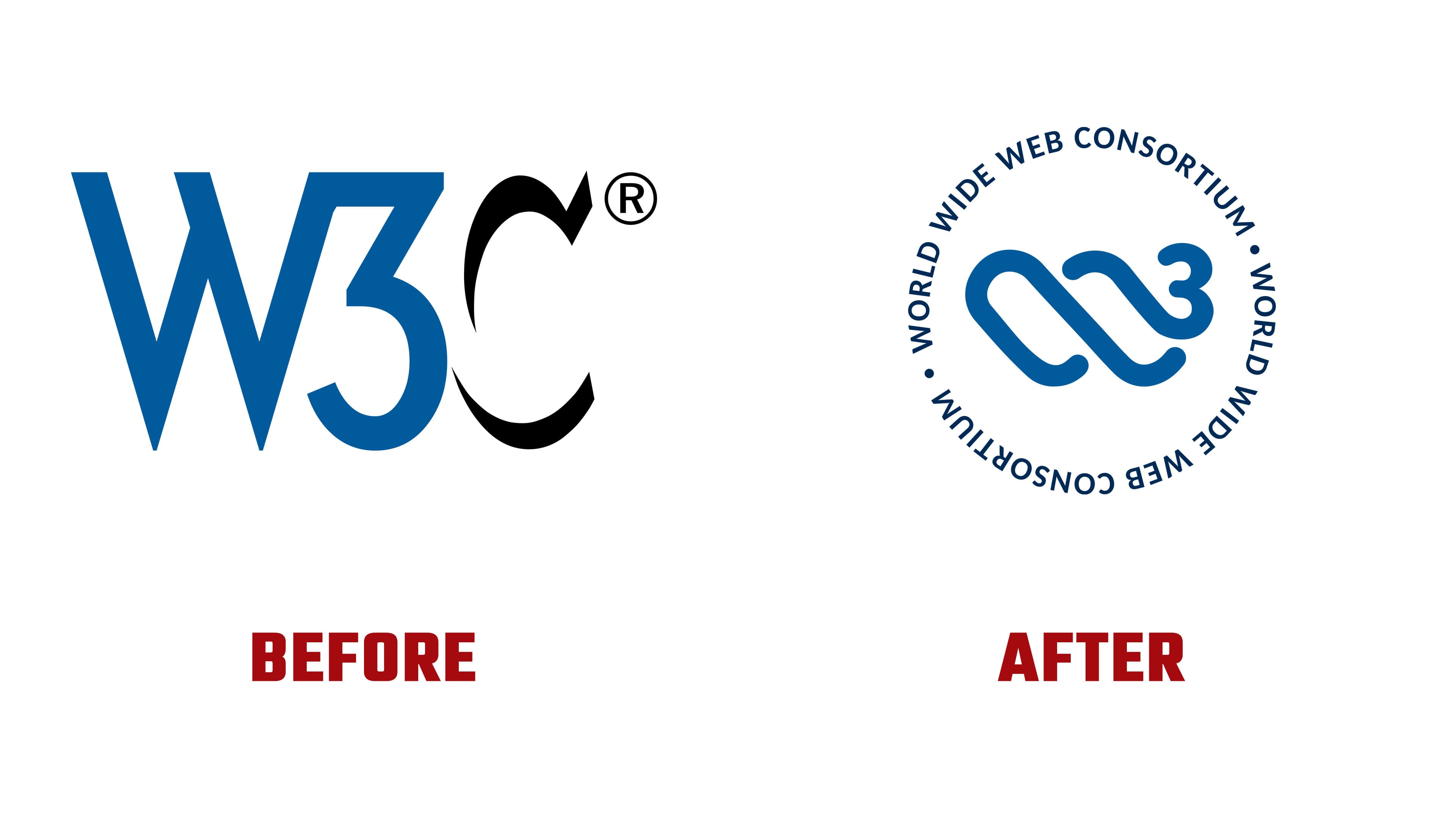
The main brand color remained the same, representing a recognizable shade of blue that symbolizes continuity and stability. Instead of the letter mark “W3C,” an abstract symbol is now used, understandable to people of any culture, and emphasizing the organization’s international reach.
Around the new symbol is the full name of the organization, “World Wide Web Consortium.” The circular shape reflects the idea of unity and continuous development. At the center is a spiral open to multiple interpretations. It may resemble a wave, a human hand, or a DNA molecule. The upper curve of the spiral resembles a heart, suggesting that W3C is the “DNA at the heart of the web.”
The renewed image highlights the consortium’s openness, its desire to engage with a new generation of participants, and its commitment to maintaining the authority it has earned through years of work.