Unrivaled Sports updated its mark and identity with Itch Projects. The project was introduced in 2026. The brand operates in sports and focuses on young athletes. The update gave the company a mark for different sports and a shared system for all areas.
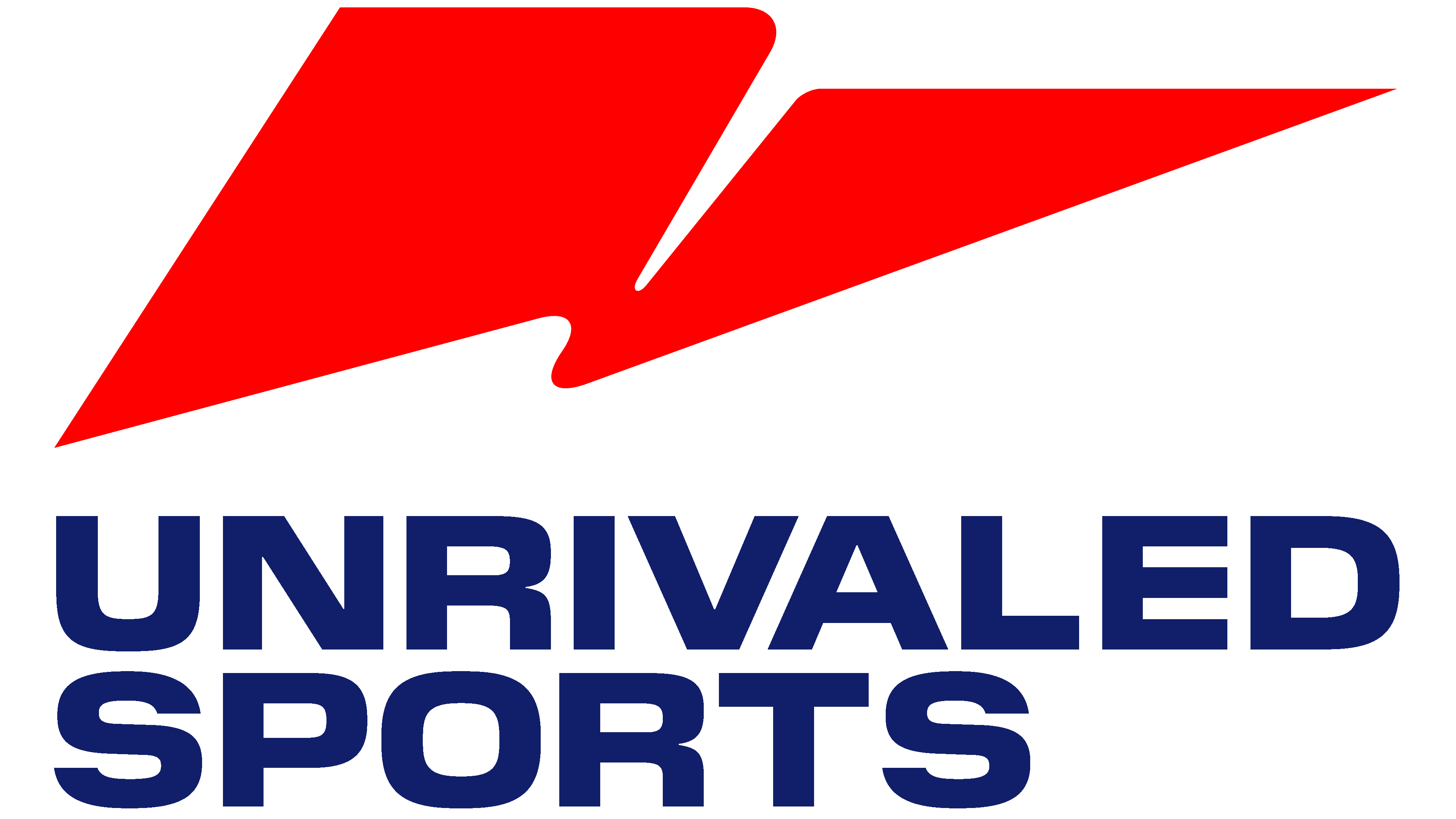
The main change centers on the new symbol. Previously, the brand relied on a dense sports wordmark with large letters and a two-line structure. It recalled the identities of leagues, tournaments, and sports television programs from the late 1990s and early 2000s. The new version keeps the previous typography and adds a large red mark above the name. Unrivaled Sports received an emblem that can stand alone from the text.
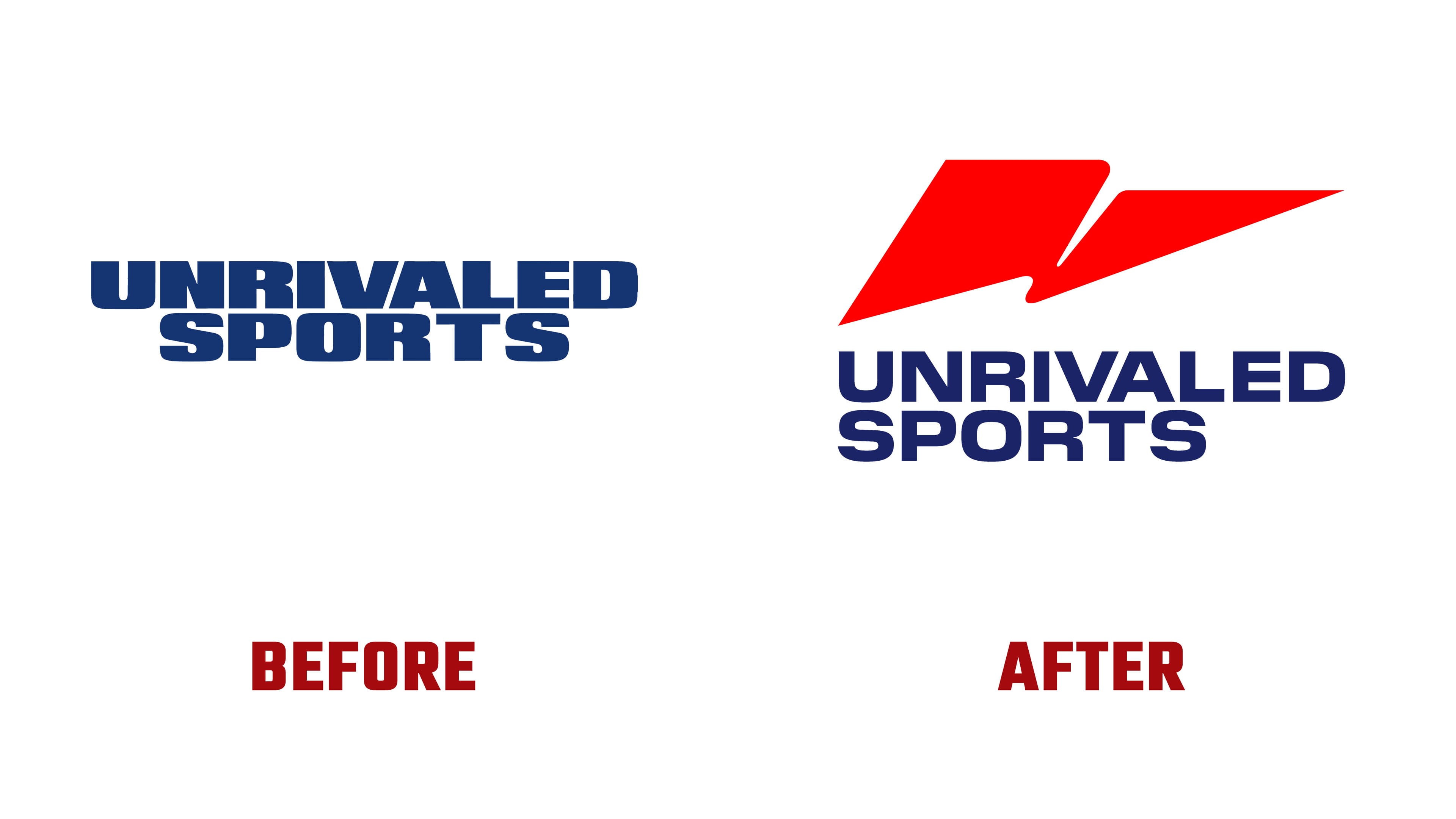
The brand mark is based on an abstract pennant. In sports, a pennant represents victory, team achievement, belonging, and competition. Through it, the company builds a visual image for young athletes worldwide. The symbol’s shape differs from that of a standard flag. It is built from lines and asymmetry, while the inner wave refers to the first letter, “U,” in the brand name.
The symbol reads as a sports gesture, a flash, a cut through the air, or the trace of a sharp burst of speed. It adds tension and a competitive tone to the name. The red accent strengthens the contrast with the dark blue name. The previous version felt calmer and relied on a single color. The new identity makes the brand more emotional and brighter in the sports environment.
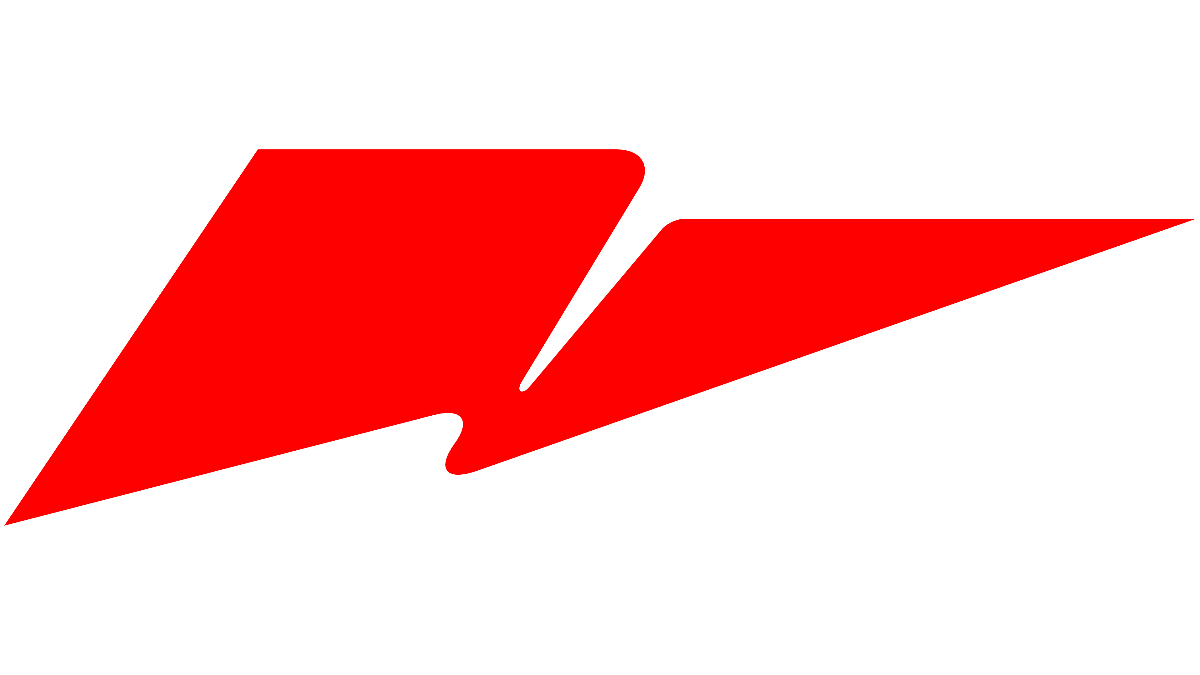
According to the project, the team created hundreds of flag options before reaching the final version. The search focused on abstraction, form brevity, image recognition, corporate solidity, and youthful sports energy. In the final version, the Unrivaled Sports logo became a combination of a wordmark and a separate emblem for digital media, presentations, and athletic apparel.
The name Unrivaled means “having no equal.” The updated logo conveys a similar meaning. It connects to rivalry, ambition, and team culture while moving away from sports clichés. For the audience, the logo creates an image of a brand associated with victory and sports. For partners, it presents Unrivaled Sports as a company with a unified identification system.