


![]()
Calder Gardens received a mark built on the pause between two words. For a place dedicated to Alexander Calder, the move feels appropriate. His work is tied to balance, air, changing viewpoints, and relationships between forms. The logo by “karlssonwilker” uses space as its main meaningful device.
Calder Gardens opened in 2025 in Philadelphia, on Benjamin Franklin Parkway. The project is dedicated to Calder, one of the influential artists of the 20th century. His family has been connected with the city for several generations. The space brings together art, architecture, a garden, and cultural programming. The 18,000-square-foot building was designed by Herzog & de Meuron. The gardens, with more than 250 plant species, were created by Piet Oudolf. Inside, works by Calder spanning five decades are on display.

The logo does not copy Calder’s mobiles or sculptures. Instead of a quote, it works with another theme, space, distance, foreground, and background. In the name Calder Gardens, the gap between the words becomes part of the mark. It resembles an opening, as if the viewer enters the project through it. The pause between the words connects art with the garden setting.
The strength of the mark lies in its dual reading. The logo reads like the institution’s name, while the empty areas begin to be perceived as form. The logo gains volume and tension. The mark changes depending on the viewpoint. It recedes into depth, comes forward, or recalls a shadow.
For Calder Gardens, this device is tied to the institution’s purpose. The gardens are conceived as a place for quiet viewing and personal perception. The logo supports the same idea. It does not explain Calder through a ready-made emblem, but leaves room for the viewer’s eye and personal judgment.
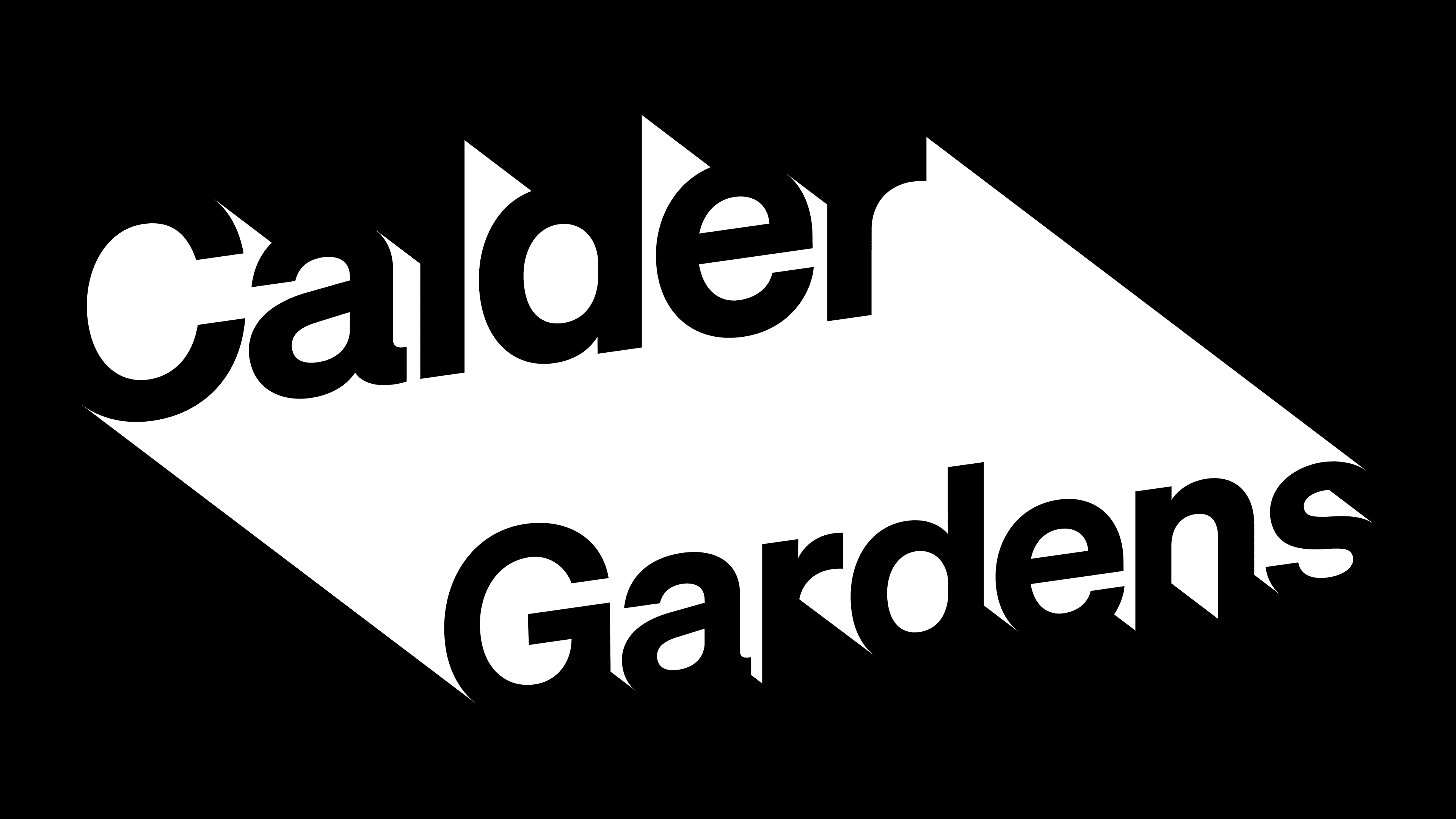
In use, the logo often looks like a cutout. The surface becomes the base of the mark, while the absence of ink or material forms the name. Because of this, the identity is closely connected with the architecture and the exhibition.
The new image of Calder Gardens is built on restraint. The studio “karlssonwilker” created a logo where meaning emerges from a pause. For a project about an artist of form, balance, and air, the mark conveys a connection to Calder through space, viewpoint, and the tension between the visible and the hidden.