The Warka logo is imbued with patriotism. The emblem pays tribute to the city where the brewery is located and shows respect to the heroes who became famous in the battles for Poland. The sign connects the drink with the celebration of victories and significant dates.
Warka: Brand overview
| Founded: | 1478 |
| Founder: | Żywiec Group |
| Headquarters: | Poland |
| Website: | warka.com.pl |
Meaning and History
As Warka points out, its roots go deep into history – to the 15th century. In 1478, Bolesław V (Prince Mazovian) appointed the brewery as the exclusive beer supplier to his court. But since then, little was known about it because the production of alcoholic beverages declined, and the company lacked capacity. In 1968, the construction of a specialized brewery began, which would provide the population with quality beer, as the town of Warka had long been famous for its production.
The works lasted from 1973-to 1975, and the official opening of the new brewery took place just at the end of this period. The company began to operate under the management of Warsaw Brewing Industries (Zakłady Piwowarskie w Warszawie) and was its structural subdivision. But in 1976, the brewery was separated from the capital organization and became independent.
In 1994 the brewery changed ownership and became “Browary Warka Sp. z o. o.”. Then the owners re-equipped the company, modernized it, and turned it into the largest beer supplier in the country. Then the brewery was taken over by the Swiss company Welinvest in 1996, which sold it to the Australian firm Brewpole BV. In 1999 it was bought by Heineken N.V. and included in a combined group of five producers of alcoholic beverages.
In 2004 the Polish company underwent another renovation, after which it was able to produce up to 350 million liters of beer a year. It has three product lines: Warka Strong, Królewskie, and Warka Classic. The bottles and cans of the branded beverage have a recognizable design in the national colors.
What is Warka?
Warka is a brewery from Poland, named after the city in which it is located. It owns the brand of the same name, under which it produces three types of 5.2% lager. The company is part of the Żywiec Group and belongs to the Heineken Group. The historical year of its establishment is 1478. The time of the actual launch of the renovated brewery was 1975.
Old
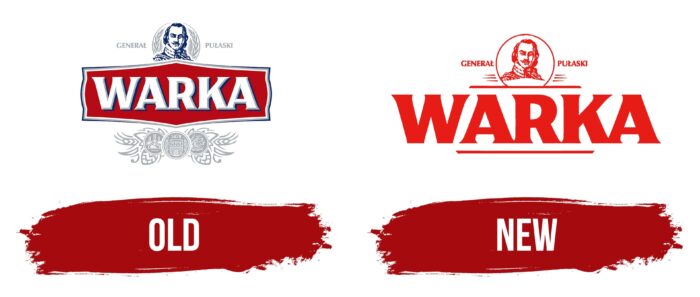
There is an elongated hexagon in the logo’s center, with a triple border that consists of white, gray-blue, and blue stripes. In the center on a red background is the word “Warka,” with miniature serifs in the form of barbed protrusions. The inscription is in the upper register and is decorated with the same lines as the hexagon, but in this case, they are on the right and look like shadows that give volume to the letters.
Above the name of the beer brand is a portrait of the famous statesman, a participant in many political protests, an officer of the US colonial army, and Polish patriot – Kazimierz Pułaski (in English – Casimir Pulaski). On the right is his surname, on the left the rank he held. In contrast, the general is in the dark blue, and the elements around him are in light gray. At the bottom are the brand awards received for the high quality of the product. One of them marks the supposed year of its formation – 1478. Next to it, the leaves and cones of hops are drawn.
New
The changes have touched on minor details in the modern logo, while the most important ones have been retained. These include the portrait of Casimir Pulaski in a circle, the Polish inscriptions “General” and “Pułaski,” the bold brand name with small serifs in the form of sharp protrusions. Otherwise, the emblem is lightened: short and long lines are used instead of many small components. They are around the portrait and at the top and bottom of the word “Warka.” The red background is no longer limited to the hexagon – it is common to all parts and has a square shape.
Font and Colors
In the process of modernizing the logo of the Polish beer brand, the designers kept key elements that emphasize the great importance of Poland to world history. With political overtones, the updated palette of the alcohol company is presented – it is in the colors of the state flag of the country.
The typeface is inspired by the large antique lettering used on tavern signs. It is based on bold antiqua with short perpendicular strokes that blend harmoniously with the legs of the letters. The brand’s signature palette now consists of red and white, considered national colors. Earlier, dark blue and gray-blue were also used.
Warka color codes
| Lust | Hex color: | #e81c15 |
|---|---|---|
| RGB: | 232 28 21 | |
| CMYK: | 0 88 91 9 | |
| Pantone: | PMS Bright Red C |
