


![]() Warsteiner Logo PNG
Warsteiner Logo PNG
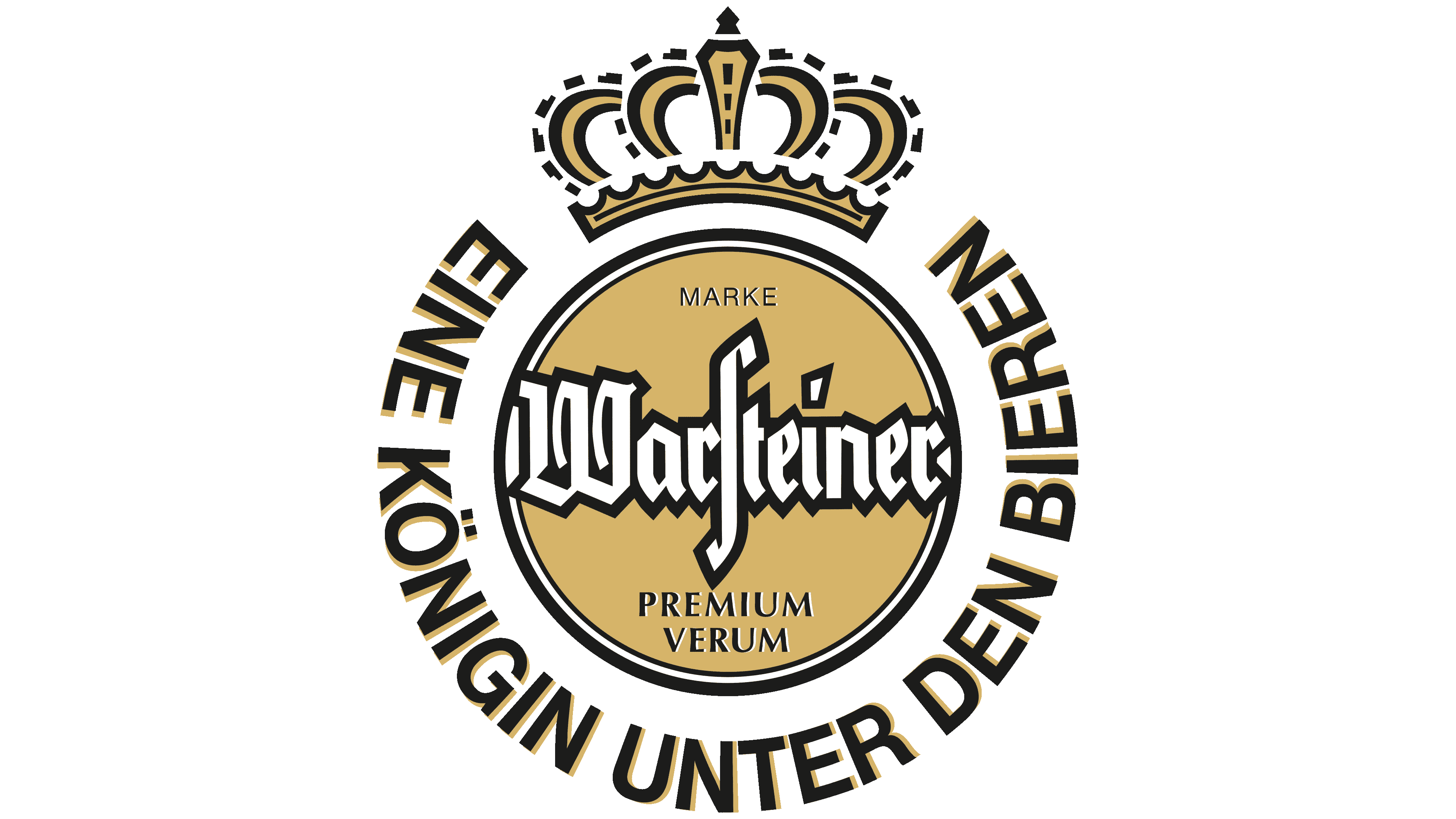
The emblem shows a drink that has received more than one award. The Warsteiner logo highlights the main one, the crown’s approval, which testified to the high quality of the foam. The symbols promise: beer has only gotten better over the centuries.
Meaning and History
![]()
The march of this brand’s products began in the middle of the 18th century, when farmer Antonius Cramer began selling surplus beer he brewed. According to the tax report for 1753, he paid the state for his new activities for the first time: 1 thaler and 19 guilders. Then the entrepreneur involved his son Johannes Vitus in brewing. He was also engaged in this business, adapting his own house in the center of Warstein. Even a fire in 1802, which destroyed the entire household, could not stop him. His son built a new building, opened the Domschanke brewery, and doubled his efforts.
The third-generation Cramer, in turn, had two sons, Albert and August, who joined the family business in 1823. Over time, they updated the company’s equipment and improved production methods while training at the Brauerschule brewing academy in Worms. In 1898, the brothers bought a steam engine and registered the company, listing it as a Warstein trading company.
A new turn in brand promotion occurred in 1927, when the Kaiserquelle spring, with its incredibly soft water, was discovered in the Arnsberg forest. It served as the basis for a premium German beer, enriching it with a unique flavor. Demand for the drink increased, so the logo became recognizable nationwide. Soon, the production expanded so much that it was moved to another site, the Waldpark plant, located on the city’s southern outskirts.
Currently, the company is run by the ninth generation of the Cramer dynasty. Thanks to continuous investment in production and identity, the brand is known worldwide.
What is Warsteiner?
Warsteiner is an old German beer brand and the family company that produces it. They have been around since 1753, offering a premium pilsner to customers from all over the world. The brewery is located in Arnsberg Forest Nature Park, near the town of Warstein. The founder of the brewery is Antonius Cramer.
Old
![]()
The original Warsteiner emblem is a light icon with a wide golden ring, inside which is a solid circle of the same color. It serves as the background for the beer brand name, composed of letters from the old German alphabet. The accent detail is the “s”: it is very vertically elongated, resembling a delimiting element. Around it is the inscription, which means “queen among the beers” in German. It is crowned by the imperial crown adorned with ornaments. The gold components (frame and center) are complemented by glittering highlights and a gradient, making the logo appear to be composed of noble metal.
2013 – 2016
![]()
The bezel is much thinner than in the first emblem in this version. And it has no light glare and metallic shine. The circle in the middle has become slightly larger: it has received a thin border, not touching the others but set at some distance. Thanks to this, the crown now sits on the circle, right on its lower stripe. Under the brand name appeared the year of its creation, a leaf, and two-hop cones. The gold color has a patina, and the central circle is decorated with a gradient. The accent is shifted from the letter “s” to the “t”: the designers stretched it vertically and cut the top bar at an angle.
2016 – today
![]()
The logo is now used, with a more distinct gradient, and the letters in the name of Warsteiner Brewing Company are black, whereas before they were white with a thin contrasting border. The bar at the “t” has been reduced. The oblique element above the “i” has been turned into a rhombus. To the right and left of the crown, the designers placed the year the brewery was opened. At the bottom, they added “Das Einzig Wahre,” a current slogan. The gold frame was wider again and had a noble metallic sheen.
Font and Colors

The Warsteiner beer brand remains faithful to its original brand identity, so each new logo repeats the main features of the previous one. And it is used not only on labels but also on some lids. All variants are in elegant pastel colors and necessarily include a crown – a sign of excellence and premium level. It shows the product’s high quality and authenticity.
The font used in the Warsteiner logo is called Nimbus Roman No 9 Small Caps. It first came out in URW++. It is a transitional Gothic font reminiscent of letters from the old German alphabet. The circular lettering is grotesque. The signature palette consists of muted shades of gold, black, and white monochrome.