Symbolizing commitment to the country and nation – the capital of America, the emblem of the Washington Capitals, the capital hockey club “Caps,” reflects the team’s pride in their affiliation. The modern emblem demonstrates career, aspiration, and movement towards a single goal – victory.
Washington Capitals: Brand overview
| Founded: | 1974 |
| Founder: | Monumental Sports & Entertainment |
| Headquarters: | Washington, D.C., U.S. |
| Website: | nhl.com |
Washington Capitals, a professional hockey team, joined the NHL in 1974. The club’s owner, Abe Pollin, chose the name “Capitals” after a team naming contest. He made an obvious choice for a team representing Washington, the capital of the United States. Moreover, in his opinion, such a nickname would distinguish his team from other clubs. The team’s common nickname is “Caps.” Additionally, they are called “Second Round Exit” and “Red Army.”
The team colors of the “Capitals” are patriotic white, blue, and red, that is, the colors of the American flag. The stars on the uniform are an allusion to the stars on Washington’s coat of arms.
Washington Capitals were the most average team in the League. They failed to achieve great success. In 1995, the club radically changed its image. It abandoned the traditional red-white-blue colors in favor of a dark blue, black, and bronze color scheme with stars and a bald eagle – the national emblem of the USA. The alternative emblem of “Washington Capitals” included the Capitol building with two stars on the side.
The uniform, designed by Reebok, marked a return to the original red-white-blue color scheme. Even the new emblem of the Washington Capitals strongly resembles the 1974 emblem, which was supplemented with a hockey stick. “Washington Capitals” still uses this uniform and emblem.
The official mascot of the “Washington Capitals” is Slapshot, a large anthropomorphic bald eagle wearing the number 00.
Meaning and History
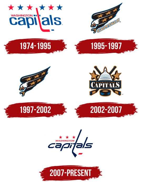
In 1975, Washington became the hometown of a team of young and promising hockey players. The visual identity of the Washington Capitals team is conveyed in several different ways. First, it was hockey paraphernalia with inscriptions, then – a swift and formidable bald eagle, a little later – the dome of the Washington Capitol with crossed sticks, now – a refined debut version. Despite an unsuccessful start, the athletes were able to achieve high victories and become professionals. Their career, aspirations, and movement towards the goal are reflected in the details of the emblems.
What is Washington Capitals?
It is a hockey club from the Capital Division (NHL). It has existed since 1974 and, since 1997, has been playing at the Capital One Arena. The team has played in the Stanley Cup finals twice and even won once. Moreover, it won three Presidents’ Trophies.
1974 – 1995
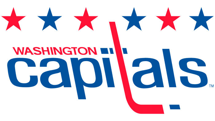
The original logo of the “Washington Capitals” was a minimalist and restrained version. The central part of the logo was occupied by the word “Capitals,” written in blue. It was chosen deliberately. It was a reference to Washington, the capital of America. Above was the red name of Washington itself. Similar to a hockey stick, the letter “t” in this word was highlighted in bright red. The left-leaning italic also distinguishes this unique logo.
1995 – 1997
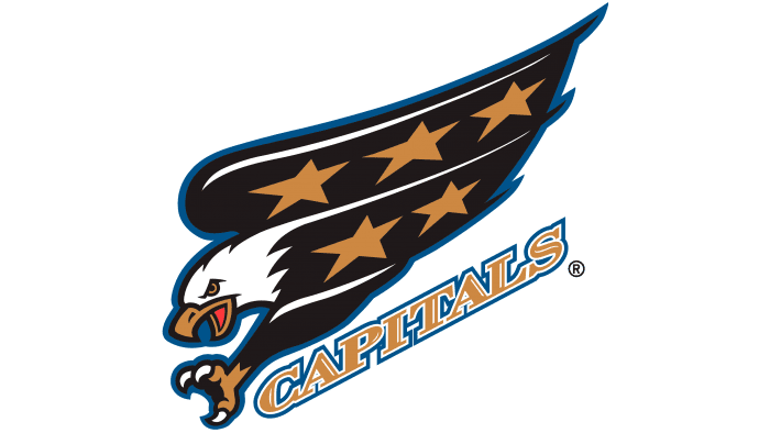
Twenty years later, the team decided to change the concept and logo completely. In the 1990s, black became extremely popular among NHL participants. That is why it was adopted as the main color for the new logo of the Washington Capitals. At the center of the emblem was a black eagle, soaring upwards with extended claws. Just below was the word “Capitals,” written in gold and framed in blue. Stars appeared for the first time on the new logo. Despite the new logo being different from the previous one, the word “Capitals” remained one of the key elements of the logo.
1997 – 2002
After 23 years, the name disappeared from the logo, which now only depicted a flying eagle.
2002 – 2007
The third change of the “Washington Capitals” logo dates back to the early 2000s. The main color palette still included gold and blue, but the number of characters in the logo was increased. In place of the abandoned eagle on the Capitol building, two crossed blue sticks and two gold stars appeared on the side. The team (in case someone didn’t know or forgot it) was located in the center, inside a black rectangle. The city name was written in gold, and the word “Capitals” was written in white. The black rectangle was framed in blue and gold. At the very bottom were crossed sticks and a blue-gold puck. The logo was well-detailed, with shades and overflows of the primary colors.
The Capitol was a good visual element used to “tie” the city and the local hockey team together. Did the team need all these details on the logo? Probably, it does not have the most pleasant memories for the team’s fans, as, owning this logo, the team set an anti-record in its history. In 2001, the “Washington Capitals” acquired Jaromir Jagr, but he was far from an ideal player. But on the other hand, in 2004, the club won the draft lottery and first chose Alexander Ovechkin.
2007 – today
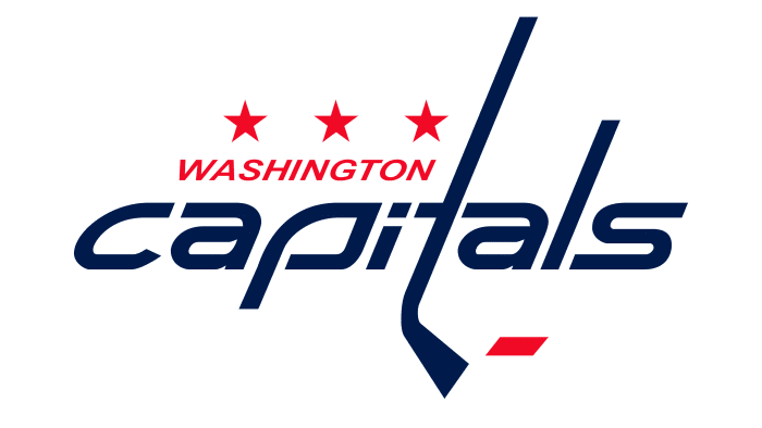
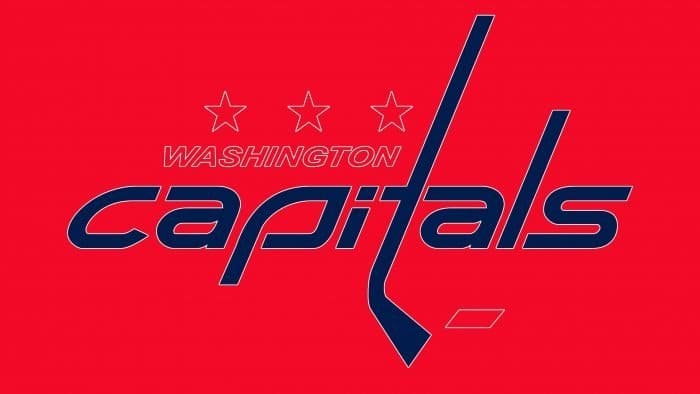
The current version is a revised sign related to the early period of the club’s existence. Only a few nuances have changed. The first and most significant transformation is the font. If it was previously inclined to the left, now it is to the right. The developers also reduced the number of stars from six to three and changed the color of the puck from blue to red.
At the same time, they completely preserved the rest of the structure, including the main highlight of the logo: the stick instead of the lowercase letter “t,” added to the upper segment. In the modern version, the main role is played by the text, and there is almost no graphics except for the stick.
Compared to previous logos, this one is perhaps the best, with the best color combination ever for the “Capitals.” The color scheme of the jersey has become attractive and pleasing to the eye. The logo itself is not a logo, as they say, obvious. Moreover, it is not even written in capital letters! Much can be said about the authenticity of the logo, but it is unlikely to be improved using the same color palette.
Washington Capitals: Interesting Facts
The Washington Capitals are a hockey team from Washington, D.C. They started in 1974 and have had some ups and downs, but they have become one of the most exciting teams in hockey.
- Tough Start: Their first year in 1974 was hard, with many losses, but it was just the beginning.
- Stanley Cup Win: In 2018, they won their first Stanley Cup by beating the Vegas Golden Knights, a huge moment for the team and fans.
- Alex Ovechkin: Known as “Ovi,” he’s one of the team’s best players, famous for scoring many goals.
- Home Arenas: They used to play in the Capital Centre and now in the Capital One Arena in D.C.’s Chinatown.
- Biggest Win: They scored 14 goals in a game once in 1984, a record for them.
- Presidents’ Trophy: They’ve had the best regular-season record three times, showing they’re a strong team.
- Big Rivalries: They have a big rivalry with the Pittsburgh Penguins, making for some intense games.
- Honored Players: They’ve retired the numbers for some of their best players, such as Yvon Labre and Mike Gartner.
- Great Coaches: Bruce Boudreau is one of their famous coaches who helped turn the team around.
- Helping Out: The team does a lot of charity work in D.C., helping kids and families.
The Washington Capitals have a rich history, from tough starts to big victories. They have great players and a lot of support from their fans. They’re a big part of their community and the world of hockey.
Font and Colors
From 1995 to 2007, the official symbolism of the “Washington Capitals” was dominated by the drawn part. In the early versions, a bald eagle was depicted – a symbol of swiftness, vigilance, and strength. It dives at an invisible prey and is ready to grab it with sharp claws. Then, a more thematic logo appeared, as close as possible to the team’s name: its identity was expressed by the Washington Capitol building (more precisely, its dome). In the background are two crossed sticks. There are also stars and a puck.
The team used several types of fonts: a quasi-Helvetic font with glyphs for the debut emblem, a classic font with serifs for the three subsequent versions, and a proper italic with pointed letters in the current logo, instead of the lowercase letter “t” – a hockey stick.
The color scheme of the personal symbol of the Washington Capitals includes the following hexagonal indices: #01183F (blue), #D00328 (red), and #FFFFFF (white).
Washington Capitals color codes
| Red | Hex color: | #c8102e |
|---|---|---|
| RGB: | 200 16 46 | |
| CMYK: | 2 100 85 6 | |
| Pantone: | PMS 186 C |
| Blue | Hex color: | #041e42 |
|---|---|---|
| RGB: | 4 30 66 | |
| CMYK: | 100 90 13 68 | |
| Pantone: | PMS 282 C |
FAQ
What does the name Washington Capitals mean?
The name Washington Capitals has no hidden meaning. It was chosen as a result of a contest for the best name for a hockey club. Capitals simply means that Washington is the capital of the United States.
What is the “Washington Capitals” logo?
The logo of the Washington Capitals is a word sign containing the name of the club. The first word is written in a red italic sans-serif font. It is located in the upper right corner and complemented by three five-pointed stars. The team’s nickname is in the middle. It uses black lowercase letters, and the letter “t” is stylized as a hockey stick. Next to it is a small red puck.
Has the “Capitals” logo changed?
Yes, the team has changed its logo several times. The last redesign was carried out in 2007 when the designers decided to return the very first emblem and slightly modernize it.
Where did the “Washington Capitals” club come from?
The “Washington Capitals” club appeared two years after the city of Washington won the right to a National Hockey League franchise.
