Simplicity and compactness are key factors that influenced the Waste Management logo. Designers aimed to demonstrate the utility of the service without overloading its visual identity. The result is a business emblem that instantly conveys the company’s field of operation. The minimalist symbol is easily recognizable and familiar to Americans.
Waste Management: Brand overview
| Founded: | January 1, 1968 |
| Founder: | Wayne Huizenga, Dean Buntrock |
| Headquarters: | Houston, Texas, U.S. |
| Website: | wm.com |
Meaning and History
Digging into the history, the origin of this company dates back not to the 20th century but to the 19th century. In 1893, an immigrant from the Netherlands started his own trash-hauling business. Harm Huizenga initially worked alone, but later, his initiative was picked up by his grandson Wayne Huizenga, who attracted other interested individuals, and together they created Waste Management. Naturally, the company needed its face for signage and advertising – something interesting, iconic, and unique. Each emblem version relies on an abbreviation of the waste processing corporation’s name, presented in various ways. This approach solves two problems: it identifies and draws attention to the specific service, emphasizing the concept.
What is Waste Management?
Waste Management is a North American company that collects, transports, and disposes of various types of waste. It has been operating since 1968, with its headquarters in Houston, Texas, although it originally started in Chicago, Illinois. Three entrepreneurs founded it, one of whom was a descendant of a trash collection service owner. These founders were Wayne Huizenga, Larry Beck, and Dean Buntrock.
1968 – 1998
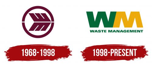
Oddly enough, this is not a graphical logo. It’s purely textual. Designers skillfully camouflaged the company name’s initial letters, making them almost unrecognizable. Upon close inspection, these letters can be spotted at the tip of an improvised arrow. At the top is an uppercase ‘W,’ and at the bottom is an ‘M.’ They are slanted and look identical. They have identical wide bands, smooth edges, and rectangular sections, giving a sense of a continuous waste management process. Above and below the glyphs, there’s an arch forming an open loop. Because of these gaps, a thin white line appears between the letters. The symbol is colored in brown.
1998 – today
The abbreviation has shed all excess and now appears as a monogram. Bold uppercase letters look fused, creating a sense of durability, reliability, and stability for viewers. The robust glyphs are strictly vertical and lack the previous slant. They do have interior angles, making them credible. Due to this, they’re perceived as letters rather than serrated ridges. Despite their bulkiness and truncated tops, they don’t exude harshness. This is due to their pleasing “eco-friendly” colors: the ‘W’ is green, and the ‘M’ is yellow. Below each symbol, the corresponding part of the name it represents is indicated. Due to the long length of the second word, it is slightly shifted to the left. The inscription is aligned on both sides.
Font and Colors
In the early version of visual identity, only straight and strict lines prevailed. Later, internal angles were added. None of the Waste Management logo inscriptions are serifs, so the edges of the bulky letters are smooth. The glyphs have a block style, including the full name typed in uppercase. This typeface is called Univers 93 Extended ExtraBlack.
The emblem’s color is diverse: brown (in the debut version), green, and yellow. The last two are related to the environment and maintaining a safe lifestyle. Green embodies nature, ecology, life, and growth. Yellow symbolizes the sun, joy, happiness, care, friendliness, and trust.


