The breadth of views is visible behind the clear three-dimensional strokes of the emblem. The Wattpad logo is full of communication, information, and love of prose that brings writers and readers together. Everyone will find content to their liking on the platform’s pages.
Wattpad: Brand overview
| Founded: | December 2006 |
| Founder: | Wattpad Corp. |
| Headquarters: | Toronto, Ontario, Canada |
| Website: | wattpad.com |
Meaning and History
The library’s primary source was Project Gutenberg, a collection of world literature collected and digitized by enthusiasts over several decades. Thus, more than 17,000 works entered the Wattpad shelves, replenishing the PG collection from 1971 to 2007. The initiators were Ivan Yuen and Allen Lau, who wanted to make the texts available to mobile phone owners.
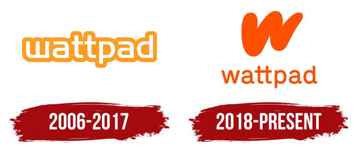
But this was not all: new authors and books constantly appear on the platform, and volunteers constantly work to improve the community. One of the symbols of Wattpad’s development is the modern logo—an inscription with a stylized letter “W.” Smooth, curved, and streamlined lines create the effect of movement. It contrasts with the old trademark, which had many corners.
2006 – 2017
The Wattpad project was launched in 2006 by a company of the same name. The brand’s creators used this name as the main element of the logo. They made the lettering white and outlined it with a thick orange line. Ivan Yuen found a free font to make the word mark stand out while saving on design costs. Instead of the first letter “w,” an inverted “m” was used in this case. It also became an icon for the application, for which it was additionally circled with a white stripe and placed in an orange square.
2018 – today
In 2018, the company undertook a redesign for the first time, ditching the old free typeface in favor of a custom typeface with rounded edges. As a result, the outlines disappeared, and the inscription became completely orange. A common horizontal line now connects the two “t” s in the middle of the word. It is a symbol of communication between all members of the community.
At the same time, the Wattpad reader app has a new icon that has nothing to do with the previous logo. It stands for “w” and looks like a sloppy brushstroke. It can be used in a square with an inscription or separately. Creative agency DesignStudio is behind all the changes.
Wattpad: Interesting Facts
Wattpad is an online platform where anyone can read and write stories. It started in Toronto, Canada, in 2006 with Allen Lau and Ivan Yuen. Now, it’s a big community for writers and readers who love all kinds of stories, from science fiction to romance.
- Content Created by Users: Wattpad has millions of stories written by people worldwide. Whether you’re into fan fiction or mystery, you can find many stories.
- Worldwide Community: Wattpad is used by people from over 50 languages, making it a place where stories reach readers worldwide.
- Wattpad Stars Program: This program is for successful Wattpad writers. It allows them to earn money, publish their work, and even have their stories turned into movies or TV shows.
- The Watty Awards: Every year, Wattpad holds a writing contest to celebrate the best stories on the platform. Winning or getting noticed here can make writers much more popular.
- Wattpad Books: Started in 2019, this part of Wattpad picks some stories to publish as real books. It’s a way for online stories to be read off-screen, too.
- Movies and TV Shows: Some Wattpad stories have been turned into movies and TV series. For example, “After” and “The Kissing Booth” were originally Wattpad stories before becoming hits on Netflix.
- Partnerships: Wattpad partners with publishers and entertainment companies to turn stories into books, movies, and other media, helping Wattpad stories reach even more people.
- Community and Support: Wattpad is a supportive place where writers get feedback from readers through comments and votes. It’s a community that helps writers grow.
- Using Technology: Wattpad uses tech to determine what people like reading. This helps readers find stories they’ll enjoy and helps find stories that could be successful outside of Wattpad.
- Joining with Naver: In 2021, Wattpad joined forces with Naver, a large South Korean company. This move aims to make Wattpad a leading entertainment company globally.
Wattpad is a place that brings stories to life, making it easier for writers to be noticed and succeed. It shows how storytelling and entertainment are changing because of the internet.
Font and Colors
The Wattpad icon creates a sense of movement because the plots of the books are constantly changing. Each story has its dynamics and development path, and the designers tried to express this idea with graphic means. The corporate identity is also not static – it is constantly progressing to inspire users to new stories.
The old wordmark seemed outdated due to the free Handel Gothic geometric font dating back to the 1960s. The only non-standard element was the letter “w,” formed from an inverted and mirrored “m.” DesignStudio has selected a new, more dynamic typeface with rounded edges for the Wattpad. Its approximate counterpart is TGL 0-16 Regular by Peter Wiegel.
Since 2006, the signature Hero Orange (# FF500A) has been the base of the color palette. It’s a vibrant, modern, energetic shade that epitomizes interesting user stories.
