


![]() Waylon Jennings Logo PNG
Waylon Jennings Logo PNG
The calm logo of Waylon Jennings hides the musician’s restless nature, who fell in love with the guitar in elementary school and started playing it at 8 years old. As a teenager, he played so skillfully that at fourteen, he was already performing on KVOW radio and leading his first band.
Waylon Jennings, born Wayland Arnold Jennings, was an influential American country musician who significantly shaped the genre by pioneering outlaw country alongside Willie Nelson, David Allan Coe, Kris Kristofferson, and Johnny Cash. Born on June 15, 1937, in Littlefield, Texas, Jennings began performing at a young age, quickly transitioning from a radio DJ to collaborating with Buddy Holly, whose tragic death deeply impacted him. Moving to Nashville, he defied industry pressure to maintain creative independence, blending country, rock, and blues. Jennings’ rebellious attitude and innovative albums like Honky Tonk Heroes, Dreaming My Dreams, and the platinum-certified collaboration Wanted! The Outlaws revolutionized country music. In addition to successful solo hits, he joined The Highwaymen, achieving further acclaim. Despite personal struggles, Jennings continued recording and performing, later narrating the TV series The Dukes of Hazzard. Inducted into the Country Music Hall of Fame shortly before his passing in 2002, Jennings’ legacy continues through tribute albums, a dedicated museum, and the enduring influence of his music.
Meaning and History
![]()
Waylon Jennings was born Wayland Arnold Jennings and was known as Waymore, Watasha, Chief, and Hoss. He used his stage pseudonym, Waylon, for his logo, which became his second “self.” Being a creative personality who opposed the country’s classic standards, the musician chose an unusual sign based on his name. The first version was a long inscription; in the second, it was shortened and reduced to a single letter. Despite their differences in appearance over the years, both emblems are circulating in the music world and in marketing. And they perfectly characterize the virtuoso guitarist from the Texas prairies with boundless expanses and free winds.
What is Waylon Jennings?
This is an American singer, guitarist, and songwriter from Littlefield, Texas. One of the key pioneers of the Outlaw Country movement, he was known for pursuing creative independence from the musical standards and rules established in Nashville.
1974 – 1978
![]()
This Waylon logo is textual. It elegantly presents the name of the American song performer. Such elegance fits well with his stage image, complete with a stylish black hat, leather vest, long hair, and a neatly trimmed beard. The emblem emphasizes the musician’s uniqueness, creative streak, pedigree, and refined taste.
The inscription is set in a vignette style, decorated with curls, large dots, and letters with smooth curves, reminiscent of an embroidered monogram. The bold glyphs are almost entirely devoid of sharp angles, soft and flowing. They are characterized by a slight tilt and a thin outline, meticulously following the shape of each symbol. From “y,” a wide tail extends to the right, and from “W,” an elegantly curved element goes upward.
1978 – today
![]()
The most famous Waylon logo is an eagle stylized as the letter “W.” It is highly meaningful:
- It embodies the United States of America, as the bald eagle is its symbol.
- The bird conveys the singer-guitarist’s unstoppable creative drive.
- It reflects the musician’s freedom-loving character.
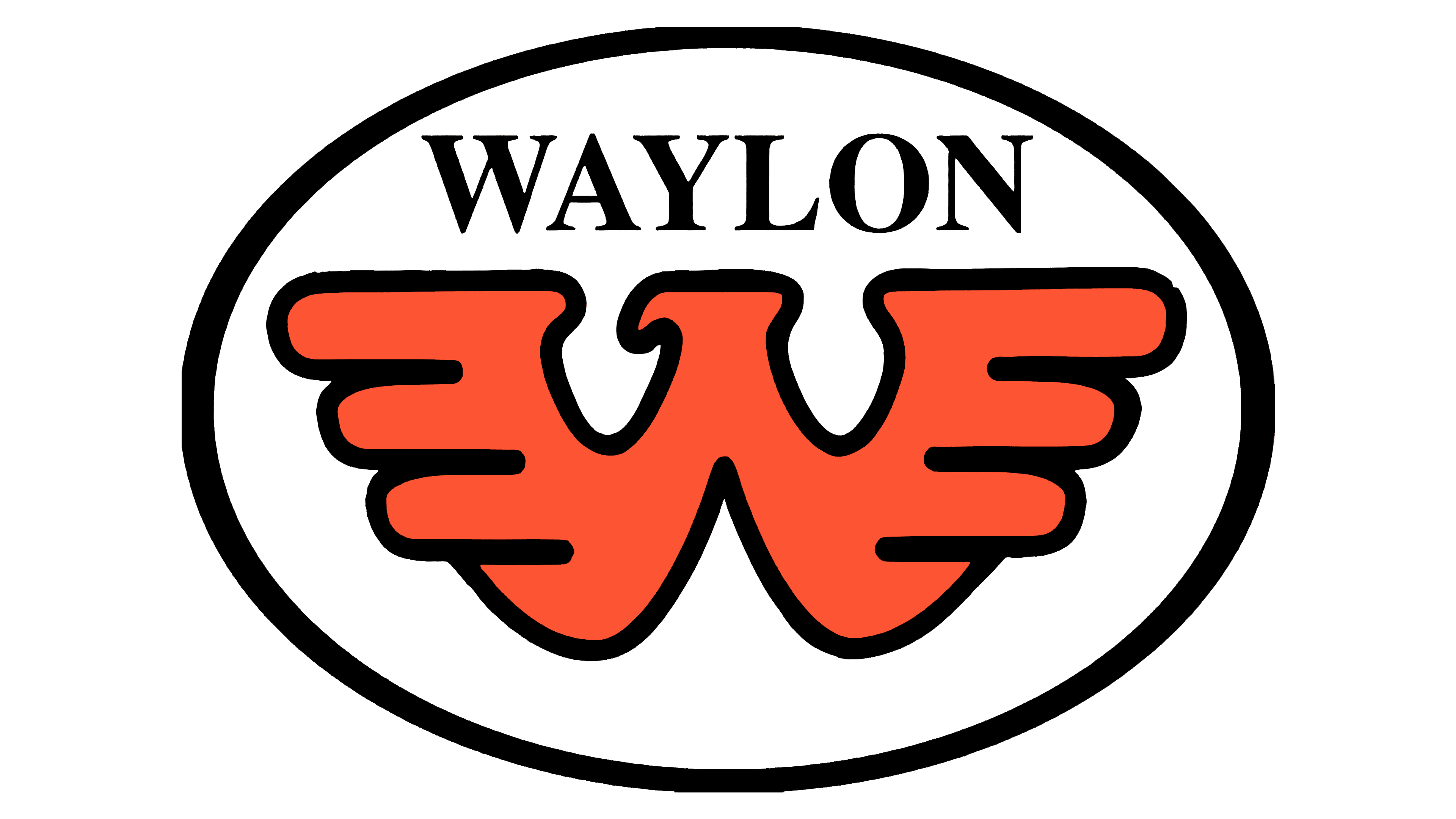
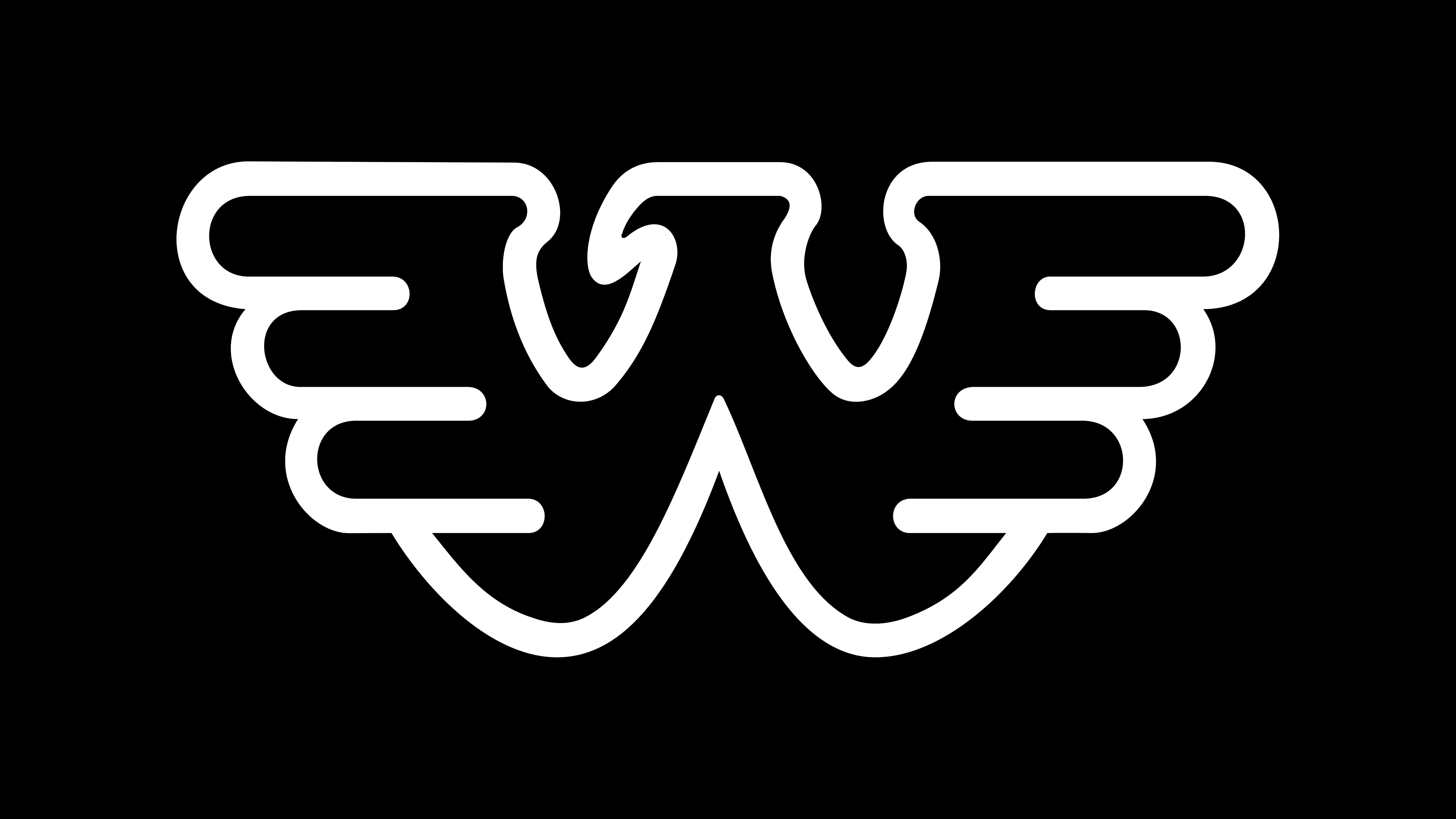
The powerful eagle is depicted with outstretched, upward-raised wings, conveying the glyph it represents. Each wing has three improvised feathers with rounded ends. Only the beak is sharp; all other angles of the bird are soft and smooth. The emblem is drawn with a thin black outline, which is white in the middle.
Font and Colors
The logo inscription uses a typeface created specifically to reflect the brand’s identity. The characters are large, smooth, and marked by expressive, soft lines. The first letter is uniquely styled, creating a visual focal point.
In earlier versions of the logo, a rich color palette was used, with orange as the main color, a shade associated with emotion, inspiration, and freedom. Later, the brand adopted a restrained monochrome scheme based on black. The transition to black and white coincided with a shift in the artist’s image and creative direction, moving toward more serious, profound, and personal themes.
The early version featured bold italics with a slight slant and rounded strokes. Later, the typeface acquired custom characteristics with prominent, distinctive forms representing the artist’s initials. The original logo characters resemble handwritten letters, conveying the musician’s vibrant personality and individuality, seamlessly reflecting his musical style and manner of performance.