The Weight Watchers logo shows that the platform helps you “build” your body on your own. Create the desired volumes and curves. The emblem guarantees comprehensive information on this issue and round-the-clock support.
Weight Watchers: Brand overview
| Founded: | May 15, 1963 |
| Headquarters: | New York, NY, U.S. |
| Website: | weightwatchers.com |
Meaning and History
The path to this company’s success began with the fact that its founder could not lose weight for a long time, despite many tried and tested methods. Nothing helped Jean Nidetch. Even if she lost weight, she quickly gained it again. This continued until the sufferer went on a diet called the Prudent Diet, which was developed in the 1950s by Dr. Norman Jolliffe, head of the Bureau of Nutrition.
Noticing her weight loss and the simultaneous desire to eat something sweet, Nidetch realized that she lacked motivation. And she didn’t like the way information was presented at weekly meetings at the clinic. Therefore, the patient herself began to discuss the problem at home, inviting everyone from the group. At first, the support team consisted of six people. Two months later, it has grown to forty faces.
One day, her clients included Al and Felice Lippert, who gave her the idea to create her service. As a result, in 1963, Nidetch and Lippert registered Weight Watchers Inc. in Queens. Al ran the company and was responsible for distributing the franchise. Jean taught courses, taught how to lose weight and how to lose weight. Felice was involved in recipe development and product research, based on which she published a cookbook on nutrition in 1966.
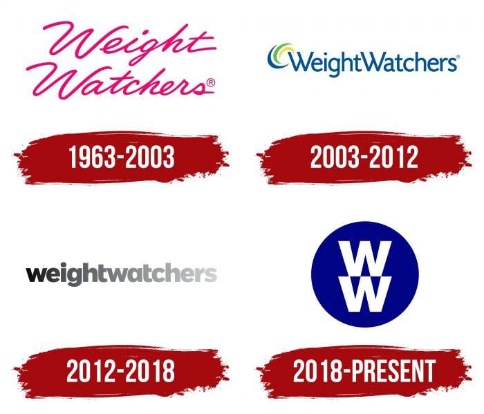
Their joint activities led to success but provoked a lot of competitors. Therefore, the company had a hard time for some time. In 2015, she partnered with Oprah Winfrey, an American celebrity. And in 2018, the company expanded its services and received a new name – WW. At the same time, she carried out a major rebranding, including updating the logo. She has four of them in total.
What is Weight Watchers?
Weight Watchers is a program designed to maintain a healthy body weight. It assumes that people can lose excess weight through a sensible diet, moderate exercise, and psychological support. Each participant has a certain number of daily points that can be spent on different products. Housewife Jean Nidetch developed the concept. The brand under its current name appeared in 1963 and is owned by WW International.
1963 – 2003
The debut logo was a simple handwritten cursive lettering. The phrase “Weight Watchers” was in two lines and was on a white background. It was painted in neon pink, close to fuchsia. The designers have combined both parts of the name with the same letter “W”: it is identical in both the top and bottom rows.
2003 – 2012
In 2003, the company revised its magazine, adjusted its publication, and carried out the first redesign of the logo. It was cardinal as the administration approved a new visual style. For the logo, the developers chose a sleek and even font from the grotesque category. The symbols were very tight, so both words merged into one. But, despite the close arrangement, the first letters remained in capital letters.
Moreover, both “W” looked like two Roman numerals, “V,” standing one after the other. At the top, on the left side, there were three semi-oval strokes — yellow, green, and blue. The inscription was also blue.
2012 – 2018
Since 2012, the company has its electronic tools and a mobile application. During the same period, the management decided to change the sign of visual identity. This is directly related to digital products’ launch, as a corporate logo should look distinct on any device. For the logo, Weight Watchers again chose its name. To modernize it and make it easy to read, the designers have completely combined the two words, converting the inscription to a lower case. In this version, all letters were classic, bold, wide. The color scheme of the logo is monochrome, with a gradient transition from dark black to light gray.
2018 – today
2018 has brought major changes. The company expanded the scope of services, after which the slogan reflected in the name lost its relevance because the company’s activities became much more diverse. The developers suggested shortening both words to the initial two “W.” This is how the current abbreviation appeared. The letters are stacked one on top of the other and look like four victory signs or four “V” ticks. They are painted white and placed inside a cobalt disc.
The development of the corporate identity progressed in parallel with the expansion of the company. If the logo looked like a modest italic inscription at the beginning, now it has become a bright emblem in the form of a round seal. This greatly simplified the image and allowed it to be used as a trademark, icon, and label for product labeling.
Weight Watchers: Interesting Facts
WW International, Inc., previously known as Weight Watchers, is a company that helps people lose weight and live healthier lives. It started in 1963 and has included the latest nutritional science and technology.
- Origin: Jean Nidetch, a New York housewife, started WW. She found that sharing weight loss experiences in a group was helpful, leading to the first WW meetings.
- Points System: WW uses a points system where foods have points based on nutrition. Members have a daily points limit, encouraging healthy eating without banning foods.
- WW Rebranding: In 2018, the company became WW to emphasize overall wellness, including mental and emotional health, alongside weight loss.
- Digital Tools: WW offers an app for members to track food, activity, and progress. The app also provides recipes, workouts, and a support community.
- Celebrities: WW has worked with celebrities to share their weight loss stories, helping to connect with more people.
- Worldwide Reach: WW is active in several countries, promoting healthy living globally.
- Science-Based: The company bases its programs on current nutrition and behavior science, working with health experts to ensure its advice is sound.
- ZeroPoint Foods: WW’s newer programs include foods that don’t count against daily points, like fruits and vegetables, to encourage healthier eating habits.
- Support Community: WW offers meetings and workshops, both in person and online, to provide motivation and support from both coaches and other members.
- Diverse Diets: The program caters to various eating preferences, including vegetarian, vegan, and gluten-free, making it accessible to more people.
WW has evolved into a brand focused on comprehensive wellness, using technology, research, and community support to help people achieve a healthier lifestyle.
Font and Colors
Different fonts were used at different times. The debut version contained cursive lettering imitating handwriting. The second logo featured a Homizio Black typeface with a modified “W.” For the third version, the designers opted for the Tide Sans 700 Mondo font with the “t” bar’s trimmed left side.
The signature palette has always been bright, except in 2012-2018, when it consisted only of black and white. The brand’s color palette includes neon pink # ec016d, navy blue # 00519c, and deep cobalt # 000187.
Weight Watchers color codes
| Dark Blue | Hex color: | #000187 |
|---|---|---|
| RGB: | 0 1 135 | |
| CMYK: | 100 99 0 47 | |
| Pantone: | PMS 2738 C |


