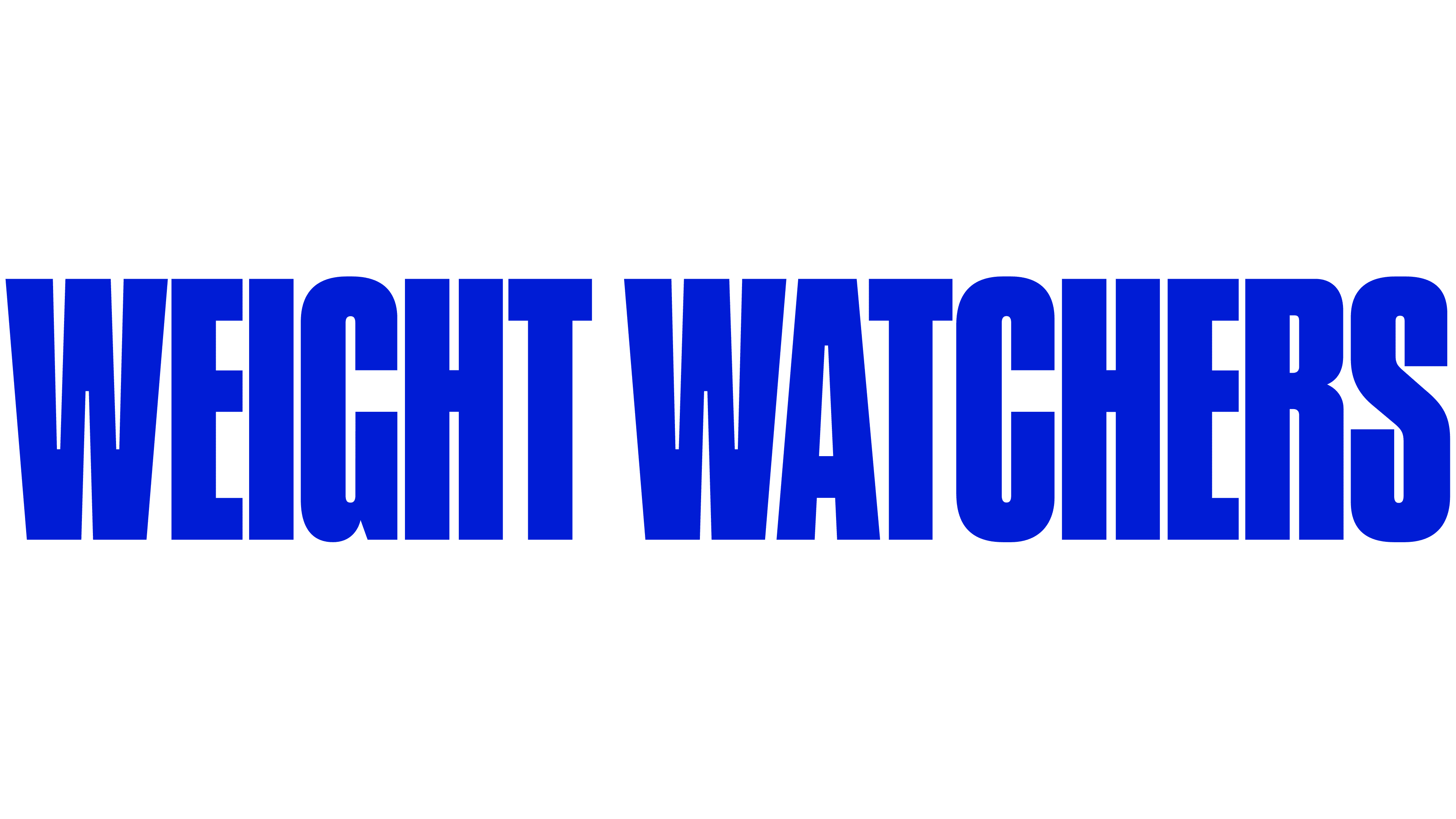
WeightWatchers has unveiled a new brand image. The new style is not a set of cosmetic tweaks. It represents a restructuring aligned with the current and future configuration of the health market, where digital services and GLP-1-based medications play a leading role. The update affects the visual system, the product model, and the company’s long-term development direction.
The new mark is built on a restrained formula. Its structure features two W letters separated by a vertical stroke. The composition is perceived as a personal path, divided into stages, and as a move away from universal scenarios toward individual outcomes.

The color retains the familiar blue, but the shade has become cooler and denser. The typography is heavier. A wide, grotesque typeface with tight spacing forms a solid mass in which the letters nearly touch. Shortened stroke endings and even line weight create a sense of cohesion and strict structure.
The visual framework was developed by the agency, Mrs. & Mr. The public presentation took place on December 16, several months after the completion of financial restructuring and the company’s exit from bankruptcy proceedings. After that, WeightWatchers officially shifted its focus to GLP-1-related initiatives and services to support women’s health during menopause.

In professional and business circles, the update is seen as an attempt to secure a position in a segment growing alongside the popularity of medications like Ozempic. The new visual style moves away from the traditional weight-control program image. It establishes a more medical, technology-driven, and pragmatic brand image, designed to expand presence in pharmacological support and long-term health services.