The Western Star logo reflects the reliability of heavy-duty trucks and complete confidence in them. The emblem also conveys the versatility of this equipment, as it suits various fields of activity, from construction to the municipal sector.
Western Star: Brand overview
Western Star originated in 1967 in Kelowna, British Columbia, Canada. Initially, the business was a branch of the well-known American truck maker White Motor Company. Western Star’s primary focus was manufacturing heavy-duty trucks for the forestry sector, which was crucial to the economy of western Canada.
Innovation and growth were swift early on in the company’s history. The brand made a name for itself as a manufacturer of tough, dependable vehicles that could withstand the challenging environments found in Canadian forests. The business developed a devoted clientele by paying close attention to each individual’s demands.
In the 1970s, the company broadened its model selection beyond the logging sector. The business began manufacturing vehicles for the long-haul transportation, oil and gas, and mining industries. This expansion helped the company boost sales and solidify its position in the market.
The 1980s brought significant changes. Following Australian billionaire Terry Peabody’s 1981 acquisition of the company, several structural modifications were implemented. Under new leadership, the manufacturer kept refining its products and broadening its sales area. The company aggressively pursued foreign markets, particularly in Australia and other nations with developed mining industries.
The 4900 series of trucks, which debuted in 1990, became one of the most popular in the company’s history. These vehicles had superior fuel efficiency, more driver comfort, and improved aerodynamics. The 4900 model rapidly gained popularity among transportation businesses and long-haul truck drivers.
In 1992, the company established a new plant in Kelso, Washington, USA, boosting output and providing better service to the American market. This move greatly enhanced the company’s standing in North America.
The company was actively expanding during the mid-1990s. To increase its worldwide footprint, it bought several other manufacturers, including ERF (UK) and MAN’s Australian division.
A pivotal moment in the company’s history happened in 2000 when DaimlerChrysler AG purchased Western Star and integrated it into the Freightliner LLC business. This acquisition gave the company access to cutting-edge technologies and the resources of a multinational automaker.
Following its acquisition by DaimlerChrysler, the company kept expanding its product lineup. A new model, the 4800, was released in 2002, catering to the needs of the construction sector and regional transit. This model gained popularity among clients who operate in urban settings by combining the brand’s classic durability with enhanced mobility.
The company commemorated the manufacture of its 100,000th vehicle in 2005, marking a significant achievement that highlighted the business’s consistent expansion and importance within the heavy-duty truck sector.
A new flagship model, the 5700XE, was introduced in 2011. The increasing need for longer-haul trucks that are more fuel-efficient led to the design of this model, which prioritizes aerodynamics and fuel efficiency. The 5700XE gained popularity among drivers and fleet owners by fusing contemporary technology with the brand’s classic rugged appearance.
With the launch of the 5700XE with the Detroit DT12 automated manual transmission in 2015, the company significantly improved efficiency and comfort for drivers.
During the 2010s, the company continued creating new models and improving its current ones. The manufacturer concentrated on improving safety by developing technology like adaptive cruise control and lane departure warning systems.
In 2020, the company debuted the brand-new 49X model for heavy-duty uses. This model was completely redesigned with cutting-edge improvements, including a new steel and aluminum cab, better visibility, and sophisticated safety systems.
The 47X model, which completed the heavy-duty truck portfolio, was introduced in 2021. This model was created for various uses, such as snowplows, dump trucks, and concrete mixers.
Today, Western Star continues its operations as part of Daimler Truck North America, maintaining its unique identity and reputation as a premium heavy-duty truck manufacturer. This brand’s history is a story of a company that successfully combines tradition with innovation, constantly adapting to customers’ evolving needs and market conditions.
Meaning and History
What is Western Star?
It is an American heavy-duty truck manufacturer specializing in producing reliable and durable vehicles for various economic sectors such as mining, logging, and construction. Customers can personalize their trucks as per their requirements and specifications thanks to the company’s wide range of truck layouts and options. The trucks are known for their rugged construction, high performance, and ability to handle even the most challenging road situations and work environments.
1967 – 1980
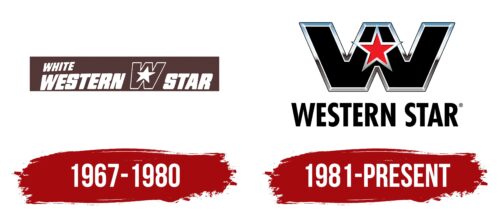
The Western Star logo is based on a long rectangle, extended horizontally, containing several key elements:
- The full name of the heavy trucks
- The name of the parent company
- The brand’s personal mark
Each element is arranged to ensure every word is clearly readable without overlapping adjacent details. Therefore, the top line is dedicated to the corporation that founded the brand. “White” is written in an uppercase sans-serif font and placed diagonally, rising to the right, indicating optimism and confidence in the future.
The second row is dedicated to the phrase “Western Star,” rendered in extra-bold letters. These monolithic, large, blocky, and powerful characters effectively convey the trucks’ simplicity, durability, and reliability. This style of writing harmoniously represents the heavy machinery capable of handling any task and covering any distance, perfectly aligning with the concept of a technical brand and conveying the massive size of the vehicles.
Between the first and second words of the name lies the brand’s symbol—a single letter “W” with a star in the center. This way, the designers turned the text designation of the lineup into a graphic using only two elements. They cleverly incorporated the name, as the star is a multi-faceted symbol with numerous meanings, such as leadership, guidance, light, and hope. These qualities are offered to customers through custom-made heavy trucks.
Only two colors are used in the emblem: brown and white. Brown is the background, representing reliability, comfort, solidity, and stability. All text, the contour of the “W,” and the star are colored white, symbolizing beginnings, accessibility, openness, and simplicity.
1981 – today
The heavy truck manufacturer underwent a complete redesign to make the Western Star emblem modern, thematic, and professional. This resulted in a symbol that perfectly fits the format of a progressive logo. It exudes an aura of confidence, strength, steadfastness, and immense power, all concentrated in the letter “W.” This letter features:
- Mega-wide strokes
- Absence of sharp ends
- Metallic texture
- Chrome shine
- Clear geometry
- Classic palette
Through this glyph, the company clearly expresses its concept of super-durable equipment capable of operating in any field. The letter is colored black, creating a businesslike atmosphere, and is outlined with a silver frame, adding volume and making it three-dimensional, as if the “W” has polished edges.
In the center is a red star with a similar metallic border. Its sharp rays, two of which (the lateral ones) extend beyond the glyph, symbolize leadership, the pursuit of perfection, and limitless possibilities. This element represents the brand name and signifies powerful energy, fostering innovation and progress.
Below the symbol is the full name of the heavy truck manufacturer, set in a geometric font. This choice underscores the company’s confidence in its vehicles and reflects their immense capabilities. The tall, sans-serif letters indicate that these machines are accessible to anyone and that there are no barriers to their use. The grotesque style also hints at the brand’s openness to customers and its customer-centric focus.
The inscription is center-aligned and black, symbolizing strength, rigor, elegance, and sophistication. The wide internal spaces within the letters and optimal spacing between symbols ensure excellent readability and convey powerful energy. This design clearly articulates the company’s vision.


