


 Whirlpool Logo PNG
Rotary washing machines proved so popular in the 1940s that the manufacturer adopted Whirlpool’s name and logo, the brand under which household appliances were sold. Therefore, the brand and the corporation that owns it now share a similar name and use similar visual symbols.
Whirlpool began on November 11, 1911, in Benton Harbor, Michigan, when Louis Upton and his uncle Emory Upton founded Upton Machine Company. Louis had lost money in a small appliance store. He received a patent for a hand-powered washing machine as compensation. Emory fitted it with an electric motor, and Chicago trader L. C. Bassford supplied $5,000 in startup capital.
The first major customer was Federal Electric, a division of Commonwealth Edison. Still, the relationship ended after three years when Federal Electric began producing washers independently. The loss forced Upton to make toys, camping gear, and car accessories for a time. In 1916, Sears, Roebuck & Co. became a key partner. Sales through the Sears catalog grew during and after World War I, and in 1921 Sears named Upton its sole washer supplier.
In 1929, Upton merged with Nineteen Hundred Washer Company and became Nineteen Hundred Corporation. The Great Depression hurt it less than many rivals, while World War II shifted its plants to ammunition production. In 1947, the company released an automatic spinner-type washer through Sears under the Kenmore brand. In 1948, it sold the model under the Whirlpool name, and in 1950, the company became Whirlpool Corporation.
Expansion followed through acquisitions and international moves. In 1955, Whirlpool bought Seeger Refrigerator Company and RCA’s appliance lines, and was then listed on the New York Stock Exchange. It invested in Brasmotor S.A. in 1958 and entered the Canadian market through John Inglis Co. in 1969. Later deals brought KitchenAid, Roper, Bauknecht, and Maytag, adding Jenn-Air, Amana, Magic Chef, and Admiral.
Meaning and History
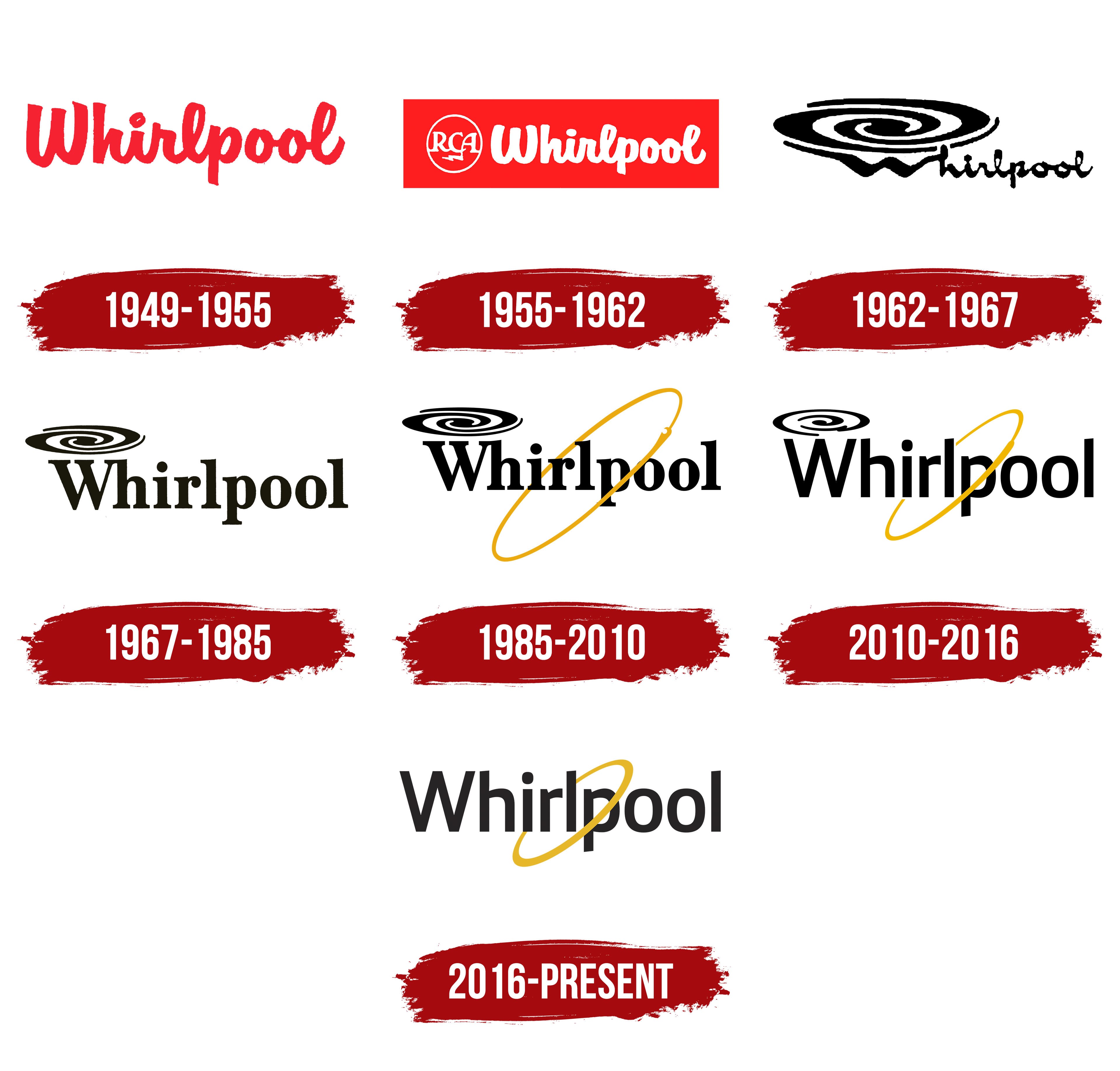
The Whirlpool brand emblems have changed many times, coinciding with the parent company’s identity update. So the only detail by which their logos can be distinguished is the word “CORPORATION.” The trademark is not present, but there is a black inscription “Whirlpool” threaded into a gold ring. The last element symbolizes the manufacturer’s desire to sell only reliable, high-quality household appliances. It is also a sign of innovation, a hint at the expansion of the range and the corporation’s growth. The ring became especially important in 2016 when the swirling pattern above the “W” disappeared.
What is Whirlpool?
Whirlpool is the flagship brand of the American appliance manufacturer Whirlpool Corporation. It is distributed across North and South America, Africa, Asia, Europe, and the Middle East. Its main products are modern kitchen and bathroom equipment.
1949 – 1955

In the 1949 logo, the brand name was dark red. A semi-cohesive handwritten font with slightly careless lines was used for its design. Almost all the letters in the word were connected: the only links missing were between “W” and “h” and between “p” and “o.”
1955 – 1962

After RCA joined the Whirlpool brand, household appliances were sold under the general RCA Whirlpool brand. As a result, a monogram of the letters “R,” “C,” and “A” in a white ring was added to the already existing logo. She was on the left side. One of the “A” diagonals at the bottom turned into lightning, symbolizing the power and reliability of household appliances. The font of the title block was more rounded and smoother than in the previous version. The color changed to white, and the background appeared as a red rectangle.
1962 – 1967

During this period, two versions of the emblem were used, with the word “Whirlpool” rendered in black, flat letters. The font remained cursive, but the style was broadly Arabic. One logo had a circle with the monogram “RCA” on the left. In another design, a black-and-white spiral hovered above the “W,” a whirlpool, a symbol of rotary washing machines.
1967 – 1985

In 1967, the brand name was set in a long, bold, serif style, similar to DSType’s Acta ExtraBold or FontSite Inc.’s Baskerville FS Bold. The word remained black, but the tall letters made it look more impressive. Above the “W” was a spiral, which was reduced in the new version.
1985 – 2010

The designers slightly increased the thickness of the glyphs, causing the upper serifs of the letter “W” and the next “h” to connect into a single line. The font remained the same: geometric serif. The spiral vortex has stayed the same. But around the word “Whirlpool,” a golden ring appeared diagonally. On the one hand, it crossed the “po,” and on the other, it went beyond the “irl.” In front of the ring, just above the “oo,” there was an extension with a hook-shaped notch. The artists wanted to depict a wrench, something usually associated with technology.
2010 – 2016

After the 2010 redesign, the logo became visually cleaner. First, the serifs disappeared from the inscription. The new typeface was similar to the slightly modified Open Sans Semibold currently used in Whirlpool’s official typography. The developers only slightly squeezed the two “o” on the sides and made subtle asymmetrical cuts on the tops of the “h,” “r,” “l,” and “p.”
Second, the swirling swirl above the first “W” has changed. There is white space between the black stripes because they are thinner. Thirdly, the golden ring lost its iconic hook and became smaller in diameter. And its back side was erased so that “irl” would be on a white background, like all the other letters.
2016 – today
The leading brand in small and large home appliances has updated its logo to showcase its continued growth. The black-and-white spiral used since 1962 is no longer above the capital “W.” The gold ring is still slightly smaller than the previous version, and the designers have also balanced it by removing the asymmetrical protrusion. But the word “Whirlpool” remains the same as before, except for muting the color scheme.
Font and Colors
If the whirlwind over the letter “W” could be correlated with the operation of washing machines, then the modern Whirlpool symbol is not tied to any specific household appliance. The main part of the emblem is a golden ring. It represents the brand’s reliability, innovation, and commitment to selling quality products. This is a universal sign associated with the parent company and its flagship brand.
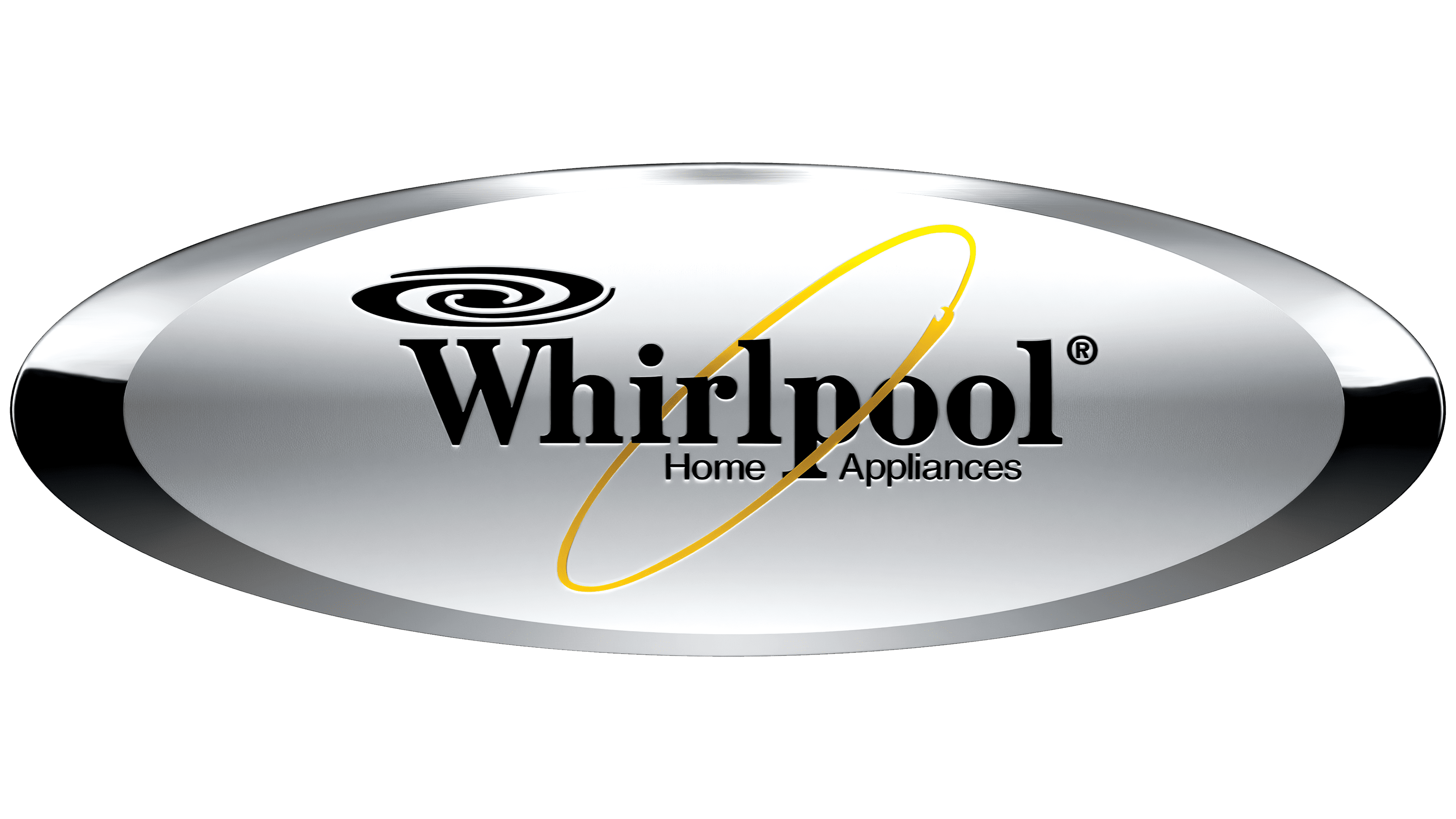
The brand’s name was formerly set in a serif typeface, possibly a mix of Century Schoolbook Condensed and Century Schoolbook Bold, with elements of John Hancock CP. None of the listed options corresponds to the used antiqua by 100%. The word “Whirlpool” in the modern logo is set in sans-serif type. This may be a modification of the Open Sans Semibold corporate font. But the color scheme hasn’t changed in a long time, combining black, white, and gold.