


![]() White Claw Logo PNG
White Claw Logo PNG
The drink splashes in the White Claw logo like it’s in a bottle. The emblem symbolizes abundance, a unique, special taste, and a good mood. A low-alcohol cocktail changes the attitude and gives energy and strength.
White Claw grew from Anthony von Mandl’s second attempt to build a new drinks category. In the 1970s, he sold wine in Canada from a small Vancouver office and even from his car trunk. In 1996, under Mark Anthony Brands, he launched Mike’s Hard Lemonade in Canada, then brought it to the US in 1999, using fermented malt rather than vodka to avoid higher spirit duties.
By the mid-2010s, US drinkers were moving away from beer and sugary cocktails. Sparkling water brands such as LaCroix were already popular, and von Mandl saw room for an alcoholic version. In 2016, Mark Anthony Brands launched White Claw Hard Seltzer, a 5% ABV fermented sugar drink with no gluten, low calories, and natural fruit flavors.
The brand avoided the bright, gender-coded look common in rival drinks. Its white-and-black cans and neutral positioning helped it reach both men and women. Growth was steady until summer 2019, when Trevor Wallace’s viral line “Ain’t no laws when you’re drinking Claws” turned White Claw into a social media fixture.
Sales rose 275% in 2019, and White Claw took more than 60% of the US hard seltzer market, ahead of Truly from Boston Beer Company. Demand caused a national shortage in September. Von Mandl then invested $385 million in plants in Arizona and New Jersey. In 2020, US revenue for Mark Anthony Group passed $4 billion, according to Forbes estimates. White Claw Zero Proof arrived in December 2023. In December 2025, von Mandl handed the CEO role to Phil Rosse while staying chairman.
Meaning and History
![]()
The drink was developed and marketed by a Dublin-based firm that is part of the broader group of the same name. Following the branding, the company informed the innovation center, Bulletproof London, that it has created a calorie-free alcoholic beverage brand for all health-conscious consumers.
Anthony von Mandl offers two ready-to-drink, mild alcoholic beverages: Mike’s Hard Lemonade and White Claw Hard Seltzer. The first was the variant with nine flavors per 100 calories: mango, raspberry, grapefruit, cherry, etc. Then a drink featuring lemon, lime, watermelon, and tangerine was launched (it was commercialized in 2020).
What is White Claw?
This popular American low-alcohol beverage includes sparkling water with natural fruit flavors and added alcohol. The drink’s base is purified carbonated water and a proprietary alcohol formula derived from fermented cane sugar, providing a clean taste without a typical alcoholic aftertaste. The lineup includes black cherry, raspberry, lime, mango, watermelon, and grapefruit. With low calorie and carb content and a 5% alcohol concentration, this drink is especially popular among health-conscious consumers.
Since the brand’s inception in 2016, demand for its products has grown rapidly. As of January 2020, he is the leading supplier of seltzer beverages. In just one year, White Claw’s sales jumped 275 percent.
In general, demand for it is so high that production facilities cannot keep up. However, it was decided to leave a store deficit to fuel interest in the drink. This is the company’s marketing policy. Still, it is not final: the firm is ready to build a plant in Glendale, Arizona, as the biggest shortage is in the United States. The plant will open in the summer of 2020. Later, two more sites will be erected and launched, including one in New Jersey.
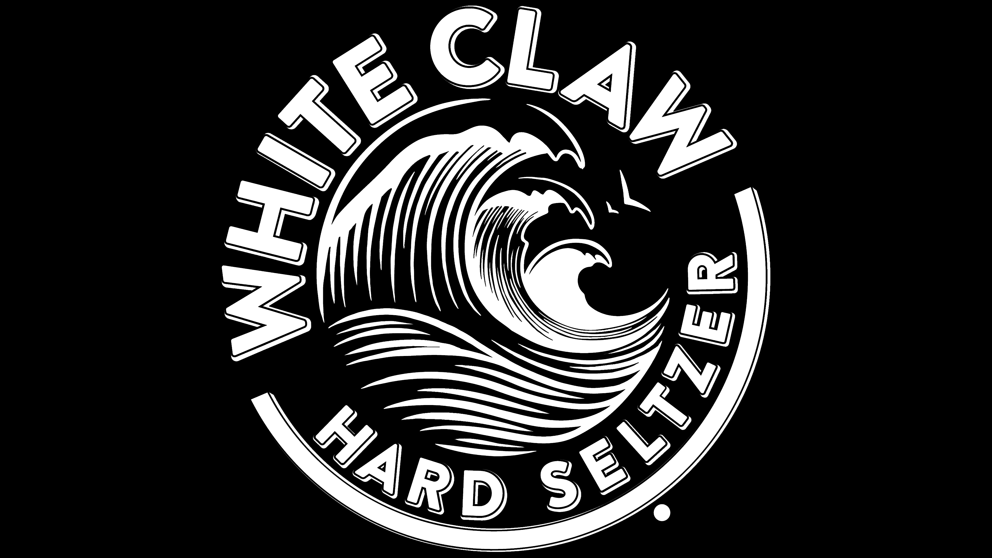
The visual mark of the most sought-after trademark of low-alcohol drinks looks fresh and professional. The round symbol, rendered in monochrome, is associated with freedom, progress, style, and forward movement. It perfectly captures the brand’s spirit and brilliantly conveys its goal of relaxing and catching a wave of fun.
Moreover, since its launch in 2016, the emblem has not changed, as there is no need to redraw it; the sign looks powerful and trendy. It consists of a triple wave formed by smooth, arched lines in black and gray. It also has a word section that replaces the top border and a curved underline at the bottom in the form of a large parenthesis.
The waves are alternating and depicted in a far perspective: a large wave in the foreground and a small wave in the background. Each has short, visible strokes that merge at the bottom. White foam caps are painted on the crest of the waves. To the right of them are two soaring birds.
The top lettering is larger, making the phrase “White Claw” appear more powerful and convincing. The lower text (“Hard Seltzer”), although half the size, exactly repeats the style of the drink’s name. Moreover, the waves have sharp tops resembling the lion’s claws, so a triple-clawed mark on the bank sometimes complements the modern logo. It symbolizes a rebellious spirit. At the same time, strict letters bring balance and confidence.
Font and Colors
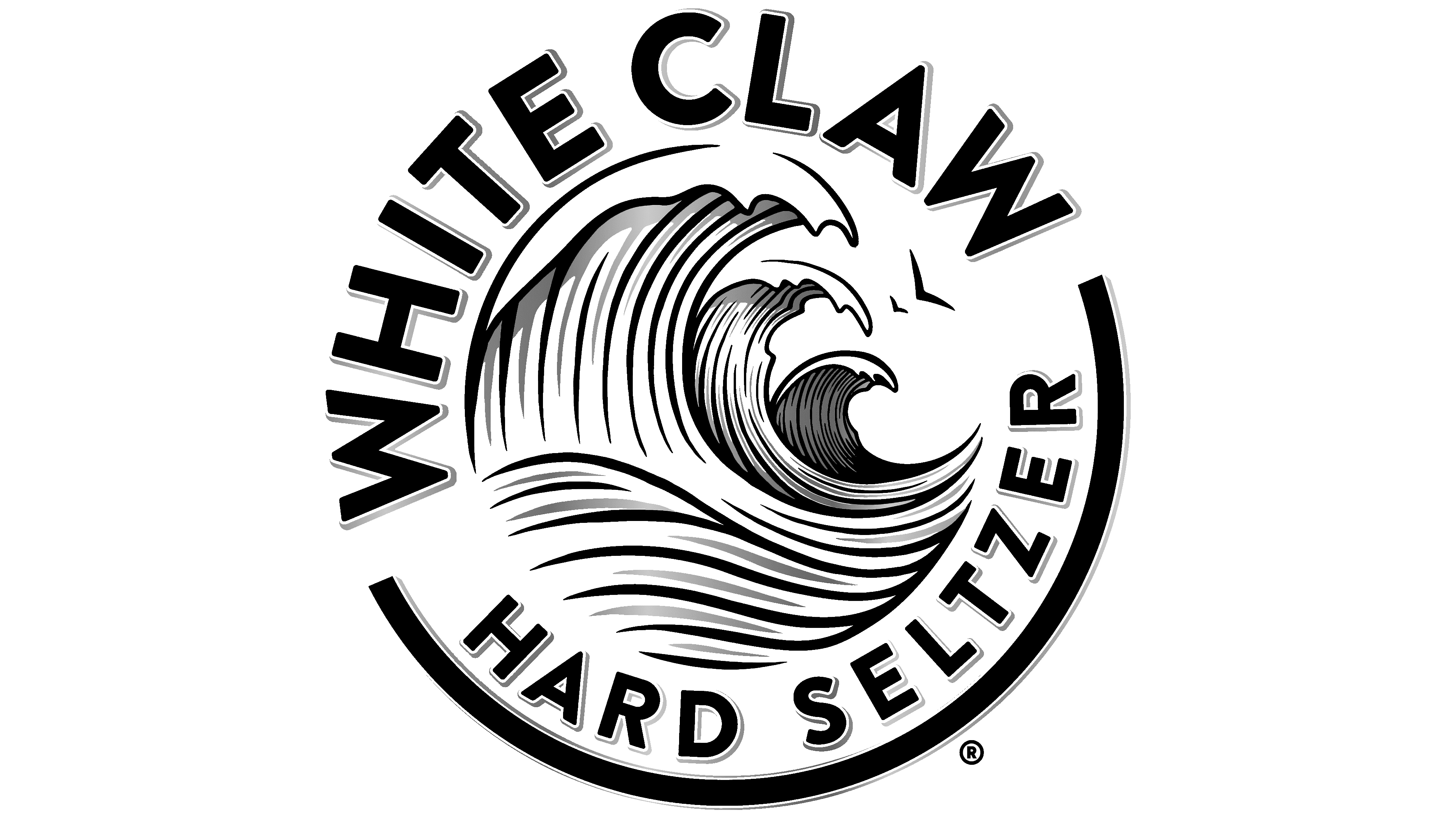
Sharp and hard letters in the White Claw emblem lettering are made in a geometric sans serif typeface, with printed and smooth characters and sharp cuts and light shading on the right. Gray stripes give them a three-dimensional effect. The font is very close to variants such as Gravesend Sans Bold and Garnet Capitals Bold, but with slightly different outlines.
The corporate logo palette is monochrome. It consists of two colors on a white background: black and gray. Despite the absence of bright colors, this combination effectively distinguishes the products, lending them solidity, reputation, and an air of elite status.