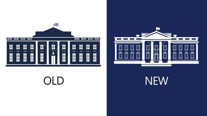
The new site of the residence, a different power – this is not all the changes in America over the past month. The US Presidential Administration has unveiled an updated logo. The new logo was designed by Wide Eye, creative director of the Carahna Magwood residence, and illustrator John Mata. The designers themselves said that they had to make changes 30 times to get the perfect version.
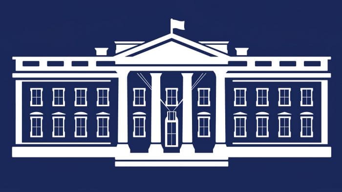
The basic color palette for the White House was used for the logo. The building itself has turned white, while the architectural details have turned dark blue. Another innovation is volume, as opposed to the logo under the Trump administration. When all brands are starting to shift to minimalistic logos with fewer details, the White House emblem refuses to obey them. Even small details have been worked out in the new logo, especially the majestic columns.
The creators said that the logo depicts the north side of the building. It symbolizes openness to the people and conveys the idea that the White House is a place for every American. Initially, the developers planned to display the south side, as it is more picturesque.
Also, the designers have developed special sets of logos that are suitable for different contexts. For example, the oval logo is useful for digital communications, press releases, and the unframed option. You can see the emblem in the form of three text lines with a small image of the facade and just the abbreviation WH in the oval.
Hoefler & Co has developed special font sets for new President Joe Biden: Mercury and Decimal. Mercury with serifs at the ends of the letters is considered more traditional. It is also used on the logo itself.
Even though the logo was not radically altered, users immediately liked it. On social media, they share rave reviews for the rebranding. The new logo and detailed fonts symbolize the combination of perspective, openness to new things together with something traditional and loved.


