The Wideroe logo, light, and soaring, comes to life when one looks at the emblem. The symbol is reminiscent of a paper airplane, a scaled-down version of the seaplanes that the company’s pilots flew. The inscription emphasizes harmony and perfection, showcasing the exceptional skill of the aviators.
Widerøe: Brand overview
In 1934, visionary Viggo Widerøe founded the airline of the same name, marking the beginning of one of Norway’s longest-standing aviation enterprises. Initially focused on seaplanes, Viderøe’s aircraft served as “lifelines,” connecting the isolated coastal areas of Northern Norway and providing cargo and passenger transportation.
With the growing popularity of air travel, Widerøe began a meaningful transition from seaplanes to land-based aircraft. In 1968, the airline introduced the De Havilland Canada Dash-7, the first European airline to use the revolutionary short takeoff and landing (STOL) technology.
By modernizing its fleet, Widerøe remains at the forefront of regional air transport. With 40 Bombardier Dash 8 aircraft, known for their comfort, reliability, and environmental friendliness, and three Embraer E190-E2 aircraft, Widerøe has significantly expanded its capabilities and reach.
Widerøe is characterized by a modern and innovative fleet of aircraft, a commitment to regional connectivity, and an unwavering focus on customer satisfaction. With a rich history of innovation and service, Widerøe is an indispensable component of the Nordic aviation world.
Meaning and History
What is Widerøe?
It is a Norwegian regional airline based in Bodø, Norway. It operates an extensive network of domestic flights throughout Norway and selected international routes to neighboring countries. Known for its service to remote and rural areas, the company connects small communities to major cities. The airline’s fleet consists mainly of turboprop aircraft that are well-suited for short-distance flights and operate in challenging environments.
before 2004
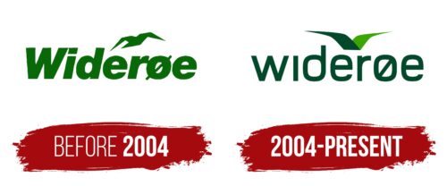
Widerøe, a brand with deep historical roots, used its first logo until 2004, incorporating significant elements highlighting its uniqueness and connection to Norwegian heritage. The brand name on the logo is Norwegian and represents the name of the brand’s founder, Viggo Widerøe. The use of bold font in the name symbolizes reliability and stability, which are particularly important to residents of the fjords who rely on the airline’s regularity and safety.
Above the word “Widerøe,” a bird that resembles a seagull is depicted. This logo element is directly related to the company’s main activity—operating water seaplanes capable of landing on water surfaces. The seagull symbolizes freedom and the ability to reach remote locations, similar to the company’s planes, which provided invaluable assistance in delivering people and goods to Norway’s remote corners.
The choice of green for the logo was deliberate. Green is associated with life and nature, aptly reflecting the role of Widerøe’s seaplanes as “lifelines.” These flights connected remote regions with the central part of the country. They provided vital communication, transporting food, mail, and goods to areas where other forms of transport were inefficient or unavailable.
2004 – today
This Norwegian airline’s logo is green, corresponding to the Scandinavian peninsula’s picturesque forests and meadows. The flying bird on the logo is made in two shades: dark and lighter, grassy green. The pointed wings are reminiscent of a bird and reference flying machines. Below this image is the word “widerøe,” which is large but has lowercase letters. The word “ø” has a characteristic diagonal slash. The font has no serifs, which makes the emblem look clear at any scale.
The airline’s green color reflects natural landscapes and shows its commitment to environmental sustainability. The bird’s pointed wings serve a dual purpose, appealing to nature lovers and those interested in aviation. The choice of a sans-serif font ensures readability and modernity, emphasizing the airline’s commitment to providing a user-friendly experience.


