The Wizz Air logo represents a unique perspective on the world. The company aims to see familiar things in a new way and to offer passengers a different approach. The emblem promises to color the world with new hues for those who decide to come aboard.
Wizzair (Wizz Air): Brand overview
Wizz Air was launched in September 2003. It was conceived by a group of investors led by József Váradi, the former CEO of Hungary’s national carrier, Malév. Although the airline was officially registered in London, its central operations were established in Budapest.
The airline’s first commercial flight took off on May 19, 2004, flying from Katowice to London Luton. This launch coincided with Hungary and Poland joining the European Union, opening new opportunities for low-cost travel across the region.
From the outset, the company targeted Central and Eastern Europe, aiming to provide affordable flights connecting these regions with Western Europe. The brand rapidly expanded its route network, establishing new bases in various countries.
In 2005, the aviation operator set up its first base outside Hungary in Katowice, Poland, marking a significant step in its expansion within the Polish market.
Operations in Bulgaria and Romania commenced in 2006, aligning with these countries’ accession to the European Union.
A milestone was reached in 2007 when the airline took delivery of its first brand-new Airbus A320 directly from the manufacturer, having previously operated only second-hand aircraft.
By 2009, the company had transported its ten millionth passenger and opened a new base in Prague, Czech Republic.
In 2011, the brand established a subsidiary in Ukraine, based in Kyiv, although this was discontinued in 2015 due to political instability in the region.
2013 marked the opening of the company’s first base in Western Europe, located at London Luton Airport.
In February 2015, the aviation firm went public with an initial public offering (IPO) on the London Stock Exchange, transitioning into a publicly traded company.
The airliner received its first Airbus A321 in 2016, allowing for increased passenger capacity on popular routes.
In 2018, the brand established Wizz Air UK, a subsidiary based in the United Kingdom, to secure its operations post-Brexit.
The year 2019 was a record-breaker, with the airline transporting over 39 million passengers and expanding its fleet to over 120 aircraft.
Throughout its history, the company has adhered to an ultra-low-cost carrier model, offering extremely low base fares and charging for additional services.
The airline is renowned for its efficient operational model and some of the lowest cost structures in the industry. Its lively magenta color scheme and unique Aeron cabin crew uniforms, designed by fashion icon Vivienne Westwood, make it easily recognizable.
By 2020, the aviation firm had grown into one of Europe’s largest budget airlines, serving over 150 destinations across 44 countries.
Meaning and History
What is Wizzair (Wizz Air)?
This Hungarian low-cost airline based in Budapest is known for its aggressive expansion strategy and innovative business model. The company operates one of the youngest fleets in Europe, consisting exclusively of Airbus A320 and A321 aircraft, ensuring high fuel efficiency. The carrier is renowned for its extensive route network, connecting Central and Eastern Europe with Western Europe and the Middle East. It stands out for its Wizz Discount Club program, offering exclusive discounts for frequent flyers.
2003 – 2015
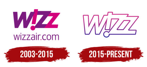
From 2003 to 2015, known as Wizz Air, the airline reflected its dynamism and youthfulness through the design of its logo. The bright and cheerful logo highlighted the company’s energy, creating a pleasant mood among passengers. A unique design element is an inverted letter “i” turned into an exclamation mark, serving as a visual highlight and emphasizing the company’s spirited and optimistic spirit.
This design feature enhances the sense of fun and enthusiasm the company aims to convey to its clients. This positive approach reflects Wizz Air’s overall philosophy and helps passengers feel more at ease and joyful during their travels.
The company’s website address is also placed under the brand name on the logo. This detail facilitates passenger convenience by encouraging them to book tickets on the website immediately. This enhances the user experience and boosts ticket sales by providing easy access to essential information and services.
2015 – today
The logo used by the specified company stands out due to its distinctive design featuring transparent letters with multicolored outlines. This design creates a sense of lightness and airiness, directly relating to the concept of flying and emphasizing the airline’s primary business area. The multicolored outlines capture attention and give each character a distinct emphasis, enhancing the overall brightness and memorability of the logo.
The logo design includes another crucial element: all the letters are connected. This design symbolizes the cohesion of the team and the unity of corporate values. It illustrates that each team member is intricately linked with the others, working together to deliver high-level service on all flights. The interconnected elements in the logo mirror the organization and integrity of the company, fostering passenger trust and confidence in the quality of the services provided.
The transparent letters with multicolored outlines create a visually appealing effect that resonates with the concept of air travel. The design ensures that the logo is eye-catching and reinforces the idea of lightness associated with flying. Various colors in the outlines add vibrancy and make the logo stand out in a crowded market, making it easily recognizable and memorable.
The connection of all the letters in the logo is a deliberate design that conveys a sense of unity and teamwork. This symbolizes the strong bonds among the team members and their collective effort to provide exceptional service. The interconnected letters represent the airline’s commitment to maintaining high standards and delivering a seamless travel experience. This aspect of the logo reflects the company’s organizational strength and dedication to its passengers.


