


![]() Xbox Logo PNG
Xbox Logo PNG
An entire virtual world lies behind the emblem. The real treasures are hidden inside the service. The Xbox logo shows how the magic console opens up for users, revealing an endless stream of interesting video games.
Xbox emerged from Microsoft in 1998 as a response to Sony’s PlayStation 2 strategy. The idea came from DirectX engineers who built a prototype using PC components and proposed a console based on Windows architecture. The project, codenamed Midway, gained approval from Bill Gates. Despite internal resistance to the name, Xbox was retained after focus group testing. The console was unveiled at CES in January 2001.
Xbox launched on November 15, 2001, priced at $299. Microsoft sold hardware at a loss of around $125 per unit, relying on software sales to offset costs. A key move was the acquisition of Bungie in 2000. Halo: Combat Evolved became the launch title and proved that first-person shooters could work on consoles. By the end of 2001, it had sold 1.5 million copies.
In November 2002, Xbox Live introduced paid online gaming, with features absent from the Nintendo and PlayStation ecosystems. Halo 2 set online records in 2004.
Xbox 360 launched in 2005, ahead of the PlayStation 3, and reached 84 million units by 2015. It was affected by the “red ring of death” defect, costing Microsoft about $1.15 billion in repairs. Xbox One was released in 2013 with controversial policies that were later reversed. Sony gained a market advantage with PlayStation 4. In 2020, Xbox Series X and S launched alongside the Game Pass model. In 2021, Microsoft announced the acquisition of Activision Blizzard for $68.7 billion, which was completed in 2023.
Meaning and History
![]()
The debut logo bore the word “XBOX” and a shining 3D X-shaped star next to it. But before that, another option is to set the style of the future emblem. In general, the brand’s trademark has gone through nine stages of evolution.
1999, before the project’s official launch, the developers created a logo with the lowercase inscription “Xbox.” The logo has thin geometric letters reminiscent of an electronic, robotic style. The top of the leg “b” is bent to the right, the lower-left corner “o” is lengthened, and the upper right corner is cut off. This design set the direction for all subsequent versions of the logo.
The final version of the branding was approved in 2001. The prefix’s name is written in classic capital letters with an accent on “B,” where the middle transverse line is originally played. A four-pointed star appeared on the left, resembling an “X.” In the 2005 version, the developers lengthened the center bar of the letter “B,” enlarged the word, and placed the “X” on a dark gray ball. In 2010, they replaced it with a silver one.
This was followed by the same emblem type, transforming the elements’ colors, arrangement, and volume. These versions refer to 2012, 2013, and 2019 and are still used on game consoles. A jubilee logo was also created for the 15th anniversary. It is based on the 2012 logo and features a green Metro ball with white stripes. Also, it has a cyber heart labeled “15 years.”
What is Xbox?
Xbox is an American brand founded by Microsoft Corporation to produce eponymous gaming consoles. It was introduced in 2001 along with their launch. The series includes five gaming consoles, a streaming service, a game development division, and several online resources.
1999 – 2001
![]()
The debut logo was dominated by “X.” It effectively framed the word “XBOX,” which was set in a “digital” typeface. That is, the letters looked like numbers on an electronic scoreboard. The characters were thin and slightly italic, tilted to the right. “B” and “O” had unusual shapes: the first was perceived as the number “6”, and the second resembled the contour of a tree leaf. They had one corner cut off, one sharpened, and the rest rounded.
2001 – 2005
![]()
During this period, the emblem was changed in a more understandable direction. The name was read clearly and accompanied by a graphic sign in the form of a four-pointed star with sharp rays diverging in different directions. It resembled a 3D letter “X” with a gradient. The lettering took on a different style, though it remained “robotic,” with an emphasis on the capital “B.” At the same time, “O” and “B” were like kegs.
2005 – 2010
![]()
The company continued to use the electronic style of the letters, but they were already twice the size of the previous ones. The designers moved the “X” to a gray ball with a light middle, so the symbol is not perceived as a sign of striking out (prohibition). The developers made it around the base, harmoniously bending the ends. They used a green gradient to color the main graphic.
2010 – 2013
![]()
In this version, the colors were an order of magnitude lighter than in the previous version, both gray and green. But the inscription remained the same as the previous one.
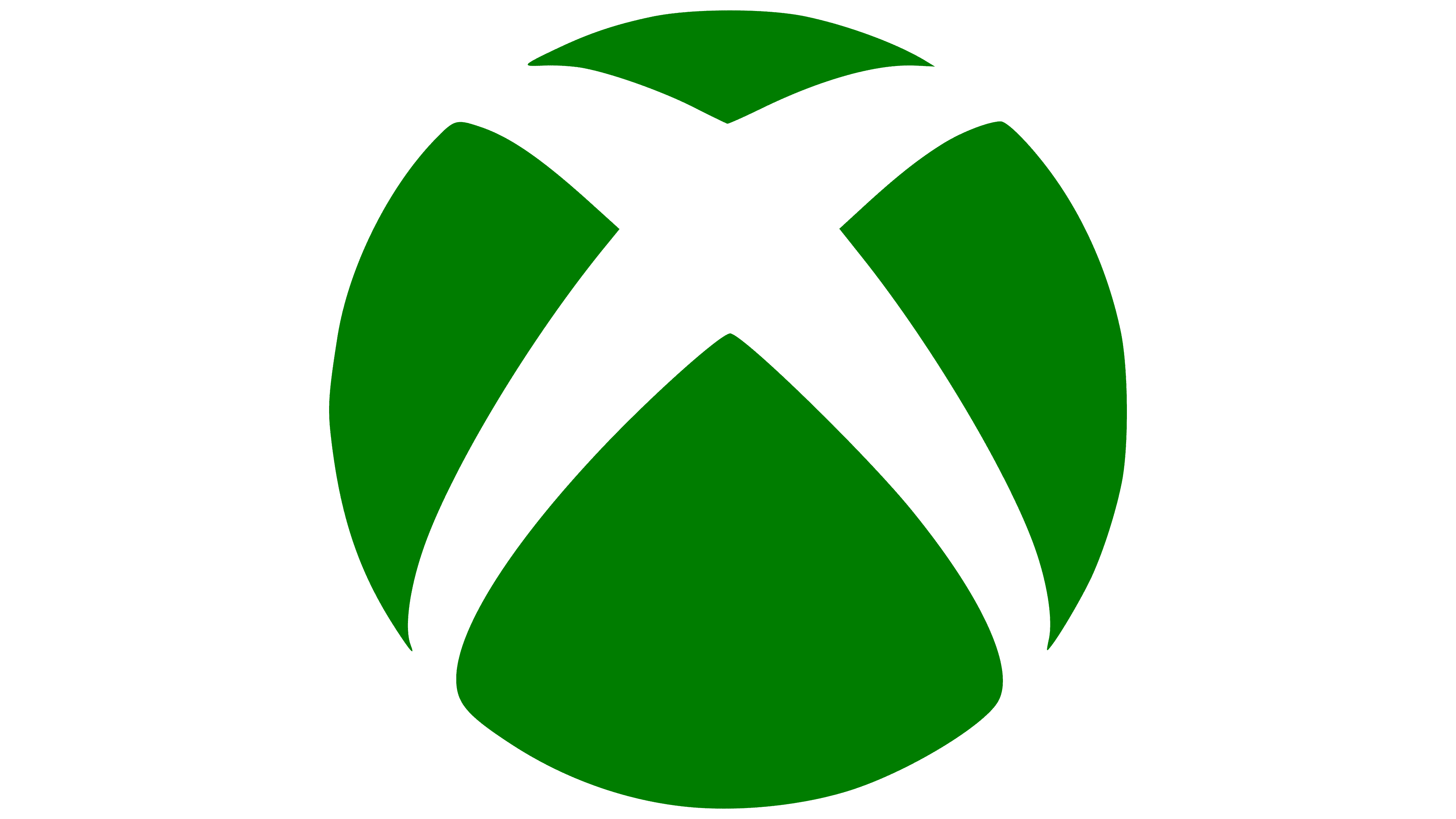
2012 – today
![]()
The logo, approved in 2012, is still in use today. It is a 2D version with flat graphics. The designers repainted the ball dark green and made it an almost solid fill, against which the letter “X” with curved ends emerges from the negative space. Apart from the color, nothing has been changed in the inscription, so the middle crossbar “B” protrudes slightly backward.
2013 – today
![]()
An emblem featuring a three-dimensional “X” mark is used in parallel. The drawing was taken from the 2001-2005 logo, which is visible in the characteristic center with a gradient. In this version, the inscription and the icon do not match in color: the word “XBOX” is dark green, and the letter “X” is light green on a gray background.
2019 – today
![]()
Another relevant emblem is monochrome, featuring the classic black-and-white combination. The shape and size of the main elements are completely preserved. The only difference is the strict black-and-white palette and flat design. Despite the similarity, the inscription in this logo is located not to the right of the round icon but below it.
Font and Colors
The current version is a black monochrome sign. Above the brand name, a large ball with white diagonally intersecting stripes is located. An updated version was released in 2019 alongside the Xbox Series X console.
The manufacturer puts a fairly simple meaning into a trademark. After all, his task is to present a product that attracts adolescents and young people, the main users of video games and consoles. The generation’s name is organically encrypted with the repeating letter “X,” which symbolizes the highest-secret stamp.
The text part is equivalent to the graphic, so much attention was paid to it. The lettering has evolved from digital geometric characters to a custom typeface called X360.
The logo palette has always been associated with neon green. It was created thanks to Horace Luke, one of the authors of the corporate logo. According to the second developer, Seamus Blackley, in the hand-drawn version, the designer had only a green neon felt-tip pen at his fingertips, so there was no other choice. This version was approved. Later, black, white, and shades of gray were added.