


![]() Xbox One Logo PNG
Xbox One Logo PNG
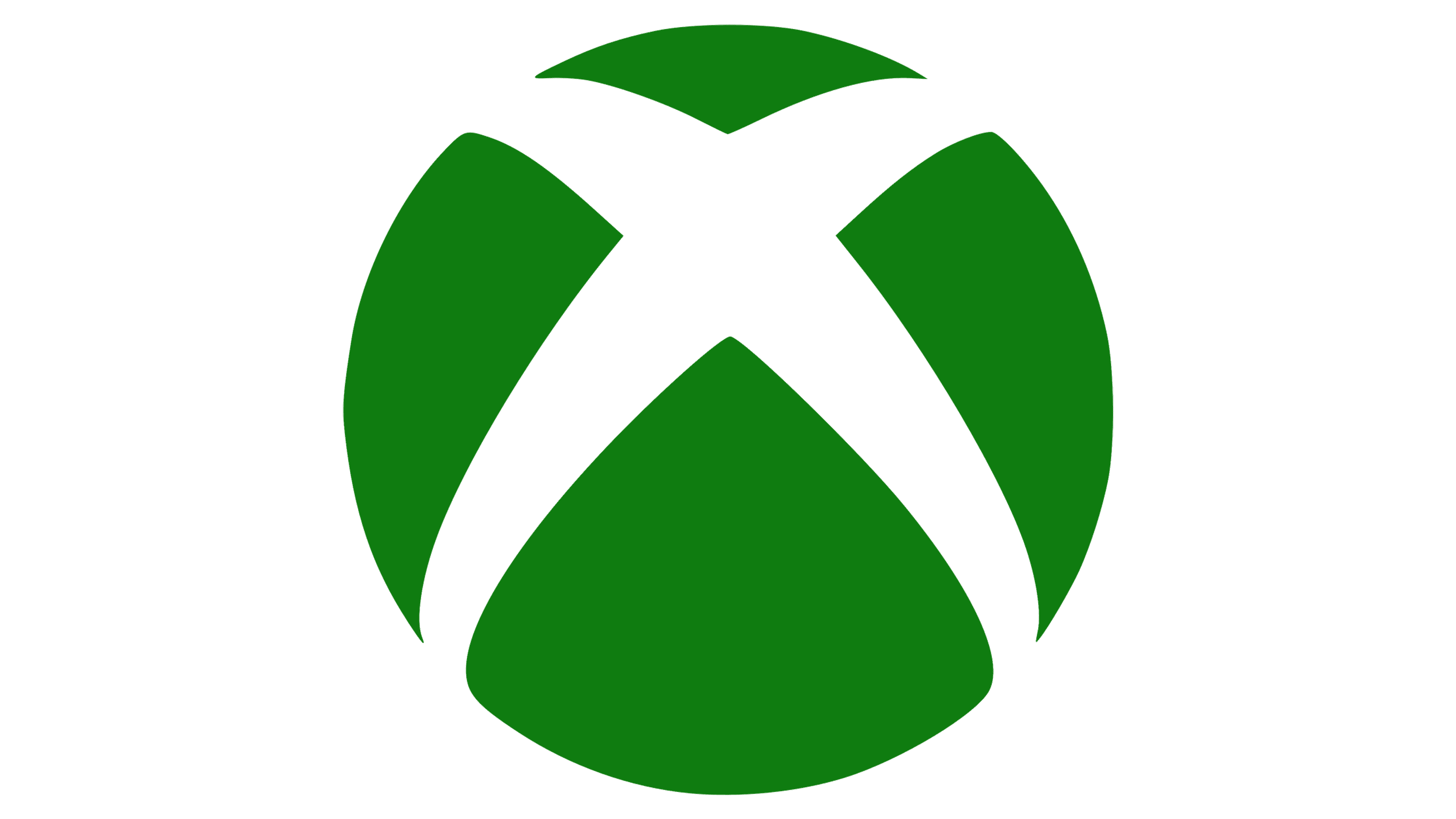
The Xbox One logo conveys the console’s name and symbolizes the intersection of the two worlds: digital and real. In addition, it reflects Microsoft’s modern, technological, and innovative approach to developing eighth-generation gaming platforms.
Xbox One was Microsoft’s third home console, following the 2001 Xbox and the 2005 Xbox 360. By early 2013, press reports about mandatory online checks and limits on used games had already worried players, partly because EA’s SimCity had recently suffered a failed launch tied to online activation.
Microsoft presented the console on May 21, 2013, at its Redmond campus. Don Mattrick positioned Xbox One as a home entertainment hub, with cable TV, sports, and Kinect voice control taking much of the reveal before games appeared. Daily internet verification, used-game restrictions, and mandatory Kinect drew heavy criticism. Mattrick’s reply that users without reliable internet could use Xbox 360 made the backlash worse.
At E3 in June 2013, Sony sharpened the contrast. PlayStation 4 was announced at $399, while Xbox One launched at $499, and Sony stressed support for used games and offline play. Microsoft reversed course later that month, removing daily online checks and used-game limits. The press nicknamed the reversal “Xbox 180.”
Xbox One launched on November 22, 2013. Mattrick left for Zynga before retail release, and Phil Spencer took over Xbox in March 2014. Microsoft then sold the console without Kinect for $399 and shifted focus toward games and services. Later models included the Xbox One S in 2016, the Xbox One X in 2017, and the Xbox One S All-Digital Edition in 2019. After more than 58 million units shipped, Microsoft ended the line in 2020 with the arrival of the Xbox Series X and Xbox Series S.
Meaning and History
![]()
The design of the Xbox One console is simple and minimalist. It fits exactly into the concept of a “box” (box), where everything is hidden under the outer shell. Only the luminous logo stands out, which indicates that the device is connected to the mains. For its visual identity, the game console manufacturer has chosen a tennis ball as its icon. It is complemented by an inscription composed of the series’ name with geometric letters. They are located on the front of the case. The same option is used in marketing, advertising, and technical documentation.
The text logo consists of a two-part inscription: “Xbox” and “One.” Both parts are aligned on one line and share the same strict style. The first word is colored in the signature green, so it does not merge with the other half. The characters are bold, with smooth lines, in uppercase. The central stroke of the “B” is turned left and moved out of the vertical strip, which makes the letter look original. Its end is cut diagonally and pointed downward. Neighboring glyphs are simple and smooth.
What is Xbox One?
The Xbox One is a personal video game console created by Microsoft and manufactured by Flextronics and Foxconn. It is the third model in the Xbox series. Its release date is 2013.
The second element of the compound name is set in a similar geometric, even font, with capital characters. Although outwardly resembling the first typeface, it is not identical. This is a completely different typeface. The inscription is strict and grotesque, highlighted in gray.
Font and Colors
For the Xbox One wordmark, the designers chose a custom typeface. The first part of the name is in X360 font; the second part is in Segoe UI. There are similar analogs: Rutan Regular (developer: The Northern Block) and Supra Mezzo Light (author: Wiescher-Design). Characteristic features of the inscription are elongated middle stripes and right angles at the ends of the letters. The logo’s color scheme is standard: dark green (#107e3c) and gray (#6b6b6b).