The Xerox logo is the word “Xerox” written in red in a simple and concise font. The logo reflects the company’s innovative and technological approach, always striving to stay ahead of its competitors in the industry. Although the Xerox emblem has undergone significant changes over the years, it remains a strong brand symbol and reflects its values and quality.
Xerox: Brand overview
| Founded: | April 18, 1906 |
| Founder: | Joseph C. Wilson, Chester Carlson |
| Headquarters: | Norwalk, Connecticut, U.S |
| Website: | xerox.com |
Xerox is an American corporation that develops document solutions. It has more than $7 billion in revenues. Xerox logo can be seen on printers and copiers sold in 160 countries.
Xerox was the first company that acquires a license to create machines for the newest method of xerography. The decision subsequently brought it worldwide fame. The history of the future giant began in the city of Rochester in 1906 when the entrepreneur Joseph Wilson opened the firm Haloid, which produced copy paper.
Meaning and History
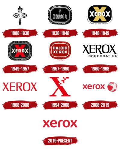
At the beginning of the last century, the American corporation Xerox was known as Haloid and was engaged in producing paper for professional photographers. It launched its first photocopier in 1949, which was reflected in its future identity. The technology used was called Xerography, and the product was called Haloid Xerox 14. The resounding success of the invention led to “xerox” becoming a household name. The company was renamed after the new popular device and received corresponding visual symbols. In the early 1960s, the word “Haloid” on the brand logo was finally replaced by “Xerox.” The “X” trademark appeared a little later, splitting into pixel dots. It symbolizes the thin line between digital and paper documents.
As the company evolved and expanded its range, it needed a new logo that wasn’t just associated with copiers. To get away from the stereotype, the office equipment and paper maker converted the lettering to lowercase. They added a sphere of lines forming the stylized letter “X.” This logo embodied the connection of the American corporation with its customers and progressive technology.
What is Xerox?
World famous American corporation in office equipment owns 8.5 thousand patents in this area. It makes printers, copiers, fax machines, computers, and military equipment.
1906 – 1938
The first logo was in the form of a torch with an oval plaque with the company’s name attached to it.
The burning torch is a symbol of superiority. The founder prophesied the company to be a leader. This was very cocky, considering that before the end of World War II, 90% of this business in the city was owned by Kodak.
The fire on top was also the embodiment of light, which is important for the light-sensitive paper to work.
The word Haloid placed in the oval translates as haloid or halogen. The photographic paper of the time was halogen-silver. Its main layer with photo emulsion was based on compounds of halogens (chlorine, bromine, iodine) with silver.
1938 – 1948
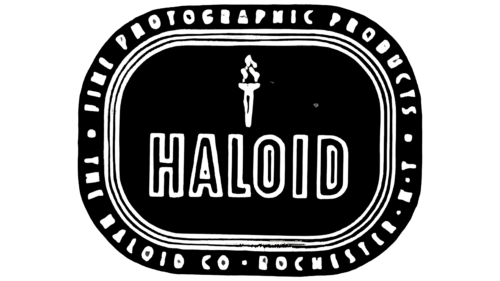
The logo changed its shape. It now resembled a sheet of paper with rounded corners. The black background and white lettering associated the logo with the black and white photo, the paper for which the firm produced. In the center was the word Haloid with a torch. The image of fire showed the light transforming ordinary paper into a photograph.
On the logo’s outline are clarifying inscriptions with the name of the company, its location, and the name of the products it produces.
1948 – 1949
Beginning in 1947, the company became involved in the issue of electrography because its major customers of photographic paper were interested in this new method. Haloid bought the patent for the machine, which was decisive for its fate.
Promoting the new direction led to an updated logo. The ’48 visual sign was the first to emphasize the copying method, pushing aside the company name.
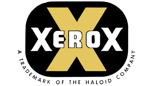
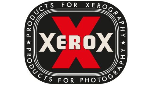
On a black square background with rounded corners was a large letter X, on top of which was written the word Xerox.
The word Xerox is the new name for copying technology. Originally, the method of transferring the lettering to another sheet of paper was called electrography. However, it seemed too “abstruse” to the owner of Haloid. The name was changed to a more resounding Greek combination of xerography (xeros – dry and grapho – to write). And later, it was shortened to xerox.
The black color alludes to the black paint used to transfer the image. And the white color of the lettering indicated white paper. Using a capital X at the beginning and end of the word indicated that the image was being transferred from one sheet of paper to another, creating two identical copies.
The decision to change the logo in this way was a risky one. No Haloid installation had yet seen the light of day, and the method was little known or in demand. However, Wilsony had nothing to lose; the firm was on the verge of bankruptcy.
1949 – 1957
The company completely returned to the image of the logo of 1938, only in the center of the background placed the word Xerox. This was necessary because customers did not understand the new name, and to link Xerox and Haloid, the logo returned the clarifying lettering on the image’s outline.
1957 – 1960
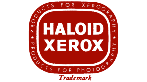
A clearer, more legible logo and a new name, Haloid Xerox, were proposed to strengthen the connection between Haloid and its products.
The logo’s background was changed to red, representing innovation, invention, and a good deal.
In the center, the two names were placed in large letters: Haloid and Xerox. And along the border, they said that the company offered products for photocopying and photography.
1960 – 1968
The method of xerography became widely known. So in 1959, the company changed its name to Xerox Corporation. The progressive New York consulting company Lippincott & Margulies created a new logo on this occasion.
It proposed a fully graphic visual sign with a large Xerox lettering and a small Corporation. All left-slanting elements (the X halves and the R foot) were elongated with the original serif. They showed the path of the paper through the machine.
1968 – 2008
The company was on its feet, making huge profits ($500 million). The big wins were celebrated with a new visual sign designed by the famous specialist of the time Tom Geismar, founder of Brownjohn, Chermayeff & Geismar.
The designer did not propose any global changes. The former inscription changed to a more stable font and acquired a red color – a symbol of achievements, profits, leadership, and victories.
1994 – 2008
Along with the current logo, an additional mark was used in the form of a large letter X, representing the company’s name, which has the upper part of one of the legs made of red mosaic. It looked as if it had turned into many sprawling copies.
2008 – 2019
The rebranding of 2008 was entrusted to the famous company Interbrand. It proposed a visual sign consisting of an image and an inscription.
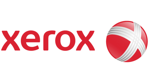
The Xerox name was written in lowercase with softly rounded letters and smoothed corners. The smooth curves of the X elements look like mirror images of each other. They hint at the process of copying.
The image is a ball wrapped around two printers’ ink stubs. They form the letter X on the front side. The ball represents the Earth. The channels of the plumes carry different inks for printing. The image shows that the company’s technology and machines are distributed worldwide. The company is well-known. Everyone uses printouts and photocopies.
The connecting lines on the balloon, as conceived by Interbrand, also showed the connections between the company and its customers, employees, and partners, who are scattered around the globe.
2019 – today
In 2019, there was a reorganization into a holding company, and Xerox became a subsidiary of the holding company. Because of this, the visual sign was changed, simplifying it. The globe was removed, leaving only the Xerox inscription. The company no longer associates itself only with copying equipment. Among its products are computers, scanners, and paper.
Font and Colors
In creating the Xerox logo, the designers reflected in it the modern way of thinking of the company and its constant desire for development and innovation. The resulting sign symbolizes the technological approach to manufacturing copiers and other office equipment. It embodies the energy and strength that the manufacturer puts into developing new products.
The main color of the logo is red. It shows a leader, a winner, and an innovator. The company is actively developing, reaching new heights, is the “engine” of its industry, and constantly developing new solutions.
The font used in the logo is created and named after the company: Xerox Sans.
Xerox color codes
| Medium Candy Apple Red | Hex color: | #d92231 |
|---|---|---|
| RGB: | 217 34 49 | |
| CMYK: | 0 84 77 15 | |
| Pantone: | PMS 185 C |
