The Xfinity logo offers access to a vibrant virtual world. The alluring light of the monitor emanates from the emblem, and the life behind it seems brighter and richer. The symbol promises to satisfy customers and deliver the most interesting content to them.
Xfinity: Brand overview
| Founded: | April 2, 1981 |
| Headquarters: | Philadelphia, Pennsylvania, U.S. |
| Website: | xfinity.com |
Meaning and History
Comcast Cable Communications has been in the communications market since 1981. It is a cult company when it comes to the US market. Thanks to its services, the residents began getting access to the Internet in 1990. The company is not fixated exclusively on the broadcasting of national channels. Its main emphasis is on broadcasting sports channels, and it is the exclusive broadcaster of the Olympic Games.
Considering the market trends that have been taking place in the new millennium, in 2010, the company decided to use the Xfinity trademark for its Internet and Television-related services.
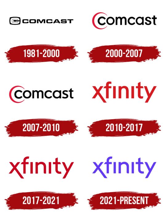
Altogether, since 1981 the company has changed its logo four times. Still, considering the scale of distribution of Xfinity services, the brand’s visual recognition was at a high level at all stages. The first three logos were issued under the Comcast brand name, and later Xfinity was used.
What is Xfinity?
First and foremost, millions of users worldwide can have television services and access to the global Internet.
1981 – 2000
The first version of the logo appeared in 1981. It depicted the company name as well as the emblem. A classic bold, sans serif font was used for the lettering. All letters were made in black.
A black and white color scheme was chosen for the emblem. A black square with rounded corners showed two C’s, one inside the other. Despite the simplicity of the logo, at the time, it looked modern and appealed to the target audience.
2000 – 2010
The first major redesign took place in 2000 for a word inscription, used lower case letters in a classic bold font without serifs. The color also remained black, but the rounded corners in the letters gave the logo a modern twist. The emblem was removed. Instead, an arched line was created, repeating the first “C” but in red.
Minimal changes were made to this version in 2007. And they were concerned only with the style of spelling of the last letter in the name “Comcast.”
2010 – 2017
At this point, television and Internet-related services began to be offered under the “Xfinity” brand name. Almost immediately, the logo was introduced. Thanks to the use of red, it looked modern and graceful, immediately attracting users’ attention to the inscription on the words, using a classic sans serif font. All the letters in the name were lowercase, but the most interesting were the letters “X” and “Y,” which had significantly elongated corners. All of the letters in the name were in thick stripes. In addition, both “i” letters lacked a dot at the top.
2017 – 2021
The 2017 redesign brought only minimal changes to the style of the lettering. The lines in the letters became thinner. In addition, the outlines became more pronounced and vibrant. The main emphasis in this variation of the logo was on color. The dark red color allowed the company’s name to stand out from the competition, indicating its ambition and constant development.
2021 – today
The last logo update to date took place in 2021. The only change was in the color palette. As a result, the color red was changed to bright purple. It communicates the company’s focus, its mission, and the services it offers to its customers.
Font and Colors
The lettering in the Xfinity logo is done in a stylish and modern sans serif font. It is closest to Merrant Regular and Neue Radial Book. If we talk about the differences, it is the absence of dots over the “i” and the elongated stripes in the first and last letters. Thus, the logo font is unique and special for this company.
If previously the main color was red, then today, a bright purple color is used, which gives the logo a technological feel. Many people associate purple with creativity and wisdom. It looks more confident when it comes to Xfinity’s field of work.
Xfinity color codes
| Han Purple | Hex color: | #6138f6 |
|---|---|---|
| RGB: | 97 56 246 | |
| CMYK: | 61 77 0 4 | |
| Pantone: | PMS Violet C |


