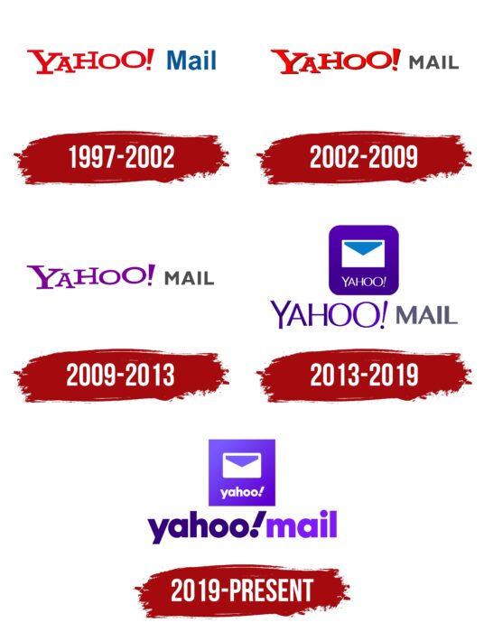
The Yahoo Mail logo resembles a regular mailbox, which makes the service intuitive for most users. The emblem is designed to increase trust through a well-known and popular name of the service developer.
Yahoo Mail: Brand overview
| Founded: | October 8, 1997 |
| Founder: | Yahoo Inc. |
| Headquarters: | United States |
| Website: | mail.yahoo.com |
Meaning and History
The first version of the Yahoo Mail service logo was introduced in 1997 and updated four times since then. Overall, the changes have been minimal, as the project management has managed to choose a spectacular style to increase visual brand recognition.
What is Yahoo Mail?
First and foremost, it is an email service designed to serve Yahoo customers. Thanks to state-of-the-art encryption protocols, users don’t have to worry about having any problems in the process.
1997 – 2002
As in subsequent updates, the first version of the service logo had a fairly simple composition. It consisted solely of the name Yahoo Mail. Sometimes, additionally, the logo had an emblem depicting a mail envelope or box. The word “Yahoo” was in bold serif red font. Even though all the symbols were horizontal, they were not on the same line. This way, the feeling of “jumping capital letters” was created. This effect was supposed to evoke positive emotions in users. In turn, “Mail” was portrayed in a more relaxed way. For this word, a narrowed font without serifs was used. All characters in this word are in blue.
2002 – 2009
Various graphic elements were not used together with the logo at this stage. The appearance was changed by improving the quality of the letters. The word “Yahoo” has a subtle shadow that creates a feeling of a three-dimensional inscription. The bright red color looked more effective than the previous variation. In turn, “Mail” was done in a classic bold font using lowercase letters. The main color was dark gray. As a result, it was felt that the word “Yahoo” dominates the prefix; that is, the company wished that the name of its brand would be the first to catch the eye of the customer.
2009 – 2013
The logo redesign introduced in 2009 made the first significant changes. It is primarily about the color palette. If “mail” completely repeated the style of the previous logo, the main word “Yahoo” became bright purple. This version came to the customer site, and therefore, in the future, this color palette was taken as the basis. Rich purple in the word conveyed the wisdom and promise of the project, its customer focus. In this case, the style of writing the word “Yahoo” was completely identical to the classic version of 2002. That is, the bulkiness of the image was removed. A white envelope was used as the icon for the mobile app.
2013 – 2019
It was decided to return to the variant using volumetric letters in the word “Yahoo.” Also, the writing style changed significantly. All of the letters became more constricted and the outlines less clear. A gradient of purple allowed the letters in the company’s name to shimmer with each other. As a result, users loved the unusual and attractive logo, and so it was actively used for the next six years. The font in this inscription stood out for its thin and straight lines, and its split ends. “Mail,” on the other hand, remained identical to the previous version, but became much larger in size, only slightly inferior to “Yahoo.”
2019 – today
The 2019 redesign concerned, for the most part, the font of the logo. In turn, both words in the brand name were now written using purple. “Yahoo!” had a darker shade, while a lighter tone was chosen for “mail.” As a result, users got bold lowercase lettering, especially where the “!” sign stood out. It leaned slightly toward the person looking at it. The bold sans serif font using lower case letters seemed more friendly to Yahoo Mail customers. The same white mail envelope was used as the icon for the mobile versions, with the company name underneath.
Font and Colors
The font style in the title “Yahoo! mail” has changed with every logo update. The presented inscription is made in a classic bold font with rounded corners and lowercase letters in the latest variation.
The color palette gradually changed from red-gray to purple. Purple has become the dominant color and has been used by the email service since 2009. Playing with shades and using a gradient add positive. It is pleasant to look at the logo because it visually attracts both active and potential site users.
Yahoo Mail color codes
| Persian Indigo | Hex color: | #35007d |
|---|---|---|
| RGB: | 53 0 125 | |
| CMYK: | 58 100 0 51 | |
| Pantone: | PMS Medium Purple C |
| Violet | Hex color: | #7f19ff |
|---|---|---|
| RGB: | 127 25 255 | |
| CMYK: | 50 90 0 0 | |
| Pantone: | PMS Violet C |
