The emblem conveys the outstanding speed of food preparation and delivery. From the Zomato logo, the steam of hot, freshly removed dishes rises from the stove. The symbols show the work’s clarity and coherence, which inspires customers’ trust.
Zomato: Brand overview
| Founded: | July 2008 |
| Founder: | Deepinder Goyal, Pankaj Chaddah |
| Headquarters: | Gurgaon, Haryana, India |
| Website: | zomato.com |
Meaning and History
The key objective of this service is to help the population get the food they want. Therefore, the site leveraged internet technology, linking those who cook with those who eat. That is, she quickly and confidently declared her presence around the world, highlighting herself with a catchy and bright logo.
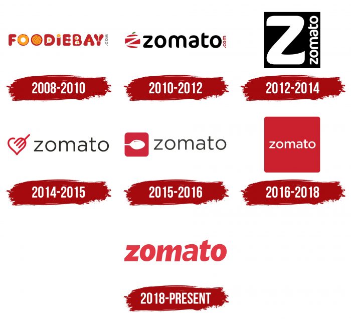
According to company representatives, their symbol has progressed along with them. It has six variants of emblems, which differ in fonts, graphics, and backgrounds. However, they are not just a demonstration of the identity of the service. It is also a way of expressing it emotionally in different situations: an early daily breakfast, a Sunday brunch, or a festive family dinner. Taken together, all signs convey the company’s love for food and a constant obsession with it.
What is Zomato?
Zomato is a food delivery service and online restaurant menu, aggregator. It appeared in India in 2008 as a home project and has gradually grown into an international company.
2008 – 2010
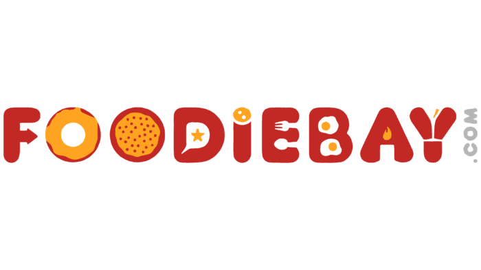
Immediately after opening his company, entrepreneur Deepinder Goyal named it FoodieBay. It was this double phrase that became the basis for the logo. And to emphasize the brand’s food orientation, the owner decided to use images of various products. Thus, a harmonious combination of drawing and text appeared. For example, one “O” looked like a donut covered with caramel; the second one looked like a pizza.
The letter “I” was depicted as a sausage stick with a cut at the top. “B” looked like a fried egg, and “Y” got the shape of a meat brisket. In the gaps, “E” (at the central crossbar) cutlery was visible: a fork and a spoon. “A” was like an open furnace with a burning crucible, and “F” contained a pointer. The color spectrum of the emblem was bright: it consisted of red and yellow. At the same time, the symbols were bubble-inflated, as if filled with air. There was a gray vertical inscription on the right – the domain on which the site was located.
2010 – 2012
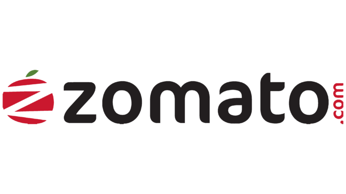
After the rebranding, a new company name appeared in the logo – Zomato typed in FF Cocon. It was decorated in a completely different style, not the same as before. The inscription consisted of lowercase characters with smooth transitions and side cuts. So, “a” was missing the lower right part (tail), and “t” was missing the upper left half (crossbar segment). In front of the text was a large red tomato with a green mini-leaf and zigzag stripes that looked like the first letter of the service’s name.
2012 – 2014
Modernizing the visual identity brought a discreet logo. Although it consisted of the same type of font, it had a different arrangement of inscriptions. Designers replaced the tomato in front of the name with the capital letter “Z.” It was wide, white, with smooth curves and a miniature point at the bottom. Nearby was the full name of the food ordering and delivery service. It was also painted white, but it was placed not horizontally but vertically and took the place of the “.com” domain. A black square was used as a background.
2014 – 2015
2014 brought a simplification of the logo and a change in the font. The result of design efforts was an inscription with grotesque letters in lower case (Gotham typeface). The developers of the Zomato emblem depicted a heart and a fork as if combining two images that personify the love of food. The drawing was in red, and the text in black.
2015 – 2016
Keeping the same font, the designers replaced the heart pierced with a fork with a red square and a white spoon, which seemed more humane. The geometric figure had all the corners rounded.
2016 – 2018
After the redesign, a new concept for the Zomato logo appeared: a red square with a white inscription inside. Unlike the emblem of 2012-2014, the title was miniature and horizontal. However, the font remained the same – Gotham with lowercase characters.
2018 – today
The international online menu aggregator envisions the logo to be clear, simple, and legible. Another criterion they adhere to is the integrity of the form. Therefore, management has implemented two modifications representing the branding – text within a simple geometric shape and a separate wordmark.
As a result, the modern emblem was simplified to the maximum: only the background in the form of a red square and the food delivery service’s name remained in it. The ratio of graphics to text is balanced and evenly distributed. The square has rounded corners, and the word “zomato” is made in the same soft style – with smooth transitions, without sharp lines.
The letters are closely spaced to each other – as much as the square space allows. Moreover, the emblem is used in two mirror-opposite forms: a red inscription on a white backing and a white one on a red one. A catchy visual impact is provided in both cases.
The single word mark is considered the primary emblem. It applies to all assets and advertisements, including print, virtual and offline media. The box is used to identify the website and food ordering points.
Zomato: Interesting Facts
Zomato, started in 2008 by Deepinder Goyal and Pankaj Chaddah in India, has changed how we find, order, and enjoy food. It began as a small website called “Foodiebay” for finding restaurants in Delhi but grew into Zomato, a big name in food services worldwide.
- Early Days: It started in 2008 by helping people in Delhi find restaurants. In 2010, it became Zomato to show it was more than a directory.
- Going Global: Zomato didn’t stop in India; it’s now in over 24 countries, listing over a million restaurants.
- Growing through Buying: To expand, Zomato bought several companies, including Urbanspoon, in the US, which helped it enter new markets.
- More than Reviews: In addition to reviews, Zomato delivers food, offers discounts through Zomato Pro, and even supplies fresh ingredients to restaurants with Hyperpure.
- Smart Tech: Zomato uses smart tech, such as AI, to suggest food and find the best delivery paths.
- Helping Hands: During the COVID-19 pandemic, Zomato helped restaurants and delivery people with contactless dining and food for those affected by lockdowns.
- Eco-Friendly Moves: Zomato is working to be kinder to the planet, like letting customers skip getting cutlery with their orders to reduce plastic waste.
- Big IPO: Zomato’s IPO in July 2021 was a big deal, showing how much people are interested in India’s digital market.
- Zomato Gold Issues: There was some trouble with Zomato Gold giving too many discounts. To fix these issues, it was changed to Zomato Pro.
- Cultural Voice: Zomato is known for its smart and modern social media, which sometimes sparks debates about its approach to cultural issues.
- Delivery Pioneer: Zomato was among the first to start delivering food on a large scale in India, and it has become essential for many users.
Zomato’s growth from a startup to a global food industry leader demonstrates its innovation, ability to overcome challenges, and ability to adapt to people’s needs.
Font and Colors
The Zomato logo uses a typeface that simplifies the sign’s perception by residents of any country in the world. The title is in clean and proportional Sans Serif typeface Metropolis Regular. The variant with bold and slightly slanted letters was used, which well complements the foodservice’s design. Small italics create a welcoming atmosphere.
The company has four corporate colors, two of which are present in the logo. These are Red Cranberry (# E237440) and White Feta (#FFFFFF). Moreover, in the symbols, the red color has a gradient: the upper part is made light, and then it gradually increases; therefore, at the bottom, it turns into a rich dark shade.
FAQ
What is the font of Zomato?
Zomato’s font is based on Metropolis, an open-source geometric typeface. The brand chose Metropolis after exploring several options and found it best suited their needs.
To make it unique, the brand modified Metropolis and named the customized version Okra. This font supports the brand’s visual identity, making it clear, modern, and recognizable.
A geometric typeface like Metropolis gives the brand a clean, contemporary look. The modifications to create Okra ensure the font fits perfectly with the brand’s style and purpose.
What is Zomato’s logo?
Zomato’s logo represents the brand’s identity and passion for food. It shows the brand’s dedication to food and the community of food lovers.
The logo is simple and powerful, making it easily recognizable. It appears in various places, from restaurant signs to mobile apps, consistently conveying the brand’s commitment to quality and the joy of food.
The design elements evoke warmth, hospitality, and excitement about discovering new dishes. The logo visually represents the brand’s love for food and its mission to share that passion with others. It is key in communicating the brand’s focus on food and community to the world.
What does the Zomato logo mean?
The logo symbolizes a passion for food. As an Indian company, the red color reflects the vibrant flavors of oriental spices, which are central to Indian cuisine. This choice represents the brand’s origins and evokes warmth, excitement, and appetite.
The logo is simple and bold, making it easily recognizable. It visually represents the brand’s mission to connect people with great dining experiences. The red hue is linked to energy and enthusiasm, matching the brand’s dynamic approach to the food industry.
This color and design show the brand’s dedication to celebrating culinary delights and enhancing users’ dining experiences.
Is Zomato American?
No, Zomato is not an American service. It is an Indian company created by two Indian entrepreneurs. The brand is headquartered in Gurugram, Haryana.
Deepinder Goyal and Pankaj Chaddah founded the company as a restaurant discovery platform and have since grown into a comprehensive food delivery and restaurant review service. While the brand operates in several countries, its roots and main operations are in India.
What is the slogan of Zomato?
The company slogan is “Never have a bad meal.” This slogan shows the brand’s commitment to high-quality food and great dining experiences. The brand aims to ensure every meal ordered meets high standards of taste and satisfaction.
This simple and powerful slogan reflects the brand’s dedication to selecting top-notch restaurants and dishes. It emphasizes its mission to help users find great food, whether dining out or ordering in. The slogan assures customers they can trust the brand for consistently good meals.
Why is Zomato red?
The company’s signature color is red because it shows a deep passion for food. This color choice fits the brand’s identity and mission to create memorable dining experiences. Red is vibrant and energetic, symbolizing enthusiasm, excitement, and appetite.
The color echoes the rich palette of Indian spices, highlighting the brand’s roots and cultural heritage. Indian cuisine is known for bold flavors and colorful spices, and red perfectly captures this essence. By choosing red, the brand connects with its Indian origin while appealing to a universal love for food.
Using red in the logo and branding creates a strong, recognizable identity. It conveys warmth and hospitality, inviting users to explore and enjoy various food experiences.
