


![]() AB InBev Logo PNG
AB InBev Logo PNG
The symbiosis of several companies in creating unique drinks is evident in the logo. The union engraved in the AB InBev logo, blended in one vessel, creates the gold standard of brewing. The conglomerate’s brands are loved and known worldwide.
AB InBev grew out of three brewing histories on different continents. Its oldest line dates back to Den Horen, founded in Leuven, Belgium, in 1366, and later merged with Brouwerij Artois, the maker of Stella Artois. In 1987, Artois merged with Piedboeuf to form Interbrew, which later added Labatt, Bass, Beck’s, Hoegaarden, and Leffe. By the early 2000s, Interbrew ranked third worldwide behind Anheuser-Busch and SABMiller.
A second branch came from Brazil. Brahma appeared in Rio de Janeiro in 1888, while Antarctica developed in São Paulo. In 1999, the two companies merged to form AmBev, Companhia de Bebidas das Américas, creating the world’s fifth-largest brewer and a dominant force across Latin America. In 2004, Interbrew and AmBev merged to form InBev, the largest beer producer by volume.
The American line came from Anheuser-Busch. Its origins date to 1852, when George Schneider founded Bavarian Brewery in St. Louis. Eberhard Anheuser later took control, and in 1869, Adolphus Busch joined the business. Budweiser was introduced in 1876, while refrigerated railcars helped the company expand nationwide distribution.
In 2008, InBev bought Anheuser-Busch for $52 billion, creating Anheuser-Busch InBev. In 2013, AB InBev acquired Grupo Modelo, the maker of Corona, for $20.1 billion. In 2016, it bought SABMiller for $107 billion, the largest merger in brewing history. The deal required asset sales to Molson Coors and Asahi. At the same time, AB InBev gained about 30% of the global beer market, ahead of Heineken and Carlsberg.
Meaning and History
![]()
The corporation came into existence through a gradual merger of companies, beginning in 1987 when Belgium’s Stella Artois and Piedboeuf Brewery formed Interbrew. The new company gradually expanded, absorbing smaller operations in Canada, the UK, and Germany, until it merged with Brazil’s largest, AmBev, in 2004. The merger allowed their brainchild, InBev, to become the largest global leader in the beer industry. In 2008, InBev took over the 150-year-old American Anheuser-Busch, which at the time ranked third in the world. The new corporation was named Anheuser-Busch InBev (AB InBev). The SA prefix appeared after SABMiller’s 2016 takeover, but it is not used in the logo.
The concern’s emblem was initially well thought out and reflected the idea of a joint business. Therefore, subsequent changes to the logo were minor and related to Anheuser-Busch InBev’s growth and expansion.
What is Anheuser-Busch InBev SA?
This is the world’s largest brewing company, with a portfolio of over 500 beer brands ranging from local favorites to global icons. The company stands out for its diverse selection, including popular regional brands that cater to local market preferences and internationally renowned brands like Budweiser, Corona, and Stella Artois. With breweries in various countries, the company offers beers for every taste and occasion, blending centuries-old brewing traditions with modern production methods.
2008 – 2016
![]()
Ab InBev strives to create brands that bring people together, as a shared love of their beverage helps build friendships and connections. The company’s first logo embodies the idea of unification. FutureBrand designed it in 2008 during the corporation’s inception.
The Anheuser-Busch symbol is an eagle in a graceful A. The InBev logo is clear, with softly rounded letters and an exclamation point in place of the letter I. FutureBrand has transformed and combined these two symbols to create an image that demonstrates unity, growth, and aspiration for the future. The letters AB retain their clarity when combined. They are placed first. This is a tribute to the brand’s long history. And the InBev letters remain clear, flowing, and straightforward, indicating that the company is the corporation’s main pillar. The design emphasized each company’s individuality while also showing how they work together.
The eagle (bald eagle) also remained on the logo, as a soaring bird in the upper-right corner. Its image carries a great semantic load. The corporation considers itself the company of the century and is focused on producing beer that will be drunk for the next 100 years. The eagle is one of the largest birds in North America, a long-lived species with strong wings that allow it to soar for long periods. It forms pairs for life. Since ancient times, this bird has symbolized power, victory, and glory. The soaring eagle on the logo demonstrates:
- The power and growth of the corporation
- rise above competitors
- movement into the future
- orientation on existence in the centuries
- partnership for life.
According to AB InBev’s philosophy, beer’s main role is to support the celebration of life. Every bottle should bring pleasure and leave a good impression. This conviction is reflected in the bright and warm colors of the bird.
2016 – 2022
![]()
In 2016, the UK-based SABMiller joined the company, which had been supplying Africa, North America, and Europe. The corporation became a conglomerate of 3 major players in the brewing market. This led to a change in the logo. The image of an eagle was removed from the emblem because the bird was most closely associated with North America and Anheuser-Busch. And the new concern was built on the rights of unity and teamwork.
The letter part of the emblem remained unchanged: the red letters AB and the dark brown inscription InBev. The letters became larger and the colors brighter, indicating the corporation’s growth. The SABMiller symbolism was absent from the 2016 logo.
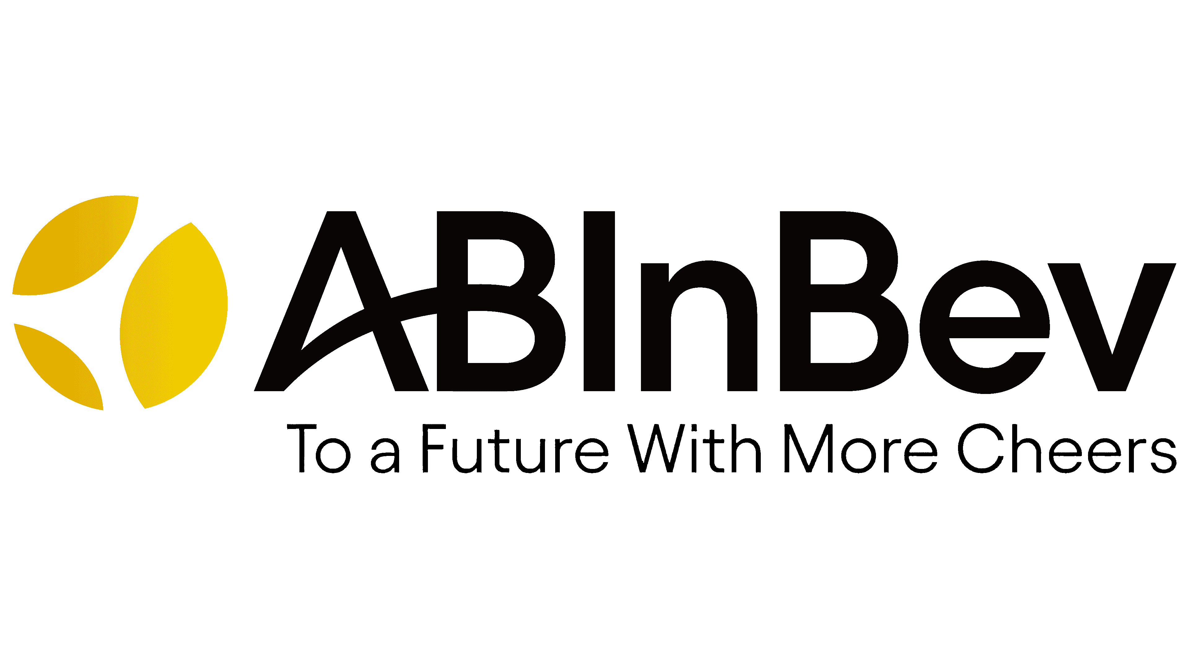
2022 – today
![]()
In 2022, the past flaw was corrected, and SABMiller was introduced as a third player in the logo. This is reflected in the yellow balloon to the left of the letter part of the logo and a change in the color scheme.
The ball has three petals, symbolizing the three players on the team. The petals are of different sizes, reflecting each player’s contribution. The lettering on the logo remains the same but has lost its color variety, becoming completely black. It is no longer a reflection of the two merged companies. This history is in the past, and the concern is about moving forward.
Font and Colors

The main colors of the emblem are white, yellow, red, brown, and black.
- White color – aspiration to new beginnings.
- Yellow – joy of life, enjoyment of the product.
- Red – energy, love of what you do, desire for change, resilience. After all, Anheuser bought his brewery when it was on the verge of bankruptcy and not only rebuilt it but made it an industry leader.
- Brown is a sign of foundation, experience, and a stable central company that has rallied other firms around it.
- Black – the power and strength of the corporation, its stable position in the market.
Small serifs and smooth lines of the logo correspond to the Quadrat Serial font. At the same time, the initial letter A is unusually connected to the letter B, demonstrating family continuity (Busch married Anheuser’s daughter, and the brewery was passed down from generation to generation until 2008).
AB InBev Logo Color Codes:
- Gold Gradient: PMS 110C; HEX #e5b611; CMYK 02-22-100-08; RGB 230-183-17
- Light Gold: HEX #f5e003; CMYK 7-5-100-0; RGB 245-224-3
- Black: HEX #000000; CMYK 00-00-00-100; RGB 000-000-000
- White: HEX #ffffff; CMYK 00-00-00-100; RGB 255-255-255