Designers who created the Absolut logo embodied their vision of perfection in it. Bold letters look monolithic, like unbreakable pillars supporting the sky. A large dot at the end signifies completeness and usefulness and that Absolut needs no additions. The blue color fits perfectly into the concept, symbolizing vodka’s crystal purity and freshness.
Absolut: Brand overview
| Founded: | 1879 |
| Founder: | Pernod Ricard |
| Headquarters: | Åhus, Sweden |
| Website: | absolut.com |
Meaning and History
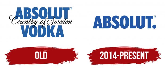
The evolution of the Absolut logoThe alcohol manufacturer relies on the brand’s heritage. The company moved away from a traditional label to emphasize the shape of the glass container, resembling a bottle from a Swedish pharmacy. Thus, the Absolut logo looks exceptionally minimalistic.
The first version of the trademark consists of three lines of inscription. At the top is the brand name, in the middle is the phrase “Country of Sweden,” and below them is the word “Vodka.” In the first and third lines, the letters are bold and sans-serif. The phrase in the center is depicted in an elegant italic font. The brand palette includes two colors: blue and black. A white background complements them.
What is Absolut?
Absolut is a vodka that was born in Sweden in 1897 and introduced to the global market a century later. It is made from the purest water, sourced from underground springs. The second ingredient is high-quality grain alcohol, which undergoes multiple filtrations to achieve a soft taste. The brand offers various types of vodka, including the limited series Absolut Elyx.
In 2014, the brand owners decided that the logo was already well-known, so they simplified it to a single inscription, “Absolut.” This was done to expand the product range without changing the original strategy.
“Brand Union,” the company responsible for the redesign, strengthened the brand’s iconic status. They created a simple but stylish logo with a new font. Now, the letters are very closely spaced and stretched vertically. The protruding edges of the letters in the new logo are adorned with short, barely noticeable serifs. By retaining the word “Absolut,” the developers emphasized its duality. On one hand, it means something infinite; on the other, it means something already complete.
Absolut: Interesting Facts
Absolut Vodka is a Swedish brand made near Åhus, Sweden, since 1879 by Lars Olsson Smith. It’s famous for its clear bottle and smart ads.
- How It’s Made: Absolut uses a special method to make pure vodka. The founder, Lars, started this method to make the vodka smooth.
- The Bottle: The Absolut bottle looks like an old-timey medicine bottle from Sweden. It got its look in 1979, based on a medicine flask from the 1700s. It’s clear and simple, which makes it stand out.
- Ads That Catch Your Eye: Absolut’s ads have been creative since 1980, showing the bottle in fun and artsy ways. They’ve made over 1,500 ads like this!
- Working With Artists: Absolut has worked with famous artists like Andy Warhol to make art featuring its bottle. This started in 1986 and helped link Absolut with cool art.
- Tasty Flavors: In the 1980s, Absolut was one of the first to make flavored vodka, starting with Absolut Peppar. This helped make all kinds of yummy cocktails.
- Caring for the Planet: Absolut works hard to be good to the environment. They get their wheat from nearby farms and run one of the most energy-efficient distilleries, which helps the planet.
- Special Bottles: Absolut often makes special bottles that look neat. These limited editions are fun for collectors because of their unique looks and themes.
- Famous Worldwide: Absolut became global in 1979 and is now known worldwide. People love it not just for the vodka but also for the creative ads and cool bottles.
- Smart Marketing: Absolut knows how to use the internet and social media to stay popular, especially with younger drinkers.
- Supporting Good Causes: Absolut supports LGBTQ+ rights and has made special bottles and ads to show it. They celebrate everyone being themselves.
Absolut mixes great vodka with clever marketing and a commitment to art, the environment, and important social issues. For many reasons, this has made it a top vodka and a brand people like.
Font and Colors
The brand’s original symbol complements the textual logo on the bottles. It resembles a classic round seal in shape. At the center of the graphic symbol is Lars Olsson Smith, the famous creator of Absolut. He was the first in the world to apply the rectification method for purifying alcoholic beverages. The portrait is surrounded by a ring of inscriptions “Sweden Vodka” and “Absolut Since 1879”.
Absolut Logo Color Codes:
Primary color
- Blue: Hex code: #0000BD; RGB: (0, 0, 189);CMYK: (100, 70, 0, 5); Pantone: PMS 286C
Secondary colors
- Black: Hex code: #000000; RGB: (0, 0, 0); CMYK: (35, 23, 24, 100); Pantone: Black C
- White: Hex code: #FFFFFF; RGB: (255, 255, 255); CMYK: (0, 0, 0, 0); Pantone: White C
