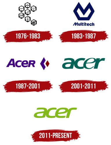
The manufacturer of laptops and smartphones adheres to a classic style that makes it recognizable. The visually strict Acer logo shows a serious attitude to work, and the flexible form of some elements is associated with electronic components. In addition, the roundings symbolize safety and adaptability.
Acer: Brand overview
| Founded: | 1 August 1976 |
| Founder: | Stan Shih, Carolyn Yeh, George Huang |
| Headquarters: | Xizhi, New Taipei, Taiwan |
| Website: | acer.com |
Acer is the world’s sixth-largest Taiwanese developer of computers and their components, smart gadgets, cloud platforms, and smartphones, with a turnover of $9.8 billion annually. The Acer logo can be seen on laptops, tablets, phones, and sports trackers.
The company was established in 1976 on the initiative of the Taiwanese electronics specialist Zhenzhong (for the world Stan Shi), who raised funds from 4 more partners. Initially, the company was called Multitech International and specialized in electronics for games and household appliances, but since 1980, the field of activity and the name have changed.
Meaning and History
The Acer logo changed several times from an image to a single inscription. The name change caused the most significant changes.
What is Acer?
An electronic gadgets corporation founded in 1976. It is famous for its laptops and computer accessories. Headquarters in Taipei. Net profit 212 million dollars a year.
1976 – 1983
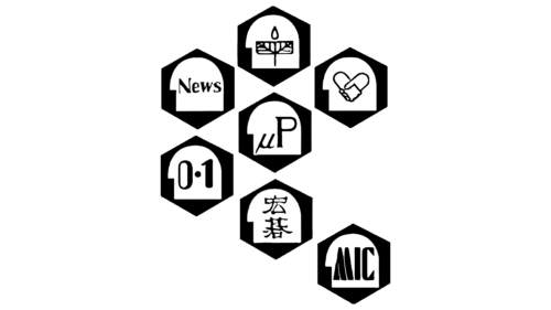
The first emblem was created for Multitech. The word meant “multitasking,” and the visual sign reflected it perfectly. The emblem consists of pentahedrons arranged like a flower with one petal torn off.
The composition creates an association with a circuit, a microcircuit, and interconnected processes. In each pentagon, some direction of activity was schematically represented; for example, μP (the designation of micro-roentgen) personified physics. There was journalism, medicine, and agriculture.
The abbreviation MIC was written in the torn petal, which was part of the word microchip, the translation of which is: microcircuit, microchip. It was these details that were the main focus of the company. The visual sign showed: from the whole variety, Acer chose to work with microcircuits.
1983 – 1987
The company changed direction, deciding to work with computers. The logo has been completely redesigned for a modern motif. The name, and on top, the design of the letter M (the first letter of Multitech) and its reflection forward, connected together. It seemed that one piece was cut out of the pentagonal cake of variety, which the company chose for itself.
Blue was associated with technology and research.
1987 – 2001
The company decided to become independent from other manufacturers and opened its division to create computer chips – Acer Laboratories Incorporated. And then completely changes the name to Acer. This results in a logo change.
A visual sign is a new name and a blue rhombus from which a piece in the form of a red rhombus departs.
The figure still contains the idea of highlighting one’s own niche, one direction from diversity. But more stylish and elegant.
Acer is an unusual name and logo for Taiwan because the word is in Latin. The thing is that the company began to enter the world market. Opened the first representative offices abroad. The company’s internal Taiwanese name is Hóngqi Gǔfèn Yǒuxiàn Gōngsī, which translates to Red Banner Limited Liability Company.
It sounds unpresentable to foreign buyers and hard to pronounce. Therefore, it was decided to take a shorter name. Latin is the international language of scientists. The owners wanted the name understandable to all educated people in any country. We showed that they have great knowledge in their field and are engaged in research and development.
Acer means maple. The company has chosen a vegetable talisman by analogy with the Apple apple. A feature of the Maple family trees is their prevalence throughout the world. And Acer strives to be represented everywhere.
2001 – 2011
The conglomerate is changing its business model again. It manufactures components through other contract firms, focusing on design development and marketing strategies. Some production divisions are separated into separate enterprises (Wistron, BenQ).
As part of marketing, a new logo was developed to promote the brand and designed by Landor Associates. The visual sign turned out to be simple and streamlined. All additional details have been removed from it. Only the verbal part remained. The name can be engraved on the brand’s products while maintaining its style.
All letters of the logo are lowercase. The corporation wants to be closer to the consumer. Shows that the buyer and his interests play a paramount role. Even though Acer is a large company, it does not exalt itself nor forget for whom it works. The disappearance of the upper case also shows deglobalization, the division into separate companies.
All the letters of the word seem to flow into one another. They demonstrate that all Acer divisions are connected. They form a single system. And the company’s gadgets are assembled from separate but developed parts, forming a complex and perfectly working system.
The logo is associated with the smoothness and noiselessness of the PC from the company. Easy to lay down software.
2011 – today
Dismissed CEO and President Gianfranco Lanci. Under the influence of appointed leaders, the firm strives to conquer new markets. Acer incorporates cloud services company iGware and opens a research center to develop models of phones and tablets. The logo is also changing.
A new version of the visual sign appeared two weeks after the resignation of Lanci. The rebranding touched on the color and font of the inscription. The transition from dark blue-green to light green showed new trends, a revival, and a change in the outlook on business development. The color represented beginnings in several directions.
The lightness of the shade conveyed the idea of cloud servers. After the purchase, the company announced the beginning of the development of its cloud platform to store information, link gadgets, and synchronize them. The close and close arrangement of letters became the prototype of such a connection.
The corners’ smoothness and the glyphs’ streamlining showed the coordinated work of all systems in the PC and electronics. Components create the perfect tandem. And individual electronic devices of the company easily communicate with each other.
Font and Colors
The main colors of the company are black, blue and shades of green, replacing each other. The company emerges from fundamental diversity (black), finds its field of activity related to technology and electronics (blue), undergoes transformations and gains experience (dark blue-green), and is born with new views, approaches, and innovations (light green).
The font resembles Snasm Book Italic italics.
Acer color codes
| Apple Green | Hex color: | #83b81a |
|---|---|---|
| RGB: | 131 184 26 | |
| CMYK: | 29 0 86 28 | |
| Pantone: | PMS 376 C |


