


 Acura Logo PNG
The Acura logo conveys elite sophistication and technical excellence. The company’s cars don’t drive; they fly along the highway. The emblem highlights its streamlined shape and high ground clearance. The sign also hints at a full-service package.
Honda launched Acura before its 1986 debut. In the early 1980s, Honda saw US buyers moving toward premium cars, a field led by BMW and Mercedes-Benz. In February 1984, American Honda announced a new luxury division under the working name Channel II. By September, it became Acura, a name tied to acutus, the Latin word for “sharp” or “precise.”
On March 27, 1986, Acura opened with 60 dealers in 18 states, becoming the first Japanese luxury brand in the US market. Its first cars were the Integra hatchback and the Legend sedan. Legend used Honda’s first V6 engine and was developed with Austin Rover, making it related to the Rover 800. Acura sold 52,869 cars in 1986, and its dealer network grew to 150 locations in 36 states by year’s end.
In 1987, sales reached 109,000 cars. Legend won Motor Trend Import Car of the Year, while Integra entered Car and Driver’s 10Best list. Toyota and Nissan responded by launching Lexus and Infiniti, both in 1990. That same year, Acura introduced the NSX, a mid-engine V6 supercar with an aluminum monocoque, VTEC, and titanium connecting rods.
The early 1990s brought Lexus, Infiniti, recession pressure, and a stronger yen. Acura answered with a broader lineup. In the 2000s, MDX became a key SUV, and Type S returned as a performance trim with VTEC engines and sport suspension. The original NSX ended in 2005. A hybrid second-generation NSX arrived in 2016 and was built in Ohio. Acura entered China in 2006. In the 2020s, Integra and Type S returned, while ZDX became the brand’s first fully electric model.
Meaning and History
The brand’s big name is the sole merit of the NameLab studio, which directly created the word “Acura.” Experienced namers used the Latin morpheme “acu” (from “accuracy”), meaning “accurate” or “accurate” in the original language. The second part (“ra”) doesn’t mean anything; it simply simplifies pronunciation and makes the name memorable. The naming studio drew on the word’s semantics to express the essence of the automobile company. As you know, Acura is famous for its precise, accurate approach to production. So this clever marketing trick was designed to attract customers.
Acura was created in 1986 for consumers who lacked status and sophistication in Honda products. The first Integra and Legend models were in high demand, selling more than 100,000 cars in just one year. Despite high prices, cars bearing the Acura logo reached the top. Because of the popularity, the company added a graphic symbol to its wordmark. The emblem, hinting at a connection to Honda, was first used in 1990. It was designed for SUVs and sedans and was available in several color options, with monochrome silver shades predominating.
What is Acura?
This is Honda’s luxury vehicle division, representing Japanese precision and engineering excellence, with a focus on performance and refinement in the premium automotive segment. Operating primarily in North America, China, and other key regions, the brand offers vehicles ranging from sports sedans to luxury SUVs, including the iconic NSX supercar. The brand showcases a distinctive approach to premium mobility, combining Honda’s reliability with high-end features and materials, producing its vehicles at specialized factories and development centers.
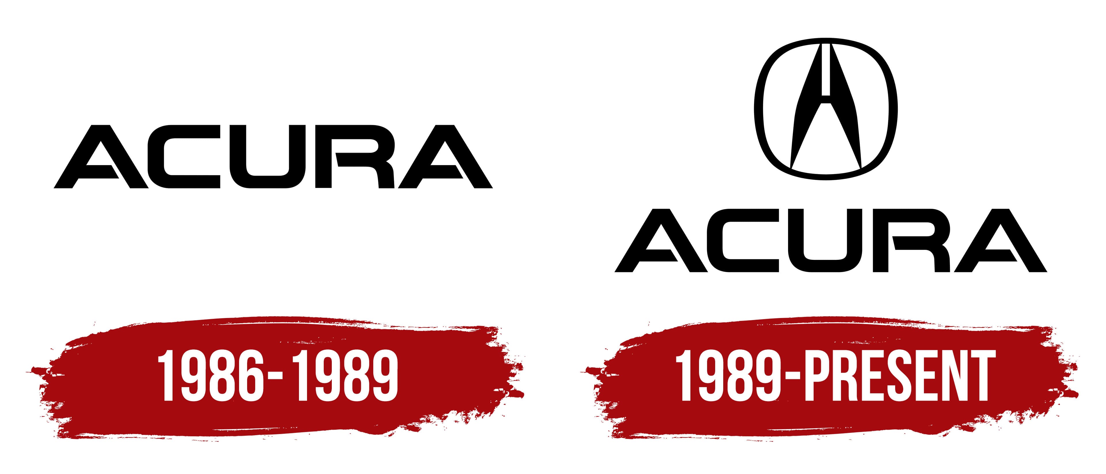
1986 – 1989

When Honda registered the Acura trademark, it found a way to personalize the new division. The designers developed a logo with the words “ACURA,” which is used on luxury cars. The typography is based on a stylized, rounded sans-serif font. The wordmark used bold, capitalized letters with many corners. The distance between the symbols was minimal but sufficient for the brand name to be easily read.
1989 – today

In 1990, the exotic NSX sports car was released. Not long before that, the company adopted a new symbol that complemented its wordmark. The current logo features a stylized letter “A” resembling the capital “H,” underscoring the inextricable link between the automaker Honda and its subsidiary Acura.
The A-shaped figure resembles a caliper, or rather a jaw with a fixed bar for internal measurements. This is no coincidence because this tool is associated with precision and helps engineers in their work. “A” is inside the non-proportional rounded square and touches its borders at four points (two at the top and two at the bottom). The brand name is written at the very bottom. The font remained the same; the designers decided not to change it to maintain continuity with the old wordmark.
After the first presentation of the Soichiro emblem, Honda was unhappy with the result. During the development of the initial version, no one consulted with him. After all, Honda wanted the letter “A” to look like an “H.” There was no such similarity because it lacked a small horizontal bar. The specialists had to redo the design and add the missing line. By that time, they eliminated all badges with the “wrong” design.
Font and Colors
The Acura brand name has at least three meanings. First of all, it is “A” – the first letter of an automobile brand’s name. Secondly, the stylized symbol is very similar to the capital “H” at the beginning of the word “Honda”. The developers specifically noted this feature to emphasize the connection between the two companies. And according to the official explanation, the logo represents the caliper’s measuring part. In this case, it symbolizes the high quality of luxury sedans and SUVs. Some car enthusiasts believe the two-piece figure resembles compass arrows pointing right.
The font used for “ACURA” resembles the NSX or NSX 2.6 typefaces. Bill Pierce designed them based on the automotive brand’s typography. Interestingly, the lowercase “a” in the NSX 2.6 matches the Acura emblem above the company name.

Beyond its exclusive, recognizable typeface, color plays an important role in the logo. Black symbolizes strength, sophistication, and elegance; white symbolizes purity and confidence. In Japanese culture, white represents perfection and integrity. On cars, the badge is completely silver to show the metal’s texture.
Acura Logo Color Codes:
- Black: Hex code: #000000; RGB: 0, 0, 0; CMYK: 0, 0, 0, 100; Pantone: PMS Process Black C
- White: Hex code: #FFFFFF; RGB: 255, 255, 255; CMYK: 0, 0, 0, 0
FAQ
What does the Acura logo mean?
The Acura logo features a capital ‘A’ stylized as a caliper. This measuring tool is associated with the brand name because the prefix ‘acu’ denotes accuracy. The symbol sits in a ring and is complemented by the word ‘ACURA.’
How did Acura get its logo?
The current Acura logo was designed shortly before the release of the exotic NSX sports car. It took longer than planned because Honda’s owner didn’t like the original design, so it had to be redesigned.
Is Acura a luxury car?
Yes, cars from this brand belong to the premium class. Like other vehicles in this segment, they are known for high performance, luxurious design, and increased comfort.
Does Honda own Acura?
The Acura luxury brand was created as a division of The Honda Motor Company, Ltd.