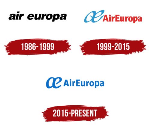
The Air Europa logo is about looking good while representing the joy of flying. The symbol “AE” in the logo looks like the path an airplane leaves behind in the sky, hinting at all the places Air Europa can take you. Their emblem is a sign of their promise to you, showing off what they stand for in a way that’s nice to look at and easy to remember.
Air Europa: Brand overview
Air Europa was founded on November 21, 1986, in Spain as part of the tourism company Globalia Corporación Empresarial S.A. Originally intended for charter flights, it catered to tourists heading to popular resorts in Spain and the Mediterranean. This decision was influenced by the growth of the Spanish tourism market and the liberalization of the European aviation industry. 1988, the airline commenced operations, offering charter flights from various European cities to Spanish resorts. Thanks to its reliable service, Air Europa quickly gained a reputation as a trustworthy charter carrier, leading to an expansion of its services in the following years.
In 1991, the company took a step forward by introducing regular domestic flights within Spain. This move was part of its strategy to diversify its business and expand its presence in the aviation sector. It began to compete with the national carrier Iberia on important domestic routes.
By 1993, the airline expanded its operations by launching regular international flights to London, Paris, and New York destinations. This expansion marked its transition from a charter carrier to a fully-fledged international airline.
During the mid-1990s, the brand initiated a major fleet renewal program, acquiring new Boeing 737s for domestic and short-haul flights and Boeing 757s and 767s for long-haul journeys. This move aimed to improve operational efficiency and enhance passenger service quality. Throughout the 2000s, the company expanded its route network, adding new destinations in Europe, North Africa, and the Americas. The airline focused on developing routes to Latin America, which became a key growth area for the brand.
On September 1, 2007, the company joined SkyTeam’s global airline alliance, strengthening its cooperation with leading airlines and improving its passenger offerings, particularly on long-haul routes.
In 2009, the airline placed a significant order for new aircraft, including the Boeing 787 Dreamliner, to modernize its fleet and increase efficiency on long-haul routes.
2015, the company received its first Boeing 787 Dreamliner, making it the first Spanish airline to operate this aircraft type. This enabled the company to provide passengers with higher comfort on long-haul flights and introduce new routes.
In 2018, the brand continued to enhance its position in the travel market between Europe and Latin America by opening new routes and increasing flight frequencies on existing ones. In November 2019, International Airlines Group (IAG), the parent company of British Airways and Iberia, announced an agreement to acquire the company for 1 billion euros, pending regulatory approval. However, in 2020, IAG and Globalia adjusted the terms of the acquisition due to changing market conditions, with negotiations ongoing to adapt to the new realities of the aviation industry.
Meaning and History
Air Europa’s logos tell the story of its growth from a small local airline to a big international one. Each new logo shows how the airline has grown, focusing on bringing new ideas and connecting the world. The change from its first, simple logo to the latest, complex one shows how much Air Europa wants to connect different places and honor its history while looking to the future.
What is Air Europa?
Air Europa quickly became a key player in Spain’s aviation scene, offering a mix of quality service, competitive pricing, and a wide route network across Spain, Europe, and the Americas. Joining the global SkyTeam alliance, Air Europa has expanded its fleet and services, boosting tourism and business between Spain and the world.
1986 – 1999
From 1986 to 1999, Air Espana S.A. evolved into Air Europa as it aimed to become an international airline. This change was more than just a new name; it was about reaching further than ever before. However, the new logo they chose was surprising. Instead of something bright and bold, they used simple lowercase letters in black. This wasn’t what you’d expect for an airline looking to stand out worldwide.
The black logo was different. It didn’t showcase the usual excitement of flying or the vastness of the sky. Instead, it had a serious, down-to-earth feel. This showed that Air Europa focused on being practical, offering short flights rather than long, adventurous journeys.
This choice reflected the real situation for Air Europa at the time. They started by focusing on charter flights and working within their limits, following the plans of the ILG-Air Europe Group. It was a practical start, aiming to establish themselves in a specific part of the market.
1999 – 2015
In 1999, with financial help from the Globalia Group and the growth of its flight routes and fleet, Air Europa launched a big rebranding. They wanted a new look to show their progress and modern vibe. They chose a stylized blue letter “A” that looked like an airplane doing aerial tricks, showing off the airline’s goals and skills.
With its smooth lines, this logo was a nod to Air Europa’s skilled pilots and busy schedule. Now, the airline has 750 flights a week, including many outside Europe. Adding modern Boeing 737s to the fleet highlighted its focus on being fast and agile, marking Air Europa as a strong contender in global aviation.
The blue logo represented the sky, with Air Europa’s planes flying high, their paths echoing its design. The logo cleverly mixed the initials “A” and “E.” The shape hints at a plane’s tail, capturing the airline’s essence and commitment to flying.
In compact red letters, the logo and “Air Europa” indicated the airline’s aim for fast flights and a leading role in global air travel. It wasn’t just about being the top airline but about being the best in quality and leadership. This new logo and slogan showed Air Europa’s dedication to innovation and quality and its goal of being the first choice for international travelers. This rebranding allowed Air Europa to update its image and emphasize its ongoing efforts to grow, improve its services, and bring new ideas to aviation.
2015 – today
In 2015, Air Europa introduced a new logo and launched Air Europa Express, showing a strong sense of confidence. With its deep blue color and elegant script, this logo highlights the airline’s professional staff, dedication to safety, and modern fleet. Air Europa also added defibrillators to its planes, showing it cares about keeping passengers safe and healthy.
The logo’s design became more refined and calm, indicating the airline’s growth and stability in the travel industry. The smooth lines promised a comfortable and enjoyable flight experience for passengers.
The logo’s blue wasn’t just for looks; it symbolized the Pacific, Atlantic, and Indian Oceans that Air Europa’s flights cross, linking the concepts of water and air. This choice of color reflects the airline’s wide reach and expertise in flying over vast distances.
Font and Colors
The Air Europa logo features a unique interplay of stylish and functional typography. The letters “AE” are intertwined, forming a continuous loop that suggests connectivity and unity. This stylization is interpreted as a nod to the infinity symbol, emphasizing the airline’s enduring presence and commitment to continual service.
The typeface for “AirEuropa” is sans-serif, which gives it a clean and contemporary appearance. It’s devoid of any unnecessary flourishes, creating a look that is both efficient and easily readable—qualities that an airline would want to communicate. The letterforms are rounded, contributing to the logo’s approachable and friendly aesthetic.
Color-wise, the logo employs a monochromatic shade of blue, which carries connotations of the sky, echoing the very essence of aviation. Blue symbolizes trust, reliability, and confidence—essential to any carrier. The consistent use of blue across the entire logo unifies the design, reinforcing the brand’s identity straightforwardly and memorably.
FAQ
What are the colors of Air Europa?
Air Europa, a leading Spanish airline, has refreshed its planes with a new blue and white color scheme. This update is in preparation for the arrival of new Boeing 787s, aiming to make the airline stand out. The first plane to showcase this new design is an Embraer 195 with the registration EC-KRJ. This makeover is part of Air Europa’s strategy to update its fleet and attract more passengers and plane enthusiasts. The blue and white colors were chosen to appeal to and honor the airline’s Spanish roots, symbolizing Spain’s strong ties to the sea and sky.
What kind of aircraft is the Air Europa?
Air Europa uses the Boeing 787 Dreamliner for its long-distance flights. This airplane is known for being very advanced, using less fuel, and being better for the environment.
The Dreamliner’s design makes it lighter and uses fuel more efficiently, which means it doesn’t use as much fuel and doesn’t pollute as much. This is great for keeping the air cleaner and matches what people now want from air travel. For those flying, the Dreamliner makes the journey nicer, with bigger windows, better air inside, and less noise.
Where does Air Europa fly in Europe?
Air Europa is a well-known airline from Spain that flies to many key places in Europe, offering plenty of options for both business and leisure travelers:
- Alghero, Italy
- Alicante, Spain
- Amsterdam, Netherlands
- Asturias, Spain
Air Europa links passengers to these appealing European locations, ranging from the historic and cultural attractions in Amsterdam and Alghero to Alicante’s sunny beaches and the stunning natural surroundings of Asturias.
Does Air Europa still exist?
Yes, Air Europa is still flying. This airline is a big deal in the industry, linking many places worldwide. It’s known for flights between northern and western Europe to sunny Canary and Balearic Islands spots, perfect for vacationers.
Air Europa doesn’t stop there. It also has flights within Spain to keep the country connected and flies long distances to North and South America from its main base at Adolfo Suárez Madrid-Barajas Airport in Madrid. This airport is key for the airline, helping it run smoothly and making it easier for people to travel between continents.


