The Air Serbia logo represents the airline’s strong connection to Serbia’s heritage and its key role in linking Serbia to the rest of the world. It captures the airline’s historic journey, showing the Serbian people’s resilience, pride, and spirit. The emblem reflects Air Serbia’s goal to provide distinctive, high-quality services that bring out Serbia’s cultural richness and hospitality.
Air Serbia: Brand overview
Founded in 1927 as Aeroput, Air Serbia’s roots lie in connecting Belgrade with Zagreb and Podgorica, pioneering air travel in Yugoslavia. After World War II, in 1947, it became JAT (Yugoslav Airlines), expanding its reach across Europe and the Middle East and later to the USA, Australia, and Asia in the 1960s. This era also introduced modern aircraft like the Boeing 707 and Douglas DC-9.
The 1970s and 80s saw JAT grow further, adding wide-body jets like the Boeing 747 and McDonnell Douglas DC-10, making it one of the biggest carriers in Southeast Europe.
The 1990s, however, brought challenges with the breakup of Yugoslavia, leading to a smaller network and financial troubles.
Efforts to restructure and rebrand JAT in the 2000s aimed at reviving its image and efficiency faced hurdles from an aging fleet and stiff competition.
A major change occurred in 2013 with a strategic partnership between the Serbian government and Etihad Airways, transforming JAT into Air Serbia. This partnership kickstarted a major overhaul, modernizing the fleet and expanding services, making Belgrade a crucial regional hub.
Throughout the 2010s, Air Serbia expanded further, adding new destinations in Europe, the Middle East, and North Africa and modernizing its fleet with Airbus A320neo and A330 planes.
Today, Air Serbia is Serbia’s premier airline and a significant player in Southeast Europe’s aviation market. It’s focused on enhancing its Belgrade hub, operational efficiency, and customer service quality, aiming to boost Serbia’s tourism and economy despite the pandemic’s challenges.
Meaning and History
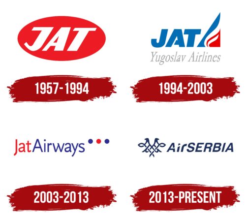
Air Serbia’s logos tell the story of the airline’s journey from its beginnings to its role today as an important international airline. These symbols mark significant growth, innovation, and strength moments, showing the character of the Serbian people and Air Serbia’s development. The logos showcase the airline’s deep connection to Serbia’s heritage, commitment to outstanding service, and warm hospitality.
What is Air Serbia?
Originally known as Jat Airways, Air Serbia was revived in 2013 as Serbia’s flagship carrier. The airline is based in the bustling city of Belgrade and operates flights from its main hub, the strategically located Belgrade Nikola Tesla Airport. The airline transports passengers worldwide, focusing on Europe and the Middle East.
1957 – 1994
Air Serbia, which started in 1957 as JAT Yugoslav Airlines, has changed its look and feel. The company’s logos have shifted from original styles to the modern look introduced with the 2013 rebranding.
The early JAT logos featured a vibrant red oval background, a color choice to grab attention and symbolize energy and growth. A rising sun was depicted inside this oval, symbolizing new beginnings and the airline’s goal to expand in the aviation world.
The logo’s design also hinted at the red navigation lights on airplane wings, indicating readiness for flight and new adventures. The letters “JAT,” for Jugoslovenski AeroTransport, were prominently displayed in white, emphasizing the airline’s Yugoslav heritage. White was chosen to reflect innovation and the start of new journeys, showing the airline’s aim to innovate and move forward into the future.
1994 – 2003
After the USSR dissolved, the company started a new chapter, unveiling a new logo. This emblem represented a break from the past, showing the airline’s growth and its connection to the nation’s new identity. The logo featured “JAT” in large blue letters alongside a blue, white, and red triangle. This triangle, resembling an airplane wing, pointed to the aviation business and expressed patriotism by echoing the Yugoslav flag’s colors.
Inside the triangle, a pattern of waves resembling a rising torch or flame symbolized the airline’s passion for serving its country, suggesting dedication beyond flying. This imagery aimed to invoke a sense of duty and enthusiasm for bringing people together in a newly independent nation.
The triangle’s upward point emphasized a forward-thinking attitude and ambition, showing the airline’s commitment to new opportunities and the nation’s progress. This logo stood as a symbol of advancement, reflecting the shared journey of the country and the airline into a new era after the Soviet Union.
2003 – 2013
When Jat Airways decided to update its brand identity, it took a creative approach that honored its heritage. A design agency that deeply understood aviation symbolism was chosen for the redesign. They cleverly incorporated the idea of navigation lights found on planes, a symbol deeply connected to flying.
The new logo featured three dots near the name, symbolizing aircraft navigation lights. This wasn’t just for looks; it connected the logo to the core of flying, blending technology and tradition in aviation.
Color played a key role in the logo. “Jat” was in bold red, symbolizing the airline’s leadership and passion for excellence, reflecting its significant role in the aviation industry. On the other hand, “Airways” was in blue, representing professionalism and the airline’s rich experience, emphasizing its expertise in global travel. The calming blue balanced the vibrant red, visually expressing the balance Jat Airways strives for in its services.
These color choices also tapped into national pride, reinforcing Jat Airways’ status as the national carrier. The mix of red and blue and the meaningful navigation light dots told a story of national pride and the airline’s commitment to its country. This redesign was more than a logo update; it celebrated the airline’s legacy, its journey in aviation, and its deep ties to the nation it serves.
2013 – today
The Air Serbia emblem brings to the forefront a stylized representation of the double-headed eagle, deeply woven into the nation’s fabric, found on its flag and coat of arms, signifying might and governance. Yet, in Air Serbia’s rendition, this eagle morphs into an abstract form where traditional wings are reimagined as the crowns atop a heart shaped by interlaced lines. This innovative design eloquently speaks of a deep-seated love for the country, blending patriotism with the universal heart symbol.
In branding, Air Serbia adopts an ingenious approach by crafting its name to visually segment it into two parts, using a nuanced typographic differentiation. This division, subtly marked by the lowercase “i” and “r” in “Air” against the uppercase in the remainder, infuses the logo with a contemporary flair, enhancing its visual engagement.
The logo’s font is bold and italicized, projecting motion and an eagerness to advance, reflecting aviation’s essence. Its sans-serif nature underscores the logo’s modernity and streamlined appeal. The choice of blue as the emblem’s predominant color further solidifies its association with the skies and the boundless opportunities within the realm of flight.
Air Serbia masterfully marries national symbolism through this emblem with the values of affection, unity, and advancement. From the abstract eagle to the calculated typography and color strategy, the design thoroughly broadcasts Air Serbia’s pride in its Serbian roots while maintaining a welcoming stance to the global community. It visually affirms the airline’s dedication to superior service, bridging Serbia with the world from the heavens.
FAQ
What is the logo on the tail of the Air Serbia?
Air Serbia’s planes display a double-headed eagle on their tails, symbolizing Serbia’s national identity. This emblem represents the country’s rich history, independence, and pride. The eagle on Air Serbia’s aircraft is an aesthetic choice; it signifies the airline’s connection to Serbian culture and its role in sharing this culture globally. Visible on various parts of the plane, the symbol ensures recognition from a distance. By adopting this symbol, Air Serbia effectively communicates the country’s values of tradition, strength, and unity, which are important to the nation and the airline.
What is the slogan of Air Serbia?
Air Serbia started on June 17, 1927, making it one of the oldest airlines still flying today. Its motto is “95 years of flying” to show how long it has been around and how it has grown over time.
This motto is a big deal because it shows Air Serbia has been flying for a long time through many changes in the world of flying. It talks about how the airline has kept going, adapting, and connecting Serbia with other places for nearly a century. Together, the motto and the logo tell everyone that Air Serbia is reliable, focuses on quality, and is proud to be Serbian. It invites travelers to join a journey that links the past and the future.
How many airplanes does Air Serbia have?
Air Serbia, which took over from JAT, is a big airline. It flies more than five million people yearly and moves 46 thousand tons of goods. With 36 planes, Air Serbia can fly to many places in Europe and beyond, carrying people and cargo to big cities worldwide.
The airline’s planes are of different types, making it easy to handle short and long trips and meet travelers’ needs. This mix helps Air Serbia adjust to changes and keep passengers happy.
What airline is Air Serbia affiliated with?
Air Serbia, Serbia’s biggest airline, has teamed up with Turkish Airlines, Turkey’s main airline, through a deal that lets them share flights. This move is meant to help both airlines work better together, giving passengers more places to fly.
In this deal, both airlines can sell tickets for the same flight. So, Air Serbia and Turkish Airlines can offer their passengers more destinations by including each other’s flights. This means travelers have more choices, easier connections, and better service. They’re planning to add even more places to fly together, making it simpler for travelers to many spots all over Europe, Asia, and beyond.
