


 AllSaints Logo PNG
The AllSaints logo is one of the most recognizable in the fashion world. It includes just a few elements, each possessing its mysterious allure. It’s hard to overlook, as this visual symbol is considered one of the most progressive and “free” among all British fashion brands. Its originality makes it memorable.
The emblem’s graphic structure and uniqueness perfectly convey the core principles of production. Every element reflects the company’s reliability, the high quality of its men’s and women’s clothing, and the distinctiveness of all its collections.
Motifs of restraint and subtle nods to classic styles are skillfully intertwined with a rock-and-roll spirit. This dynamic and elegant identity embodies the mood of an entire generation, adding rebellious and free-spirited touches to the brand’s image.
AllSaints was founded in London in 1994 by Stuart Trevor as a menswear label. Its name came from All Saints Road in Notting Hill, an area linked to music and bohemian culture. The first store opened on Foubert’s Place in 1997, using industrial interiors and vintage sewing machines. Leather jackets, trousers and low-rise jeans shaped its early range.
The company introduced womenswear in 2004. Management passed to Stephen Craig and Kevin Stanford in 2006, followed by rapid store expansion across Britain. The first US shop opened in New York in 2009, with further locations later added in major American cities. An online store followed in 2010. Financial pressure pushed the business close to bankruptcy in 2011, before investment from Lion Capital and Goode Partners stabilized operations.
Wil Beedle became creative director in 2012 and moved the collections toward cleaner, more restrained styling. Accessories arrived in 2013, with bags becoming a major part of the range. A full footwear line followed in 2015, including sneakers, while stores opened in South Korea and Japan in 2016. Fragrances appeared in 2017 and swimwear in 2018.
A 25th-anniversary collection based on archive pieces appeared in 2019. During 2020 and 2021, AllSaints increased casualwear and online sales. By 2022, it operated more than 250 stores in 26 countries. In early 2023, the range still centered on leather, denim, footwear, accessories, and clothing shaped by vintage and rock references.
Meaning and History
What is AllSaints?
This British clothing company stands out for its bold, rock-inspired style. The brand, known for its distressed leather jackets, offers collections for both men and women, predominantly in black, gray, and muted tones, creating a melancholic mood. Their unique cuts and design elements give the pieces an urban sophistication with a touch of rebellion. The brand’s stores are characterized by industrial decor, exposed brickwork, and vintage sewing machines, creating an atmosphere that perfectly complements their style. In recent years, the company has expanded its range, adding home goods and perfumes while maintaining its signature dark-romantic aesthetic, appealing to those who appreciate a refined grunge style.
1994 – today
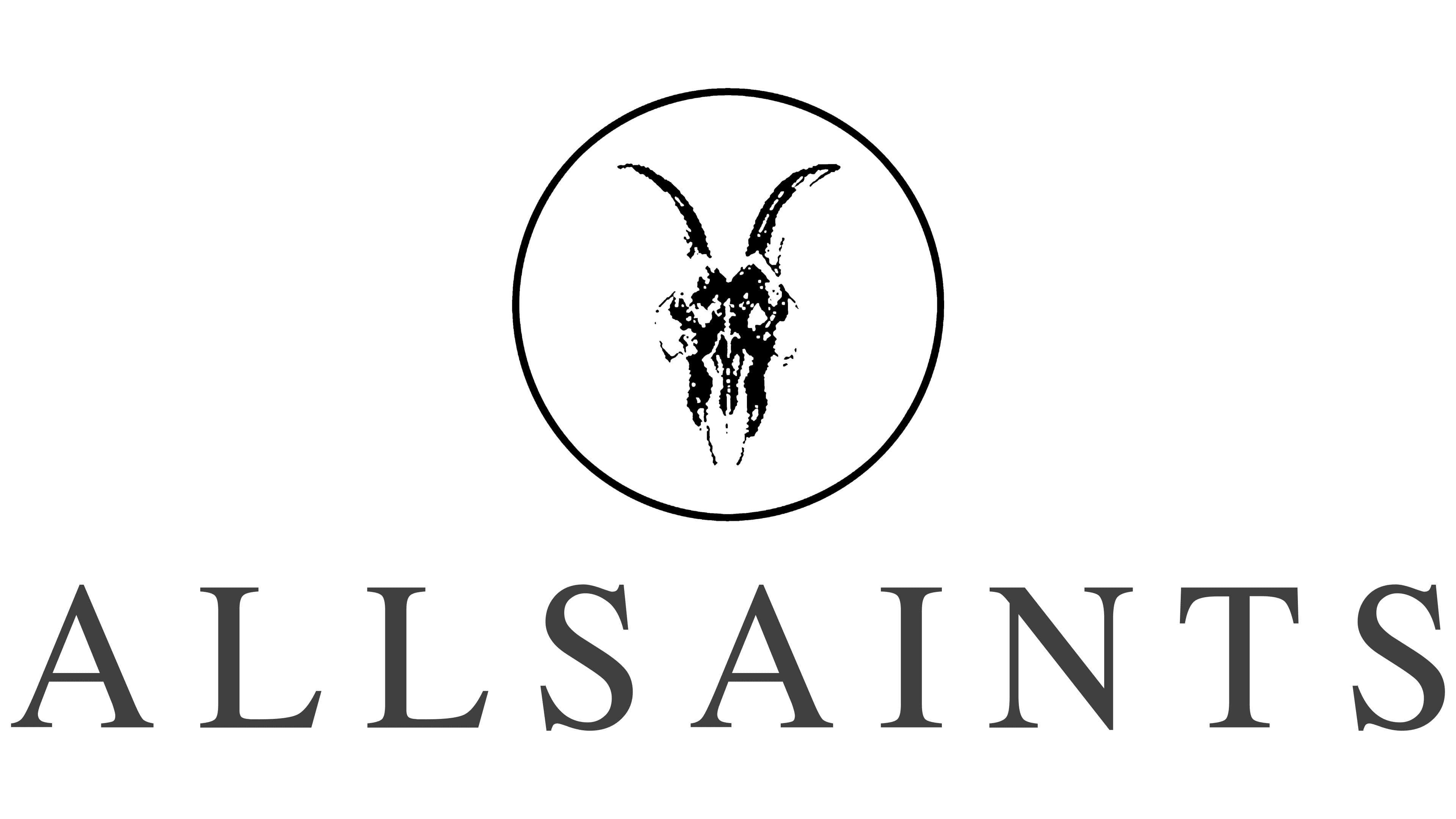
The AllSaints logo conveys a powerful, minimalist message that perfectly aligns with the brand’s spirit. It is built around three key elements: the name, the circle, and a symbol that sparks intrigue and evokes deep associations.
On a white background, bold black capital letters forming the brand’s name stand out with their strictness and simplicity. This reflects the edgy and somewhat dark style that has become recognizable for its rebellious character. The letters are elongated and sharp, symbolizing the brand’s confidence, strength, consistency, and reliability. This style was originally aimed at a male audience, which is evident in every logo element. However, as the brand evolved and introduced women’s lines, this style became universal and appealing.
A crucial element of the logo is the circle, at the center of which is the symbol of a ram’s skull. This element carries deep meaning and symbolism. The ram, depicted as a skull, is traditionally associated with strength and resilience, emphasizing the brand’s core concept: clothing for those who aren’t afraid to stand out, firmly hold their ground, and seek freedom in their style choices. The skull symbolizes eternity and timelessness, which is important for a brand that strives to transcend fleeting trends and create more than just fashion.
The circle around the skull creates a sense of completeness and unity. This element holds the composition together, highlighting the importance of each symbol in the emblem. It balances the skull symbol’s wildness and the form’s precise geometry.
This design, combined with its dark palette and symbols of strength and independence, reflects the brand’s essence. The logo has become a symbol of boldness, style, and steadfastness, underscoring the individuality of everyone who chooses this brand.