


Jus-Rol products began arriving in stores across the UK and Ireland in June 2026 with a new identity by Brandon Consultants. The ready-made dough and pastry brand updated its logo and packaging across its refrigerated and frozen ranges, including Ready to Create. The agency maintained the brand’s connection to its baking heritage while centering its message on the pleasure of baking at home.
Competition from supermarket private labels prompted the update. According to Brandon, store brands were adopting elements of Jus-Rol’s look as its growth slowed. Shoppers associated the brand mainly with ready-rolled puff pastry, even though its range included other products. The team needed to bring the range together under a consistent identity, reach new customers, and preserve familiar features for longtime buyers.
Jus-Rol’s history began in 1954. Tom Forsyth, from a family of bakers, started supplying grocery stores with puff pastry customers could roll out at home. The product reduced home-baking prep time. The name refers to the phrase “just roll,” an invitation to roll out the dough. Ready-rolled sheets, phyllo, croissants, and other products followed. In the updated identity, Brandon emphasizes the customer’s role in baking, with room to try new combinations and make food to suit personal tastes.
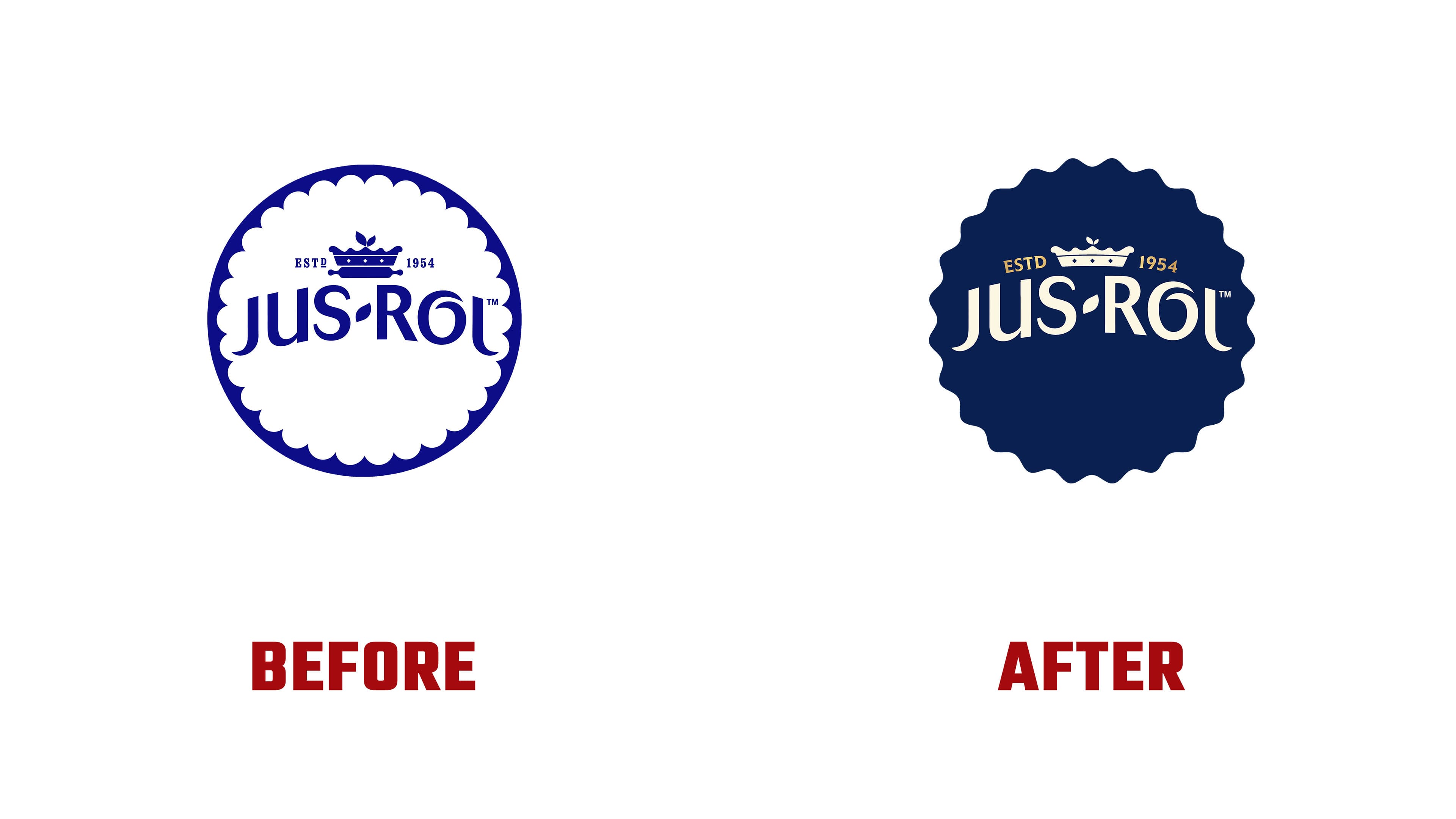
The crown and founding date carry the brand’s history into the logo. ESTD and 1954 flank the redesigned crown. The previous version included a rolling pin, while the crown and date now occupy the top of the emblem. The earlier logo was created by The Collaborators, which carried out two Jus-Rol updates under General Mills’ ownership. Its combination of a rolling pin and a pie suggested a heraldic crest, connecting baking expertise with the brand’s standing in the category.
Brandon reworked the circular badge. Previously, the name sat on a white field with closely spaced rounded cutouts along its edge, surrounded by a smooth dark blue border. The badge is now entirely dark blue, with a scalloped outer edge. It forms a single rosette containing the cream-colored name and crown, with the date picked out in gold. The top of the wordmark follows a gentle arc, echoed by the placement of ESTD and 1954.
The Jus-Rol lettering retains its defining features. The initial “J” and final “l” still have long, curved terminals. A short, angled stroke separates the two parts of the name, and an arched flourish runs above the rounded “o.” Thin strokes alternate with thicker ones. The designers adjusted the proportions, curves, and letter spacing to fit the wordmark into its new shape.
The designers associate dark blue, cream, and gold with product quality and the effort to distinguish Jus-Rol from store brands. The “It’s All Golden” campaign celebrates the pleasure of home baking. The brand encourages experimentation and a relaxed attitude toward an uneven pie edge or scattered crumbs. Evidence of the baking process becomes part of the homemade food story.
The packaging introduces radiating sunbeams and a rosette bearing the invitation “BAKE BOLD.” The Ready to Create label is accompanied by a gold brushstroke resembling a pastry brush mark. Colors distinguish the products, while photographs show sweet and savory baked goods with crumbs and drips of filling. Brandon’s project team included Client Partner Richard Colson and Design Director Rachel Griffiths. Statuo developed the updated website in collaboration with the brand and agency.