


Dutch group Unica has introduced a shared identity for its 55 technical services companies. WADM developed the new identity, which began rolling out in mid-June 2026. The businesses retain their names, autonomy, local ties, and company cultures. A shared emblem helps customers recognize their membership in the group and understand the opportunities for collaboration.
WADM spent a year and a half developing the positioning, tagline, and visual identity. The update follows Unica’s expansion. Its history began in Zwolle in 1933 with the installation company Geldersch-Overijsselsch Installatiebedrijf, abbreviated as G.O.I.B. The Unica name was introduced in 1956. Today, the group operates in energy, industry, building systems, IT, and security.
Customers previously saw the businesses as separate entities. Their different identities made it difficult to understand the group’s full range of services, from engineering system design to construction and maintenance. The new identity is intended to help clients recognize the companies’ combined expertise and introduce prospective employees to the range of careers within Unica. WADM therefore placed people, their knowledge, their sense of responsibility, and their collaboration at the heart of the project.
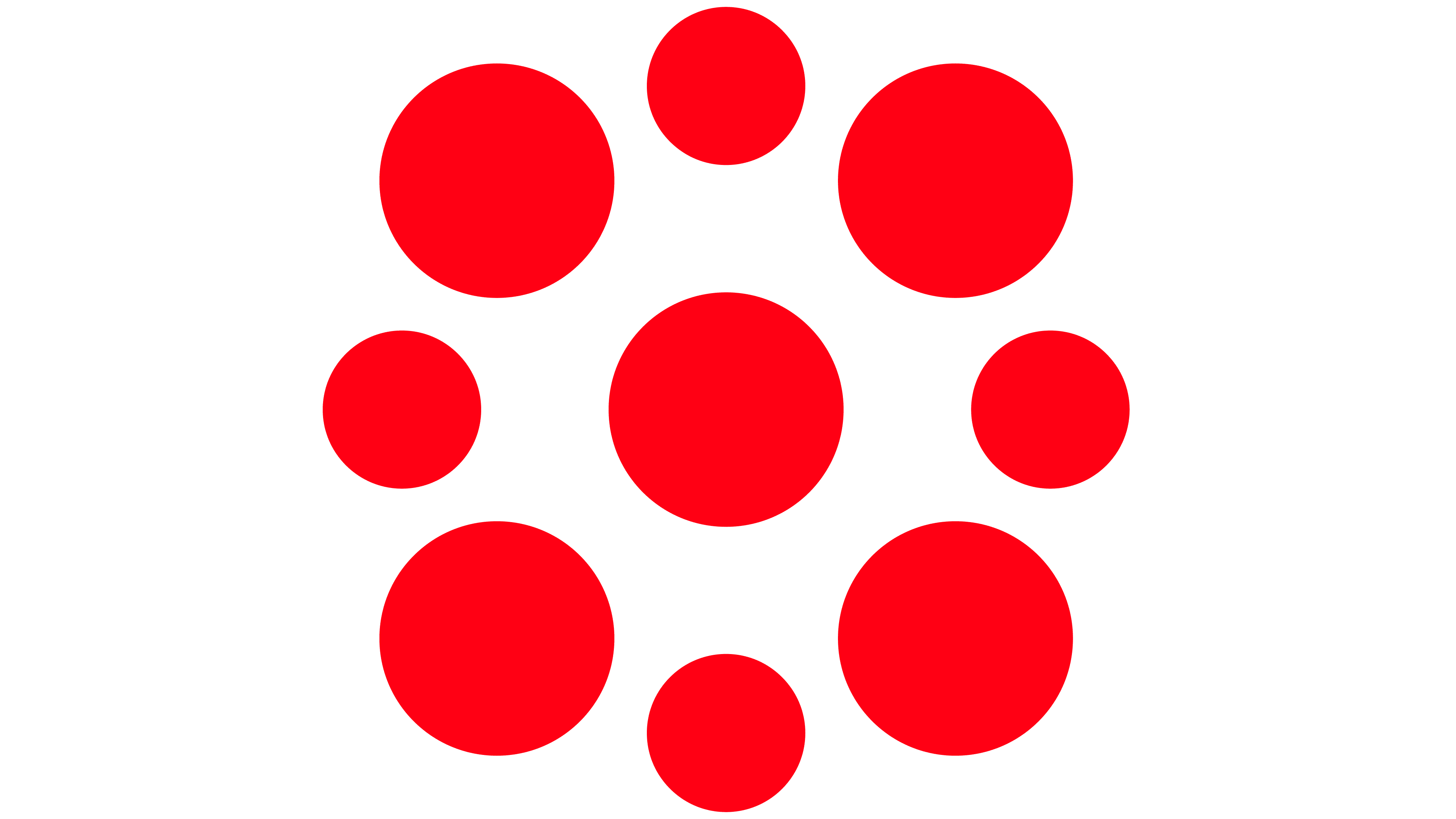
The shared emblem consists of nine red circles. One large circle sits in the center, surrounded by four large and four smaller circles in an alternating arrangement. The shapes are positioned symmetrically, with white spaces between them. The designers intended the circles to represent the businesses and specialists brought together within the group. All 55 companies use the emblem.
In the Unica wordmark, the designers combined uppercase and lowercase forms at a uniform height. A “U” with a rounded base sits beside an enlarged lowercase “n,” with their curves facing in opposite directions. The “I” is a single vertical stroke, and the “C” has rounded corners. A small red circle replaces the conventional crossbar inside the “A,” connecting the name to the emblem on its left.
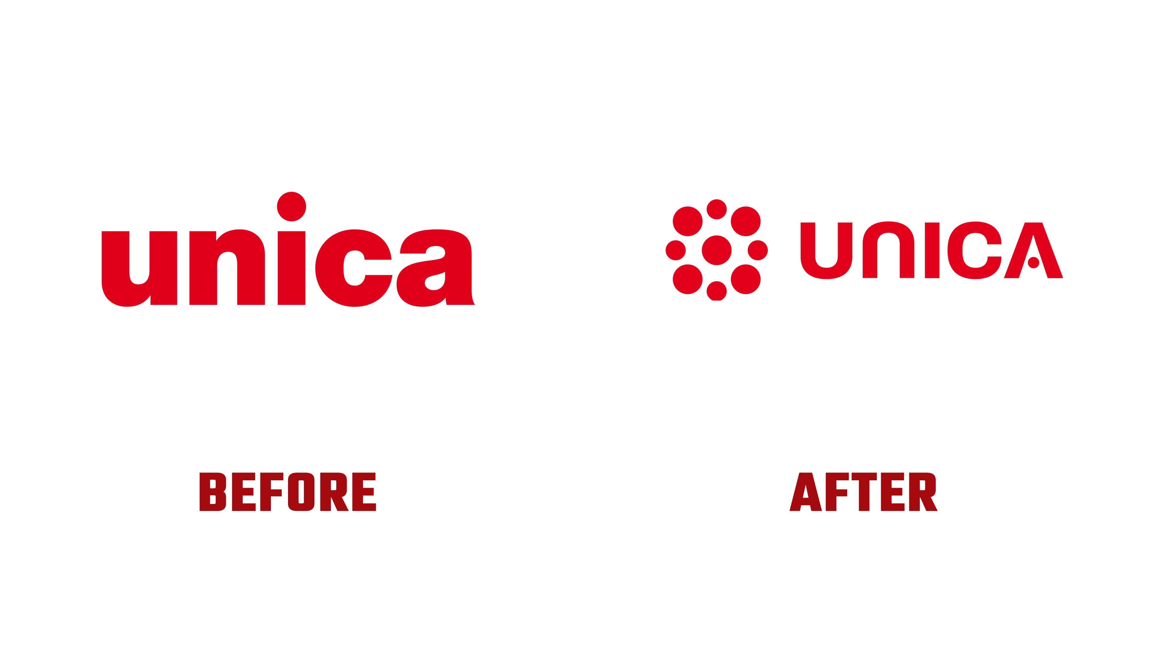
The previous logo consisted solely of a red lowercase unica wordmark. It featured heavy strokes, tight spacing, a round dot over the “i,” and a double-story “a.” The new version retains red while changing the letterforms and overall arrangement. Rounded shapes now connect the wordmark and symbol.
The tagline “United Can Do” extends the theme of collaboration. One typographic treatment conceals the group’s name within the phrase. The first three letters, “UNI,” in UNITED and the two letters “CA” in CAN are filled in. The remaining letters, including the word DO, appear as outlines. Read in sequence, the filled sections spell UNICA. The tagline expresses shared responsibility and a willingness to tackle challenges together.
Purple and orange complement red throughout the identity, including in gradients. Photographs appear inside the emblem’s circles. Other materials pair images of employees and work processes with rounded rectangular blocks. Shared guidelines apply to magazines, recruitment materials, advertising, and digital content.
The identity will gradually appear across the group’s websites, workwear, buildings, and vehicles. WADM is responsible for the brand concept and visual identity, while TheOthers handles launch events and animation. VIM Group | Team Farner is managing implementation, and Stijlgenoten Creatieve Communicatie is developing the website.