


The University of Augsburg’s faculties, research centers, and initiatives now share an identity from Munich agency Zeichen & Wunder. The project was unveiled in late April 2026, with the university announcing the launch on April 29. The identity centers on the abbreviation uniA, with connected “u” and “n” letters expressing the idea of collaboration.
The update is intended to unite departments working across different subjects and audiences, establishing their place within a single academic community. The agency drew on the university’s motto, “Scientia et Conscientia,” meaning “Knowledge and Conscience.” The designers connected its meaning to responsibility in research and used the logo’s form to express interaction across disciplines.
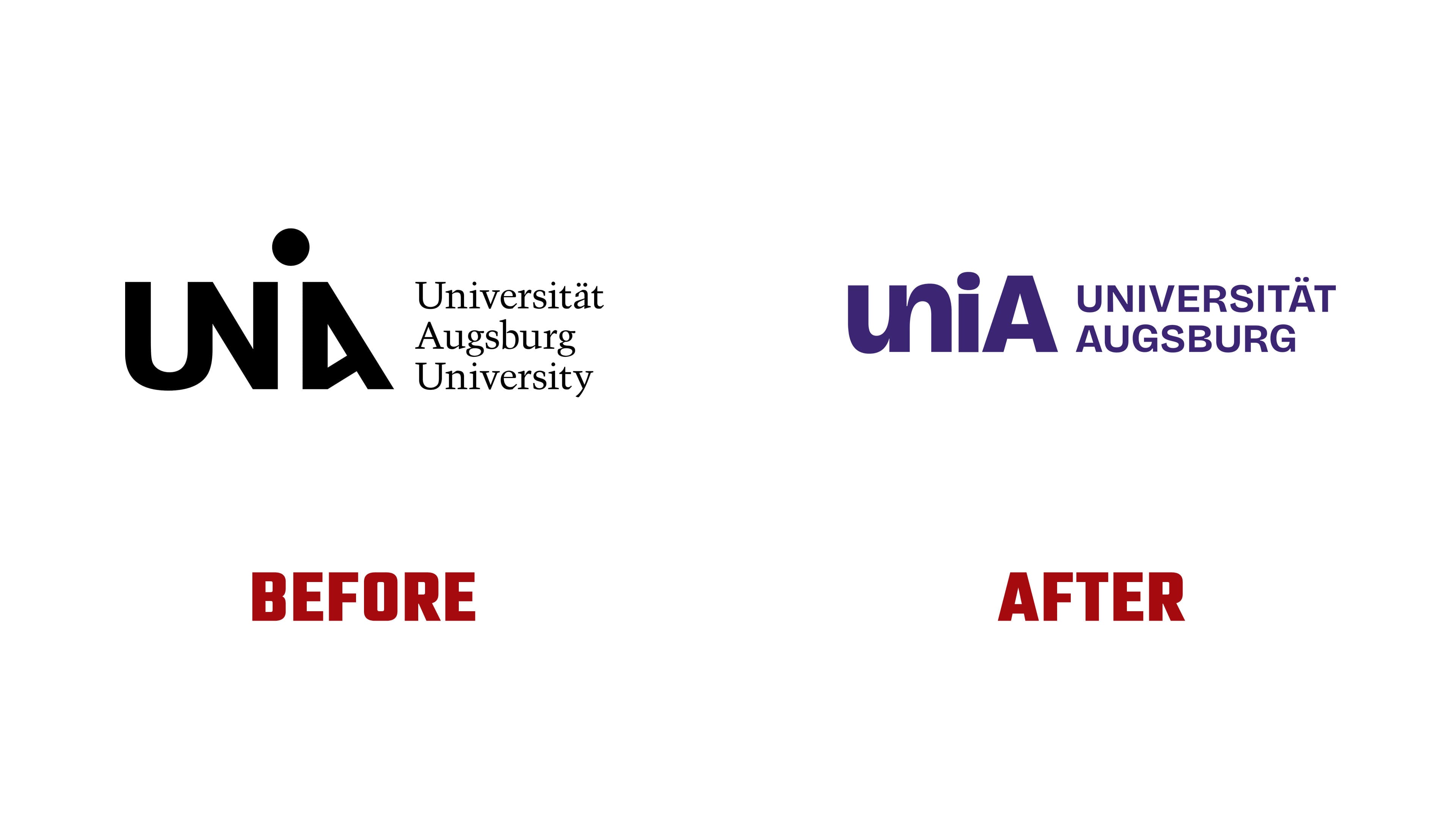
In the uniA wordmark, the lower curve of the “u” flows through a shared stroke into the upper curve of the “n.” Together, the two letters form a smooth wave. A lowercase “i” and an uppercase “A” follow, referencing Augsburg. Rounded sections sit alongside vertical and diagonal strokes, preserving the distinct letterforms within the abbreviation.
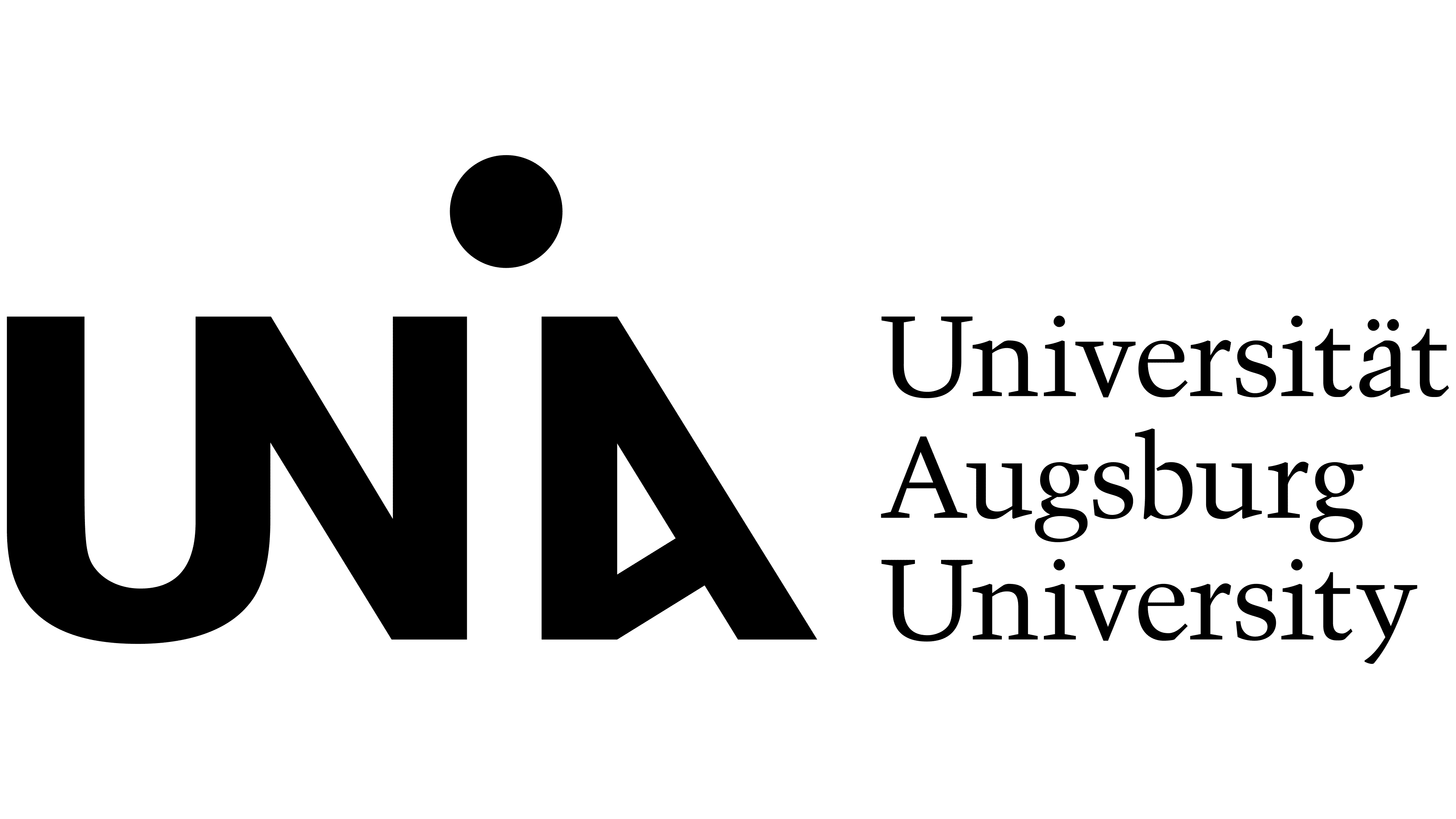
The previous logo was created in 2009 by Augsburg agency Ottmann und Pöhl. It also featured connected “U” and “N” letters. Between them, an asymmetric “A” with a slanted crossbar was separated by a gap topped with a round dot. The space beneath the dot suggested an “i.” In the new version, that letter has a vertical stem. In contrast, the “A” has symmetrical sides joined by a horizontal crossbar. Curves replace the angular connection between the first two letters.
The full name beside the abbreviation has also been reworked. Previously, Universität Augsburg University appeared on three lines to the right in the serif typeface Trump Mediäval. The German version now occupies two lines, reading UNIVERSITÄT AUGSBURG. The uppercase letters are more tightly spaced and use a sans-serif typeface. It combines strokes of varying thickness with small notches at the joins, known in typography as ink traps. Dark purple replaces black in the logo.
The system includes horizontal and vertical versions, a standalone uniA wordmark, and the English name UNIVERSITY OF AUGSBURG. Space beneath the main logo is reserved for faculty and center names. The university logo takes priority, with an additional line identifying the department or initiative. This arrangement maintains a consistent structure as the supporting name changes.
The curve formed by the connected “u” and “n” provides the basis for patterns and large background shapes, including dimensional and gradient treatments. Bright purple and light backgrounds complement the dark purple. The identity was developed for digital platforms, printed materials, and campus applications. Files and templates are available through a brand portal. At launch, the new logo appeared on the website’s homepage, social media, and flags at the main and medical campuses.
The transition was scheduled for the summer semester of 2026. Beginning in May, new publications follow Zeichen & Wunder’s guidelines, while existing materials bearing the previous emblem remain in use until supplies run out. The Bavarian State Ministry of Science and the Arts funded the project under its agreement with the university covering 2023 through 2027.