


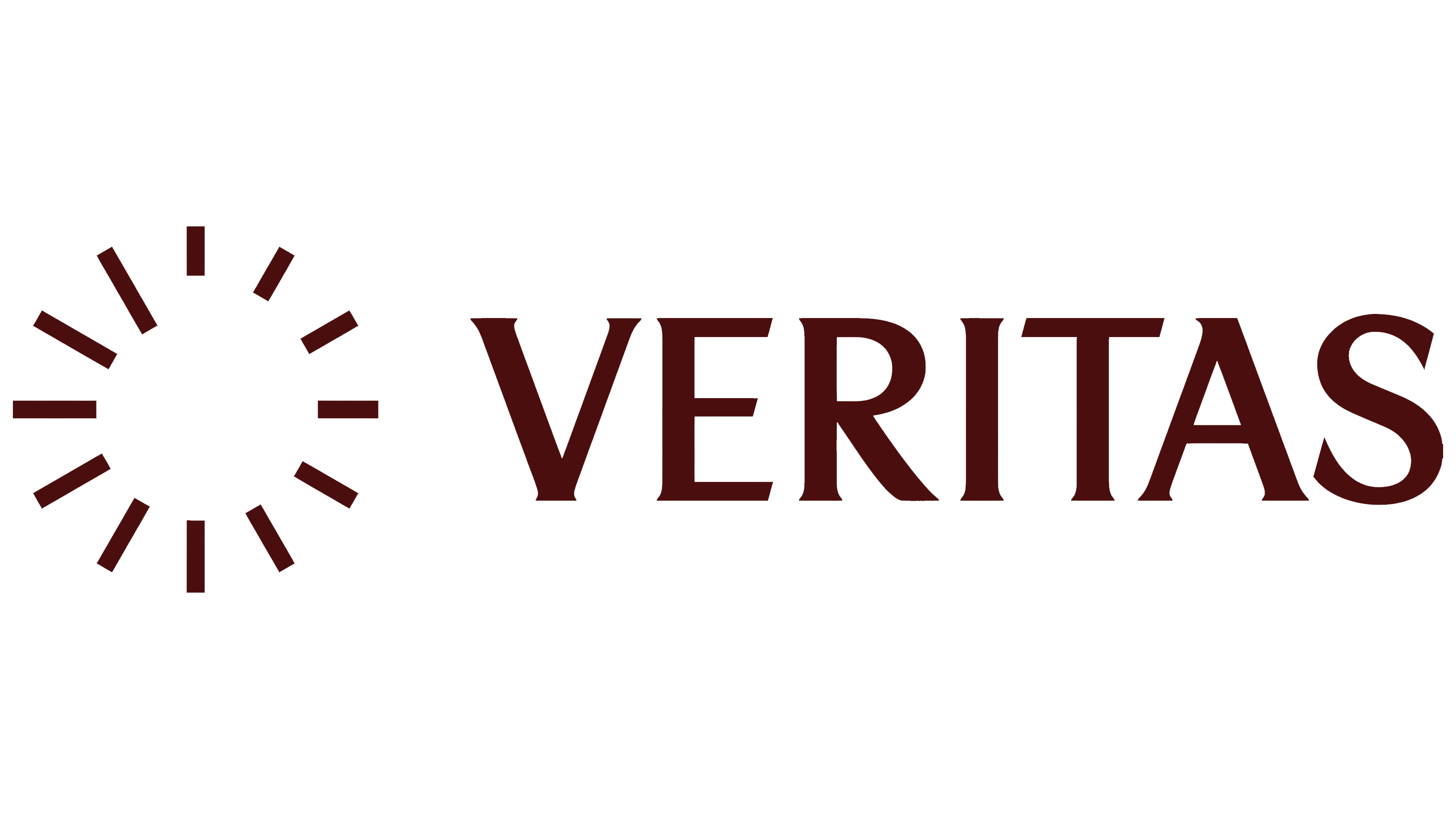
The factory tower’s clock provided the starting point for VERITAS’s identity in the planned district of Wittenberge. Berlin-based Sonder Studio developed the brand for the former sewing machine factory site, where plans call for hotels, restaurants, offices, and cultural venues. The theme of time connects its industrial past to the area’s next chapter.
The factory opened in the early 20th century as a Singer plant. It continued producing sewing machines during the East German era. In 1989, it employed 3,200 people. For Wittenberge residents, its history encompasses generations of work and the eventual closure of production. In June 2021, the city presented the new owner’s plans to open the grounds to visitors and introduce cultural institutions.
Sonder Studio needed to respect the local community’s memories while presenting the future district to tenants, investors, and cultural partners. The team retained the historic VERITAS name, and the factory’s architecture formed the basis of the logo. The team completed the work in 6 weeks under the direction of studio cofounder Caroline Kasper. The project appeared in the design press in July 2026.
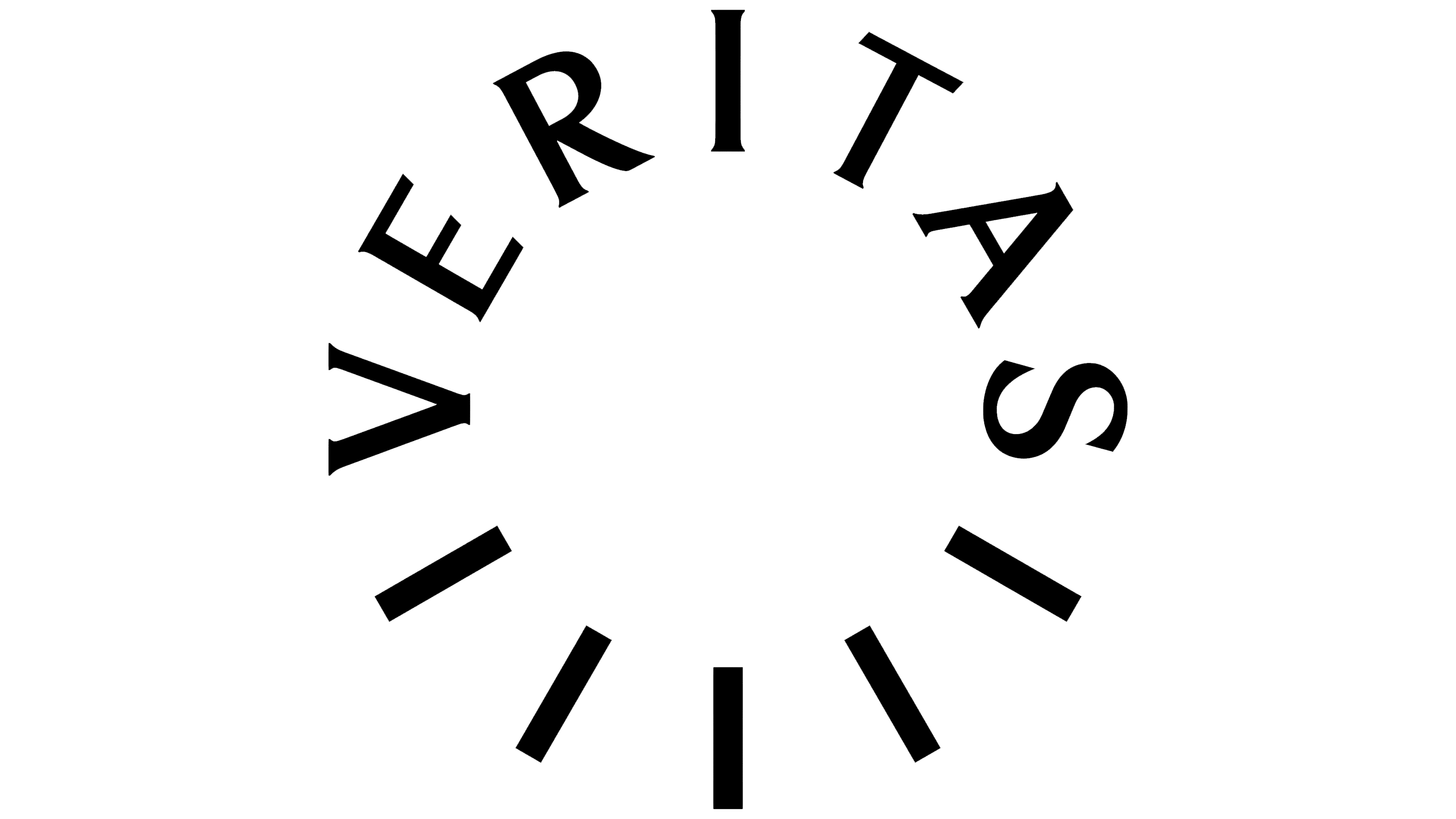
Built in 1928-1929 to supply water to the Singer factory, the tower became a local landmark for its clock. The designers used 12 radial strokes to mark the hours. Numbers, hands, and an outer border gave way to an open structure. Strokes of varying lengths form a circle around an empty center.
In the horizontal version, the clock face sits to the left of the uppercase VERITAS name. In the circular version, the name becomes part of the symbol. Its seven letters occupy the top and sides, while five hour markers complete the lower arc. The letters rotate along the circumference, with their height matched to the stroke length. When placed over a photograph, the open center reveals people, buildings, and textures beneath it.
The circular form relates to the motto “Forever evolving.” The designers intended the continuous cycle to express the site’s transformation as an extension of its history. The clock evokes the passage of time, while the symbol’s ability to change shape reflects how the district’s programming will develop alongside its participants. In animation, the letters rotate in three-dimensional space, appearing as lines when viewed edge-on. The entire arrangement turns clockwise.

Stockholm-based Victoria Englund refined the lettering. The capitals feature flared stroke endings and short serifs. The “V” combines thick and thin diagonals, while the rounded bowl of the “R” extends into a long diagonal leg. The bars of the “E” and “T” end in angled cuts. The letterforms recall carved inscriptions, connecting the name to architecture. This custom lettering appears in both logo versions.
The colors draw from the surrounding buildings and natural environment. The identity combines dark green, cream, lilac, brown, terracotta, and light pink. The horizontal logo is shown in white against a dark reddish-brown background. Different color combinations distinguish areas of the program, united by the circular symbol and photographs of Wittenberge by Thomas Kaiser.