


Visit Group has brought its hospitality software products together under the name VISIT. Essen International developed the new name, logo, and identity. The update presents the expanded group as a unified platform for managing the guest experience, from booking to arranging activities. An emblem made of 4 arrows pointing toward a single center represents the connection between its services.
The company’s history began in 1999 with the development of Citybreak in Gothenburg, Sweden. iTicket and BookVisit followed, and VisBook, Olery, Godo, Travia, vOffice, and Beds24 later joined the group. As the portfolio grew, the individual names struggled to convey the full range of its offering. Today, the company has more than 400 employees across 8 countries. Its products serve more than 10,000 customers in over 150 countries, including hotels, resorts, short-term rental operators, tourism destinations, and attractions.
The name VISIT connects the platform to the guest experience. As both a noun and a verb, “visit” naturally connects to travel and hospitality. Essen International reorganized the brand structure and refined product names and descriptions to explain how the services fit within the overall offering. The accompanying line, “Destined for more,” speaks to opportunities for customers’ businesses and the platform’s continued growth.
The emblem is built from 4 repetitions of the initial “V,” transformed into angular arrows and rotated inward. According to Essen, these converging shapes represent guests arriving from different directions and software products brought together around a shared platform. The negative space between the arrows forms a four-pointed star. Its points extend into narrow gaps between the colored shapes. VISIT describes the star as a guide in a changing industry and associates it with trust in the platform.
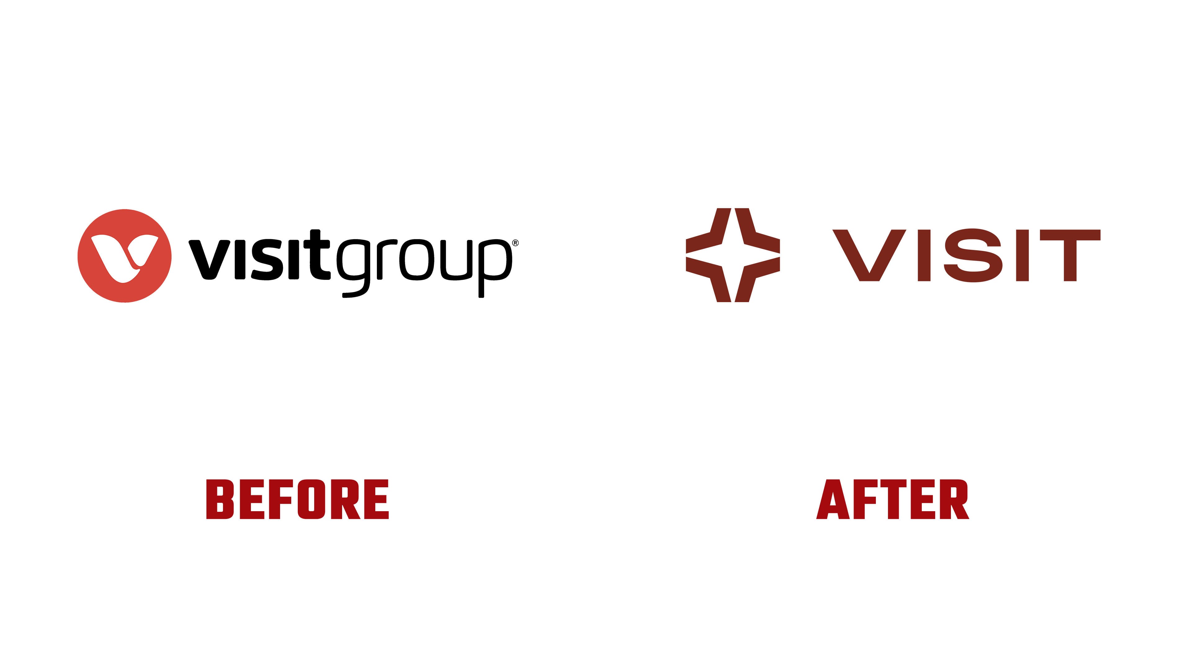
The previous logo featured a red-orange circle containing a white “v” formed from two rounded shapes, with “visitgroup” written as a single word to its right. The name was lowercase, pairing a bold “visit” with a light “group.” The new logo places the shorter name, “VISIT,” in uppercase beside the open emblem. A generous gap separates the wordmark from the arrows, and the lettering now uses a consistent weight throughout.
The heavy sans-serif letters have uniformly thick strokes. The “V” has a wide opening, both “I” letters are vertical bars, the “S” extends horizontally, and the “T” has a long top bar. Together, they give the wordmark broad proportions.
The logo is a dark reddish brown. Elsewhere in the identity, burgundy is paired with soft beige, connecting the technology company to hospitality and travel. The star formed by the emblem’s negative space appears in repeating patterns. Alongside the identity, Essen International created the visit.com website.