


![]() BMW Alpina Logo PNG
BMW Alpina Logo PNG
The BMW Alpina logo is a prototype of the wheel of fortune. The badge indicates the engine’s flawless operation and the precise fit of the parts, ensuring a perfect ride. The sign symbolizes the combination of components used in long- and high-speed races.
ALPINA emerged in the early 1960s in Buchloe, Germany, founded by Burkard Bovensiepen, whose family business had focused on typewriters. In 1962, he developed a Weber dual-carburetor system for the BMW 1500, a modification that received official approval from BMW and marked an unusual level of trust toward an external engineer. That moment laid the groundwork for a long technical relationship and shifted the company’s focus toward performance development for BMW cars.
By the mid-1960s, ALPINA moved from individual components to complete vehicle projects. The ALPINA name was registered as a trademark in 1965, and the company subsequently entered touring car racing. Cars prepared in Buchloe achieved strong results in European championships, including the ETCC, helping establish the brand within professional motorsport. During the 1970s, the company evolved into a low-volume manufacturer, building cars based on BMW platforms with proprietary engines, transmissions, suspension setups, and interiors.
In 1978, German authorities formally recognized ALPINA as an independent automobile manufacturer. Over the following decades, attention gradually shifted from racing to road cars designed for sustained high-speed travel. Production remained limited and largely hand-built, with cars sold through BMW dealers under ALPINA VINs. This structure continued into the 2010s. In 2022, “BMW AG” announced the acquisition of the ALPINA brand, with vehicle production under the ALPINA name scheduled to conclude at the end of 2025, while Buchloe would retain responsibility for service, restoration, and heritage-related work tied to “Alpina”.
Meaning and History
![]()
According to official figures, Alpina Burkard Bovensiepen GmbH & Co. KG was founded in 1965. However, the prerequisites for its appearance arose much earlier, back in 1962, when Burkard Bovensiepen from the industrial dynasty invented the Weber double carburetor. BMW executives appreciated the new part and immediately certified its quality.
It is worth noting that Burkard did not initially plan to associate his life with spare parts. Initially, he was engaged in typewriter manufacturing and later attempted to transition to textile fiber processing, but both efforts were unsuccessful. As a result, the entrepreneur devoted most of his time to tuning cars and leased an outbuilding at a typewriter factory.
What is Alpina?
This renowned German automaker collaborates closely with BMW to create high-end premium vehicles. It transforms BMW models into unique cars by applying mechanical enhancements, custom interior designs, and distinctive exterior elements, including multi-spoke wheels and signature stripes. These cars stand out from standard BMW models for their elegance and enhanced performance, combining traditional craftsmanship with advanced engineering at specialized production facilities.
1965 – 2026
![]()
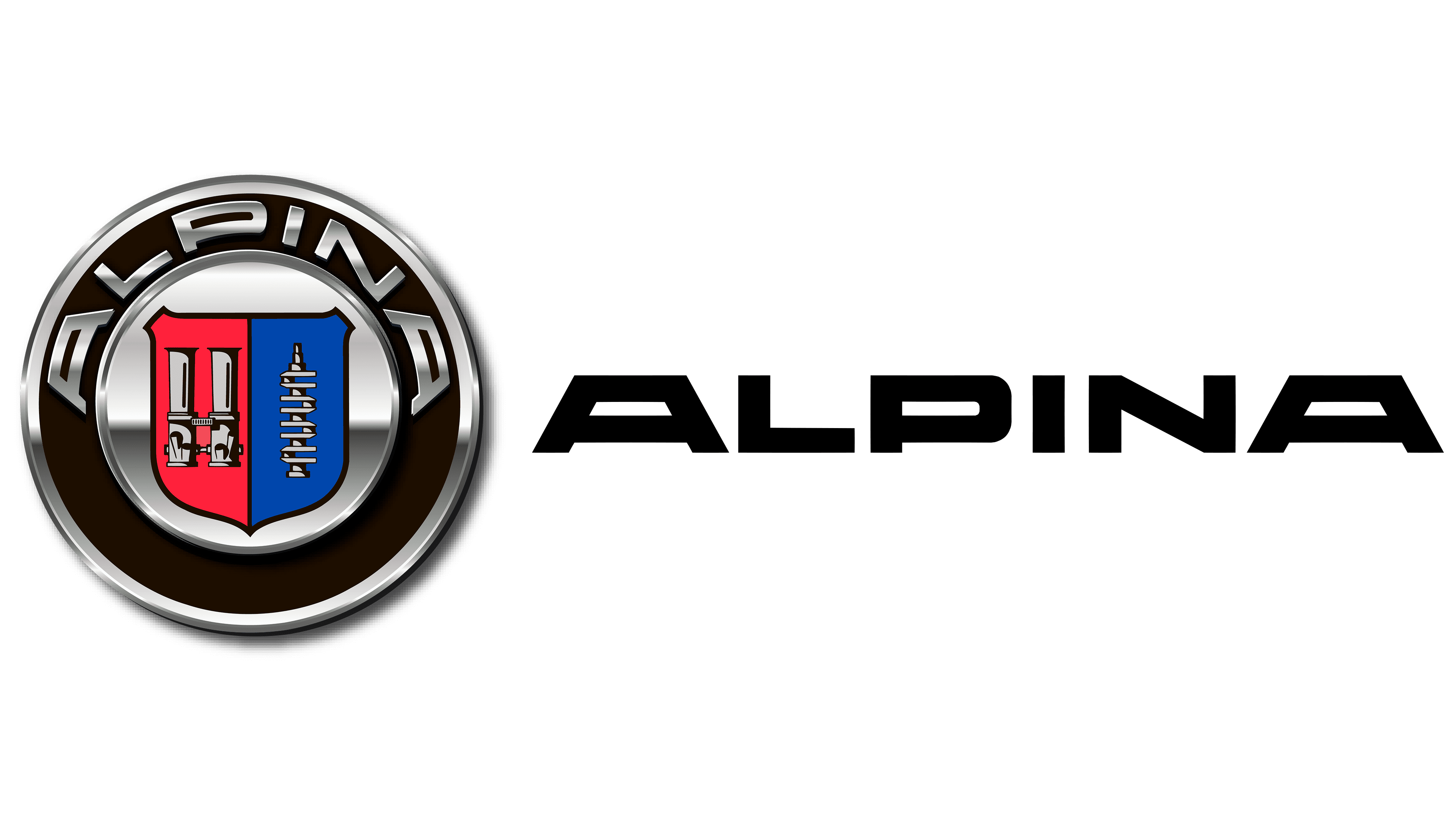
Burkard commissioned a logo for his tuning business to clarify the company’s services. The designers created a round silver badge with a wide black border. Two light stripes surround the ring and bear the inscription “ALPINA” in the upper half. The brand name is visible due to the bold capitalization.
The emblem’s design is similar to a classic coat of arms; however, among the heraldic elements, only a shield appears. It has an irregular shape, including a sharp corner at the bottom and two ridges at the edges. The shield is vertically divided into two equal segments: red (left) and dark blue (right). A thin black stripe runs between them and merges with the same-color outline. The red half shows the Weber twin carburetor, the first Alpina development for BMW. On the right is the crankshaft, another component that enables BMW engines to deliver increased power. The logo was created in 1967, two years after the tuning company’s founding.
The badge’s heraldic shape underscores Alpina’s commitment to tradition. Simultaneously, modern design solutions combined with a three-dimensional effect embody the desire for future technologies. However, the parts shown on the billboard remind us that Alpina is not an independent car manufacturer. The company is committed to improving BMW cars’ performance and marketing them under its brand, replacing the traditional BMW symbol with its emblem.
2026 – today
![]()
One of the world’s most renowned tuning brands has been acquired by one of the largest automotive groups. As of January 1, 2026, Alpina became part of BMW. The two sides spent three years moving toward this step, bringing to an end the brand’s long period of independent existence.
Within BMW, the transition is discussed with an understanding of the significant responsibility of integrating Alpina into the group, and with an emphasis on preserving the brand’s history. The next phase of development is conceived as a logical continuation of the accumulated experience and traditions that have shaped Alpina’s reputation over decades of work, without breaking with history or revising its fundamental reference points.
A new BMW Alpina logo accompanied the transition. Its design references the asymmetric Alpina mark of the 1970s and reinforces the brand’s connection to its early history.
The wordmark is built on strict typography. The typeface is based on an elongated grotesque with geometric construction and increased letter spacing. Uppercase letters are used. The typography conveys a sense of engineering precision and technical rigor.
The overall image resonates with high-end automotive engineering, emphasizing performance and control.
BMW has confirmed that Alpina will remain an independent brand. Going forward, the marque will focus on maximum performance and a high level of ride comfort, while maintaining its signature driving manner. Speed, comfort, and maneuverability form the foundation of its future positioning.
Font and Colors

The inscription is visible thanks to the capital letters. Still, readability is reduced by the disproportion: the characters are stretched horizontally and aligned in an arch. The situation is improved by the designers’ use of a sans-serif font. By the way, the width of the lines in the word approximately matches the thickness of the silvery rings bordering the frame on the emblem.
In some cases, silver can be replaced with white to make printing easier. The palette also includes other colors: classic black (top, with a black-to-gray gradient), red, and blue. The last two are presented in rather dark shades and divide the shield into equal parts. Given that these colors are used in the heraldic structure, they may have a hidden meaning related to car manufacturing.