


![]() Alstom Logo PNG
Alstom Logo PNG
Building a railroad requires a high level of concentration and an original visual identity. The French company has it all: the Alstom logo symbolizes product reliability, and the range is rich in choice. The best design solution is a harmonious balance between the identity and the product range.
Alstom was registered in France on June 22, 1928, after the merger of SACM and Compagnie Française Thomson-Houston, the French arm of Thomson-Houston Electric Company, a predecessor of General Electric. Its original name, Alsthom, combined “Alsace” and “Thomson,” while Belfort became the company’s base.
In 1932, Alsthom bought Constructions Électriques de France, strengthening its electric locomotive and hydraulic equipment business. In 1955, its CC 7100 locomotives set a rail speed record of 331 km/h. In 1969, Compagnie Générale d’Électricité took control, and in 1976, Alsthom merged with Chantiers de l’Atlantique to become Alsthom Atlantique.
The company became central to high-speed rail. In 1978, it delivered the first TGV trainset to SNCF, and in 1981, regular TGV service opened between Paris and Lyon. In 1989, Alsthom formed GEC Alsthom with the power division of Britain’s General Electric Company. The group later built trains for Eurostar and the Channel Tunnel. In 1998, after listing its stock on the Paris, London, and New York stock exchanges, the company dropped the “h” and became Alstom.
The 2000 purchase of ABB’s turbine business resulted in severe losses, and by 2003, Alstom was near collapse. France provided support in 2004, while Bouygues bought the state stake in 2006. In 2007, a TGV POS reached 574.8 km/h. After selling its power and grid units to General Electric in 2015, Alstom focused on rail, competing with Siemens Mobility and CRRC. In 2021, it completed the purchase of Bombardier Transportation for € 5.8-6.2 billion.
Meaning and History
![]()
During Alstom’s time on the market, there have been nine logo variations. With each redesign, it became more modern, with new details added to strengthen the brand’s visual identity and its recognizability among potential customers.
What is Alstom?
First of all, it is one of the world’s leading producers of railway vehicles, with almost a century of experience and modern technologies.
1928 – 1930
![]()
The original version of the logo consisted of a wordy name and three horizontal lines, two at the bottom and one at the top. At the same time, only black was used for all the logo elements. Between the elements, “Als” and “Thom” in the name, was a dot located in the central part of the intercharacter space. A classic sans-serif bold typeface with capital letters was chosen for the lettering.
1930 – 1961
![]()
The previous version of the logo lasted only two years, and the first redesign took place in 1930. It was about minimizing the image. All three horizontal lines were removed, as was the dot in the name. At the same time, the font remained unchanged, although the letters became wider. Also, the color of the Alsthom logo became closer to grey.
1961-1976
![]()
At this stage, the key elements of the logo were not the corporation’s name but the emblem placed over it. It is a black square with a black letter “A” inside, outlined in white.
1976 – 1980
![]()
The lettering was completely removed from the logo. The logo’s basis was now a stylized arrow and the two intertwined letters “A”. These letters formed a single whole, thanks to the elongated diagonal line.
1980 – 1985
![]()
Interestingly, in the 80s of the 20th century, the company had a slightly different name, namely Alsthom Atlantique. This is also shown on the logo. In general, the lettering font was identical to the previous versions. The name was displayed in two lines. The only additional element was the two thick horizontal lines below the lettering.
1985 – 1989
![]()
In 1985, the company returned to its original name. Thus, the word “Atlantique” was no longer used and was removed from the logo. The font for the lettering remained identical. Also, the two horizontal lines under “Alsthom” have changed slightly. One of them became much narrower than before.
1989 – 1991
![]()
In 1989, the company merged with one of the market leaders, namely the British corporation General Electric. As a result, the acronym “GEC” was added to the previous version, lengthening the logo and the horizontal lines.
1991 – 1998
![]()
The 1991 redesign made the logo look more modern and fresh. The lines in the lettering became much thinner, creating a friendly, positive vibe. At the same time, there is a distance between the letters. Additionally, a red triangle appeared above the name “Gec Alsthom,” which looks down.
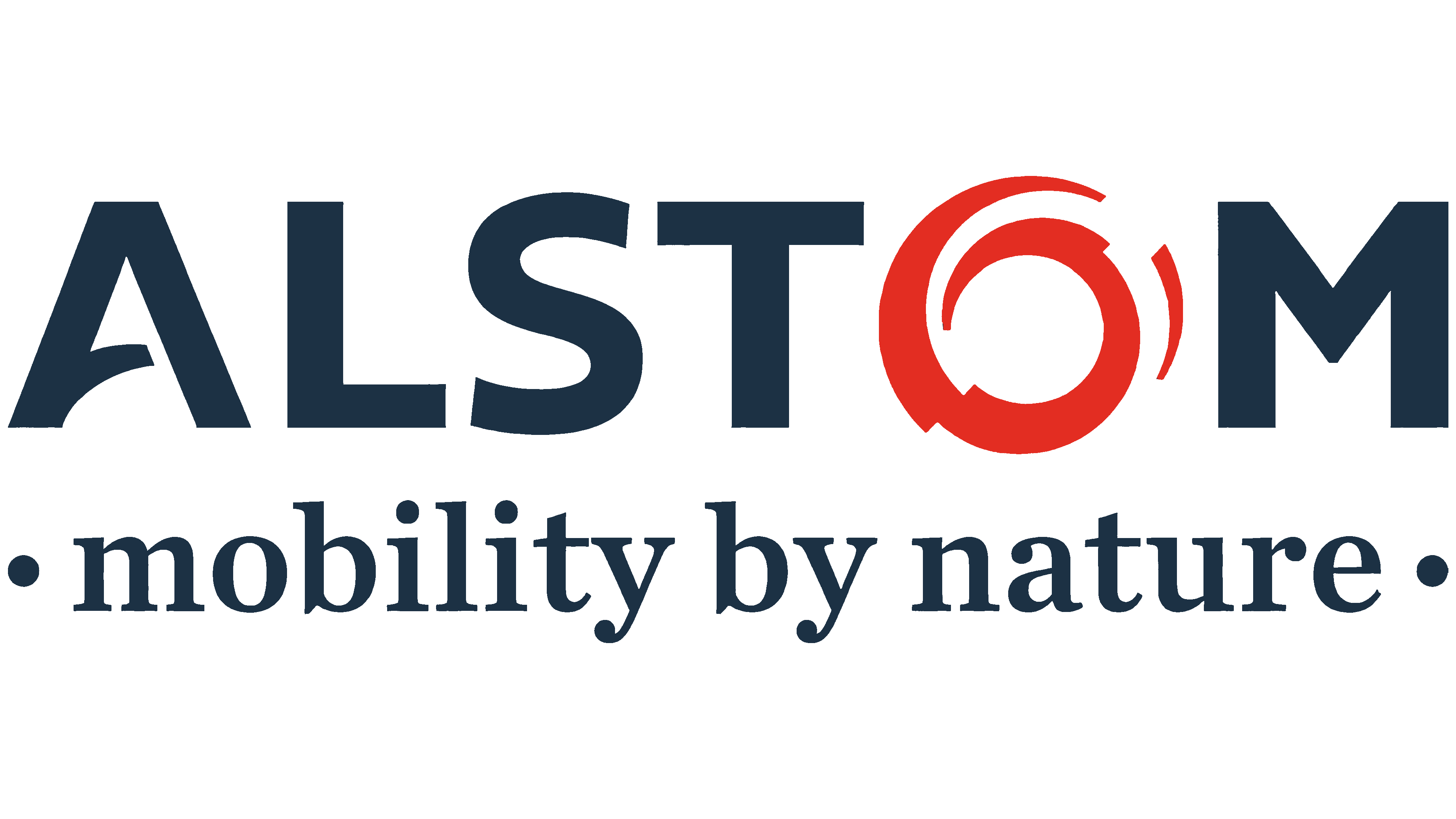
1998 – today
![]()
The last logo redesign to date took place in 1998. It was a verbal inscription with no additional elements. It was written in capital letters without serifs. All letters are adequately shaped and, therefore, easy to read. The only exception is the horizontal line in the letter “A,” which is slightly angled. This looks modern and fresh, attracting users’ attention. The main inscription is made in uppercase blue letters.
At the same time, the letter “O” stands out as the logo’s emblem. The red color chosen for it is not used by chance. It is associated with passion and desire. Overall, this letter resembles a swirl, creating an abstract image that points to the future. Thus, it creates a sense of progress and development.
Sometimes, a company slogan appears beneath the logo: “Mobility by Nature.”
Font and Colors
Before the 1998 redesign, the classic sans-serif font was used. It is a stylish and unique font with a slightly whimsical lettering style, and one of them stylized as an emblem.

At almost all stages of the company’s development, the color palette was based on black. However, the latest redesign has led to significant changes in the writing style and color palette. Today, it is dark blue, which should be associated with tranquility and a desire to develop.