


![]() Always Logo PNG
Always Logo PNG
The Always logo shows stability and protection. The emblem promises women impeccable cleanliness, even in high humidity. The company’s products keep dry under any circumstances. And this is the main quality of all brand products.
The history of Always began in the early 1980s within Procter & Gamble, founded in 1837. Engineer Tom Osborne worked on improving sanitary pads, focusing on thinner absorbent layers and adding side wings to prevent shifting.
The project faced internal resistance because Kotex, a Kimberly-Clark brand, controlled the category. Test launches began in the US in 1983, and Always was released nationwide in May 1984.
The product changed usage patterns by combining reduced thickness with higher absorption and better fixation. By the end of 1984, Always had expanded to the UK, Canada, France, Germany, and markets in Africa and the Middle East, becoming one of the first large-scale global brands for P&G.
In 1985, winged pads became part of the standard line. In 1990, ultra-thin products were introduced, further reducing size while maintaining performance and shaping the brand’s technological base.
Expansion required regional adaptation. In Asia, the brand was introduced as Whisper to reflect cultural sensitivity. It entered India in 1989 and became one of the first to openly advertise sanitary products. In other regions, names such as Orkid, Lines, Evax, and Ausonia were used.
By the 2000s, Always had established a stable position across multiple markets, supported by continuous product updates and distribution scale.
In 2014, communication shifted with the #LikeAGirl campaign by Leo Burnett, reaching 85 million views. In 2015, a shortened version aired during the Super Bowl, bringing the category into a broader media context.
Meaning and History
![]()
The Always brand acquired its logo right away, in the year it was founded. Throughout its existence, it has undergone four updates.
What is Always?
Always is an American company that specializes in producing all types of feminine pads. This subsidiary of Procter & Gamble was launched in 1983. Gradually, it expanded its product range to include vaginal wipes and disposable underwear.
1983 – 1994
![]()
The debut emblem features an imitation flower in delicate pastel colors. It has one pink petal and two elongated leaves. They are located to the right and left, pointed in different directions with sharp ends. A thin green ring surrounds all elements. Below is the series title in italics.
1994 – 2002
![]()
After the redesign in the second half of 1994, the trademark was updated. The developers replaced the circle with an oval, which was placed diagonally. They made the green leaves blue and the letters white, adding dark shadows for contrast. The lettering style was also corrected by lengthening the tail of the letter “y.”
2002 – 2010
![]()
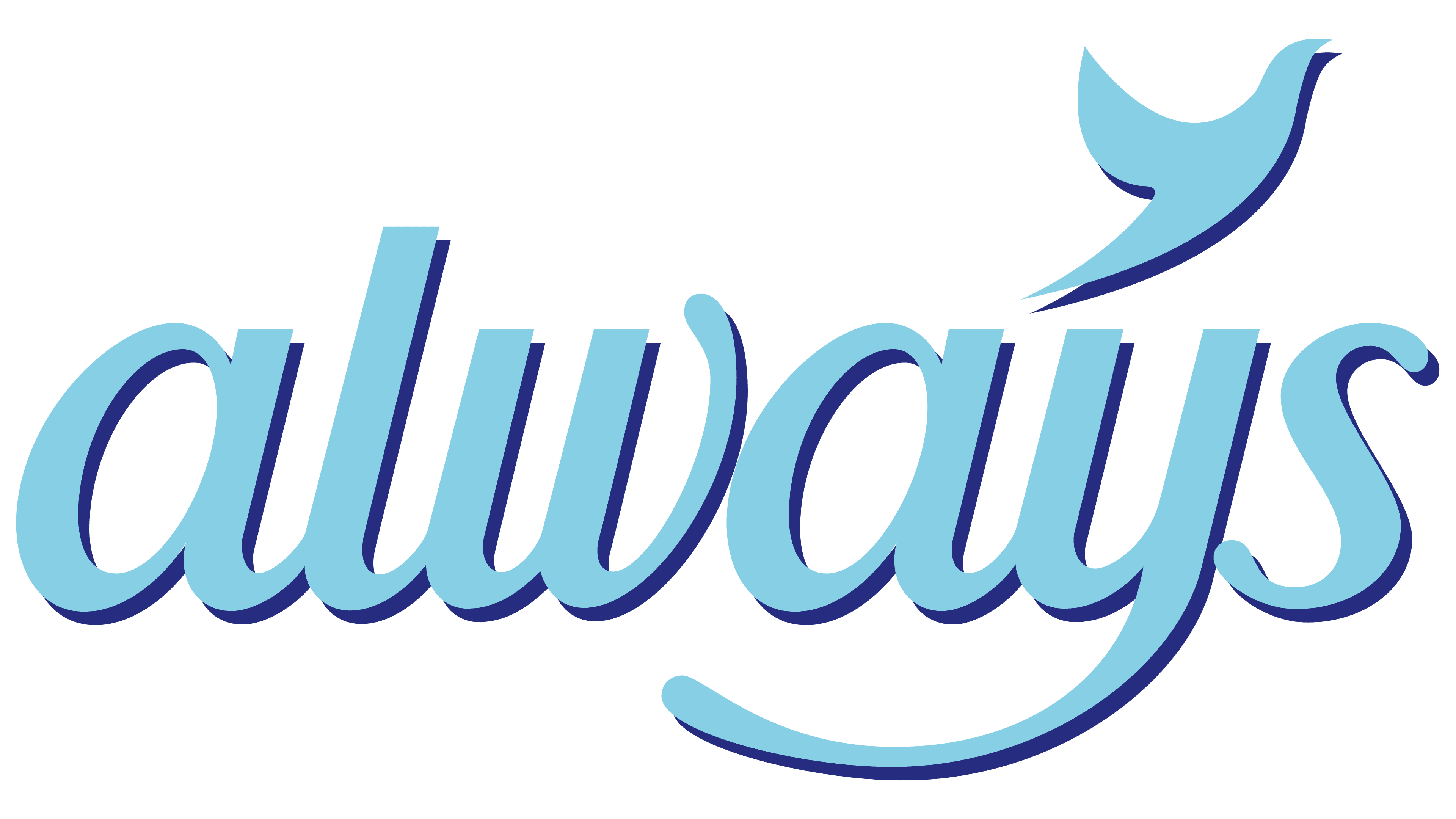
During this period, a completely different emblem was in use, a more minimalistic one. The manufacturer ditched the graphic element and focused on the brand name. The word “always” was written in thin calligraphic handwriting, tilted slightly to the right. Above “y,” the designers placed a miniature bluebird – a symbol of dreams.
2010 – 2015
![]()
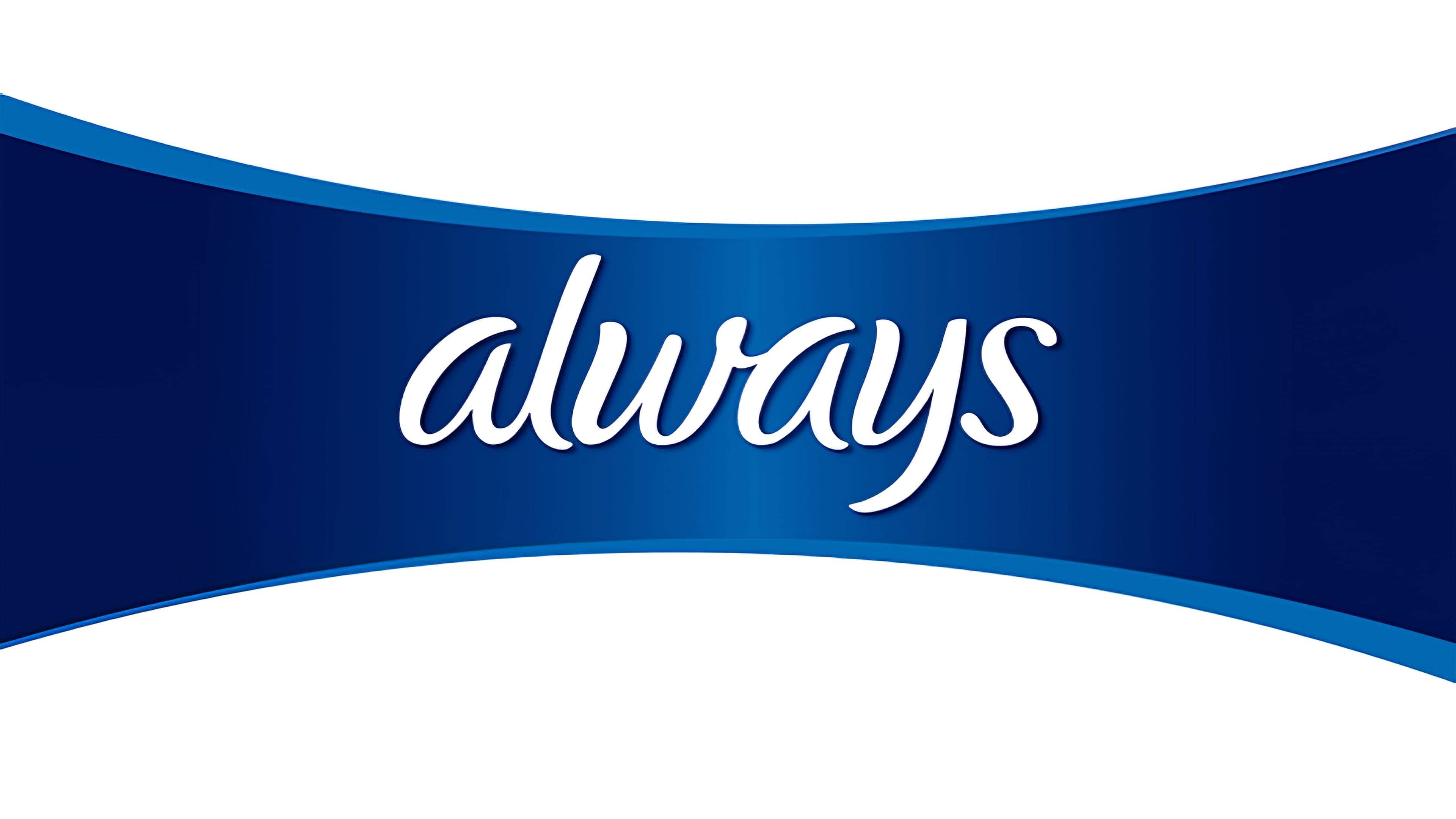
The current version of the logo is radically different from all previous ones. It uses a custom typeface that mimics sloppy handwriting. The sign of infinity took the place of the bird.
2015 – today
![]()
Keeping the same writing style, the designers have reduced the letter thickness, making the word “Always” look more elegant. Handwritten cursive text is semi-connected: only the first four characters are connected in pairs. These are “Al” and “wa.” The remaining characters are located separately. Due to the decrease in fat content, the “s” at the ends appeared thickened like dots. The figured element at the top, reminiscent of an infinity sign, was removed by the developers.
Font and Colors
Although the word “always” is the main element of the logo, it also includes a graphic representation. At first, it was a stylized flower in a circle, then in an ellipse. In 2002, a bird appeared in its place, and it was later replaced by an infinity sign made of two ribbons.
The brand name is in italics. At first, it was a classic font, but then the developers suggested a custom one. The logo’s color scheme consists of pastel shades of blue and green.
In the modern emblem, the letters are thinner than in earlier versions. In addition, a bright cornflower-blue color appeared instead of the neutral blue.