


Boston agency Pilot developed a logo called “The Hub” for the American Bus Association’s centennial, combining a wheel with people gathered around a table. Unveiled on October 21, 2025, the update began the lead-up to the association’s 100th anniversary in 2026. The new identity brings ABA’s various activities together under a shared emblem.
Founded in 1926, the association represents North America’s motorcoach and group travel industries. Its membership includes bus operators, tour operators, manufacturers, service providers, and tourism organizations. The team needed a name that reflected the breadth of its membership and responsibilities, including industry advocacy, safety, operator support, workforce development, and sales growth. The project took about a year and involved discussions with ABA’s board, councils, and members.
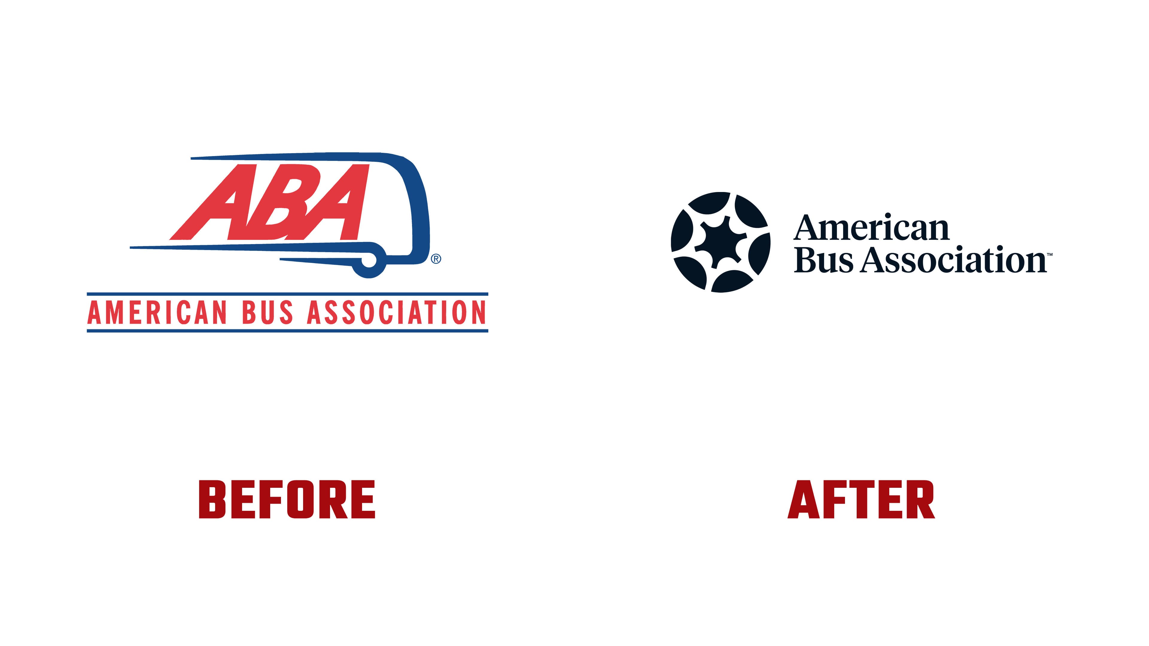
The name “The Hub” explains the logo’s construction. A hub is the center of a wheel, while the word also describes an organization that connects people and businesses. Pilot drew inspiration from commercial vehicle wheels. The association also suggests people sitting around a shared table. The circle connects ABA’s transportation heritage with its role as a forum for industry collaboration.
The emblem consists of six dark segments with rounded edges arranged in a circle. Light gaps suggest spokes and form a central opening with six concave sides. The primary version uses a deep blue-black. The alternating segments and gaps preserve the wheel resemblance while reducing it to a few bold shapes.

The previous logo featured a blue bus outline with a wheel and elongated horizontal lines. It surrounded a large red ABA abbreviation in slanted letters. The full name appeared below, between two blue lines. American Bus Association now sits to the right of the circular emblem on two lines, with American above Bus Association. The name is set in a serif typeface with initial capitals followed by lowercase letters. The project description connects the serifs with the authority of a professional association.
The Hub provides the basis for emblems representing ABA’s councils and initiatives. The outer shape remains consistent, while steering wheels, shields, flames, and other images appear inside. Colors distinguish the different groups. A related identity was also developed for the American Bus Association Foundation. The shared form connects these organizations to ABA, while the internal imagery identifies their areas of work.
For the centennial, the circle becomes a commemorative seal in shades of gold. The number 100 sits in the center, with American Bus Association and the years 1926 and 2026 around the outer ring. The Hub’s outline connects the anniversary seal to the primary logo. The centennial rollout was scheduled to continue at ABA Marketplace 2026 in Reno.
Elsewhere in the identity, white and dark blue are paired with two lighter blues and red. The phrases “Buses Move America” and “Opening roads for the businesses that move people” extend the focus on the industry’s work. The identity was developed for buses, business documents, digital materials, reports, and merchandise.
Pilot handled positioning, copywriting, and project management. Elina Mackevica led the design, with Eric Weikert providing creative direction. Bianca Lobodine provided additional design support and created the animation. ABA President and CEO Fred Ferguson and Director of Communications and Brand Ben H. Rome participated on the association’s behalf.