The American Greetings Corporation logo looks festive and welcoming. The emblem resembles a gift that unfolds before the viewer, delighting with its beauty and originality. The design uses the language of symbols as a universal way to express emotions.
American Greetings: Brand overview
American Greetings was founded in 1906 by Polish immigrant Jacob Sapirstein in Cleveland, Ohio. Initially named the Sapirstein Greeting Card Company, the business focused on selling greeting cards and gift wraps in local shops.
In its early days, Jacob Sapirstein sold cards from a pushcart on the streets of Cleveland. The business gradually grew, and by the 1920s, the company began producing its greeting cards. In 1928, the business rebranded as American Greetings Publishers, reflecting its expanding reach and ambitions.
The 1930s presented challenges due to the Great Depression, but the company managed to survive and expand its business. This era saw the organization begin selling cards in department stores, significantly increasing its market presence.
In the 1940s, the business incorporated licensed characters into their card designs, which became a key aspect. The 1950s marked a period of rapid growth, highlighted by the company’s entry into the international market with the opening of an office in Toronto, Canada.
1952, the organization went public, listing its shares on the stock exchange. In the 1960s, innovation was introduced with the popular “Soft Touch” line of cards featuring a unique fabric surface.
The 1970s brought continued expansion as the company acquired several smaller card manufacturers and began producing gift wraps and calendars. The 1980s were notable for growth and diversification. The business introduced the beloved Care Bears character line, quickly becoming a cultural phenomenon.
1986, the organization strengthened its market position by acquiring competitor Gibson Greetings. The 1990s were characterized by technological advancements, with the company beginning to produce electronic greeting cards and launching its first website.
The 2000s brought adaptation to the digital age. The business expanded its digital footprint by acquiring companies specializing in e-cards. In 2013, the Weiss family, descendants of the founder and a private investment firm, bought out the company’s shares, making the business a private entity once again.
In 2018, the company sold a controlling interest to investment firm Clayton, Dubilier & Rice, with the Weiss family retaining a significant stake in the business. Throughout its history, the organization has adapted to changing technologies and consumer preferences. The company has broadened its product range to include traditional paper cards, e-cards, gift wraps, stationery, and more.
Meaning and History
What is American Greetings?
It is a company that creates and produces greeting cards and holiday products. Its offerings include greeting cards, gift wraps, and festive decorations. The company is known for its wide range of products designed for various holidays and events, such as birthdays, weddings, holidays, and other significant moments. The company’s cards and products feature vibrant designs and high-quality materials, making them popular among consumers.
1944 – 1967
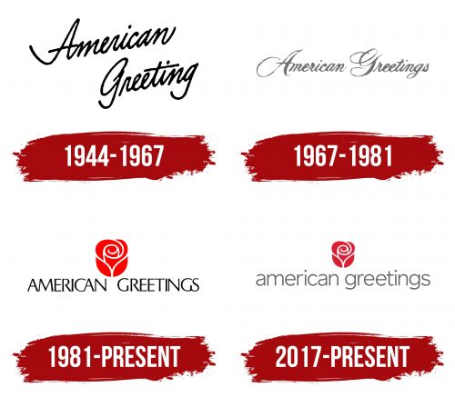
The first logo is designed with unique cursive lettering in two levels. The neat letters resemble a signature on a greeting card. This approach highlights the individuality of gifts from American Greetings. The upward tilt of the words adds dynamism and optimism to the logo, which lifts the recipient’s spirits and imbues the card with a special energy.
1967 – 1981
In 1967, with the release of the Holly Hobbie card series, the logo was imbued with a childlike elegance. This choice resonates with the delicate image of the doll. The logo retained the cursive font. The neat lettering resembles a woman’s signature. The calligraphic script is enhanced with flourishes, highlighting the special regard of the sender for the recipient. The logo hints at the perfection of the cards and packaging, which makes the greeting more festive and elegant.
1981 – today
The American Greetings logo reflects its market position in the greeting card industry in 1981 when the company was already the second largest in sales. The size and design of the symbols indicate confidence and high product quality. This logo became recognizable and helped strengthen the brand, which is associated with joy and customer care.
The emblem features an image of a rose, with the company name written below in black uppercase letters. The rose is rendered in red, creating a bright and memorable image. This logo represents the company’s core activity—creating greeting cards.
The rose symbolizes a gift and joy. The blooming flower is associated with celebration and warm feelings, aligning perfectly with the company’s mission to bring happiness and positive emotions through greetings. Cards often replace or complement fresh flowers, becoming an important part of a celebration.
The emblem highlights the uniqueness of the brand’s greetings and the tasteful creation of each card. The rose represents the beauty and care invested in every card, while the text below indicates high product quality. The strict black letters add solidity and confidence to the logo.
The company name is written in black uppercase letters, giving the logo seriousness and readability. The font is simple and elegant, without unnecessary decorative elements, emphasizing the company’s reliability and professionalism.
The red color of the rose symbolizes passion, love, and energy, fitting for a company dedicated to creating greetings. The black text color underscores professionalism and stability. The contrast between red and black draws attention and makes the logo recognizable.
2017 – today
American Greetings was founded in 1906 and has since grown into one of the largest greeting card companies in the world. The logo reflects the company’s long history and evolution. The reduction in the size of the bud and the shift to a more restrained font color symbolize a commitment to renewal and adaptation to modern market demands while remaining true to its core values.
The current American Greetings logo has changed toward balance and a restrained classic style. The bud size has been reduced, and the black letters of the company name have been changed to gray and lowercase. Above the logo is a stylized rose, emphasizing the sophistication and emotional depth of the company’s products.
The rose symbol in the emblem embodies beauty, love, and sincere feelings conveyed through greeting cards. The rose represents care and attention to detail, which is important for a company creating emotionally significant products.
The logo’s significance lies in conveying the company’s core message—the importance of the card’s content. The logo demonstrates that the true value lies in the message inside the card, not in its exterior. This underscores the company’s dedication to creating products that help people express their feelings and establish emotional connections.
The emblem’s font was changed from black to gray, giving the logo a softer and more modern look. The lowercase letters highlight the company’s friendliness and accessibility. The minimalist and classic logo style reflects the company’s commitment to tradition and quality.
The logo features red and gray tones. The red color of the rose symbolizes passion, love, and warmth, while the gray color of the letters adds restraint and elegance. These colors harmonize, creating a sense of balance and poise.


