


 Amiri Logo PNG
The Amiri logo stands out for its extravagance. The emblem emphasizes each customer’s uniqueness. Additional font elements represent clothing as an important detail of a person’s look, drawing attention and highlighting individual traits.
Amiri’s history began in 2009, when American designer Mike Amiri, of Iranian descent, entered fashion through styling work for Los Angeles bands and celebrities. That period connected him with stage clothing, streetwear, vintage denim, leather jackets, and rock-and-roll references, which later shaped the brand’s visual language.
From 2011 to 2013, Amiri worked on custom garments for private clients in a small Hollywood studio. He made coats, T-shirts, and jeans by hand, testing distressing, washes, cuts, and decorative details. In 2014, the brand was officially founded with a full menswear collection produced in Los Angeles and built around ripped denim, leather outerwear, and rock-inspired shirts.
In 2015, Amiri gained its first major retail support from Maxfield in Los Angeles. In 2016, the label expanded through Selfridges in London and Barneys in New York, while Mike Amiri received the Rising Talent award from GQ. In 2017, the company launched its first full footwear line, and Amiri became a finalist for the CFDA/Vogue Fashion Fund, strengthening its position in the high-fashion market.
The first flagship store opened on Rodeo Drive in Beverly Hills in 2018, the same year the women’s collection appeared. In 2019, Amiri entered Paris Fashion Week. Later growth included bags and eyewear in 2020, a Miami flagship and improved online sales in 2021, offices in Europe and Asia in 2022, artist and musician collaborations, and a Tokyo flagship in 2023.
Meaning and History
What is Amiri?
It is a luxury fashion brand founded by designer Mike Amiri in Los Angeles, California. The brand is known for its rock-and-roll-inspired aesthetic, combining high-end craftsmanship with a distinctly American street style. It offers a wide range of products, including ready-to-wear, footwear, and accessories for men and women. The brand’s signature look often features distressed denim, leather jackets, and intricately detailed pieces that blend grunge and glamour.
2017 – 2023

The first Amiri logo was characterized by simplicity. This approach indicated that the brand’s clothing is part of everyday urban fashion and accessible to customers.
Straight, thin lines and increased spacing between letters created a similarity with the identities of other fashion brands. Each character was like a separate creation by a master, elevated to a runway for easy viewing.
The brand was named after its founder, Mike Amiri.
2020 – today
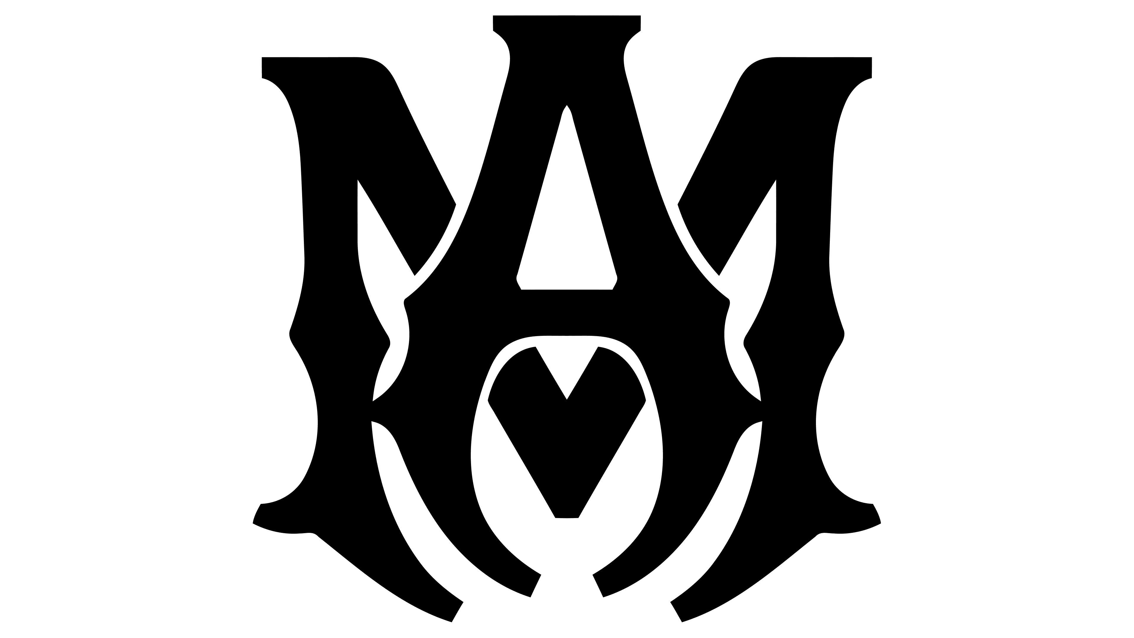
In 2020, the logo was transformed to align with the master designer’s grunge style. The emblem consists of the designer’s name in uppercase letters overlaid on one another. The ends of the symbols curve inward. The glyphs have thickenings and branches, resembling gnarled tree roots.
The monogram creates a dark impression, fitting well with the grunge style’s unconventional and sometimes off-putting look. The black color parallels emus, punks, and other philosophies that influence appearance.
The emblem gained individuality and became highly memorable, making the brand easily recognizable. The logo conveys the theme of handmade craftsmanship and the master’s direct involvement in creating pieces, reflecting the “do it yourself” (DIY) approach.
2023 – today
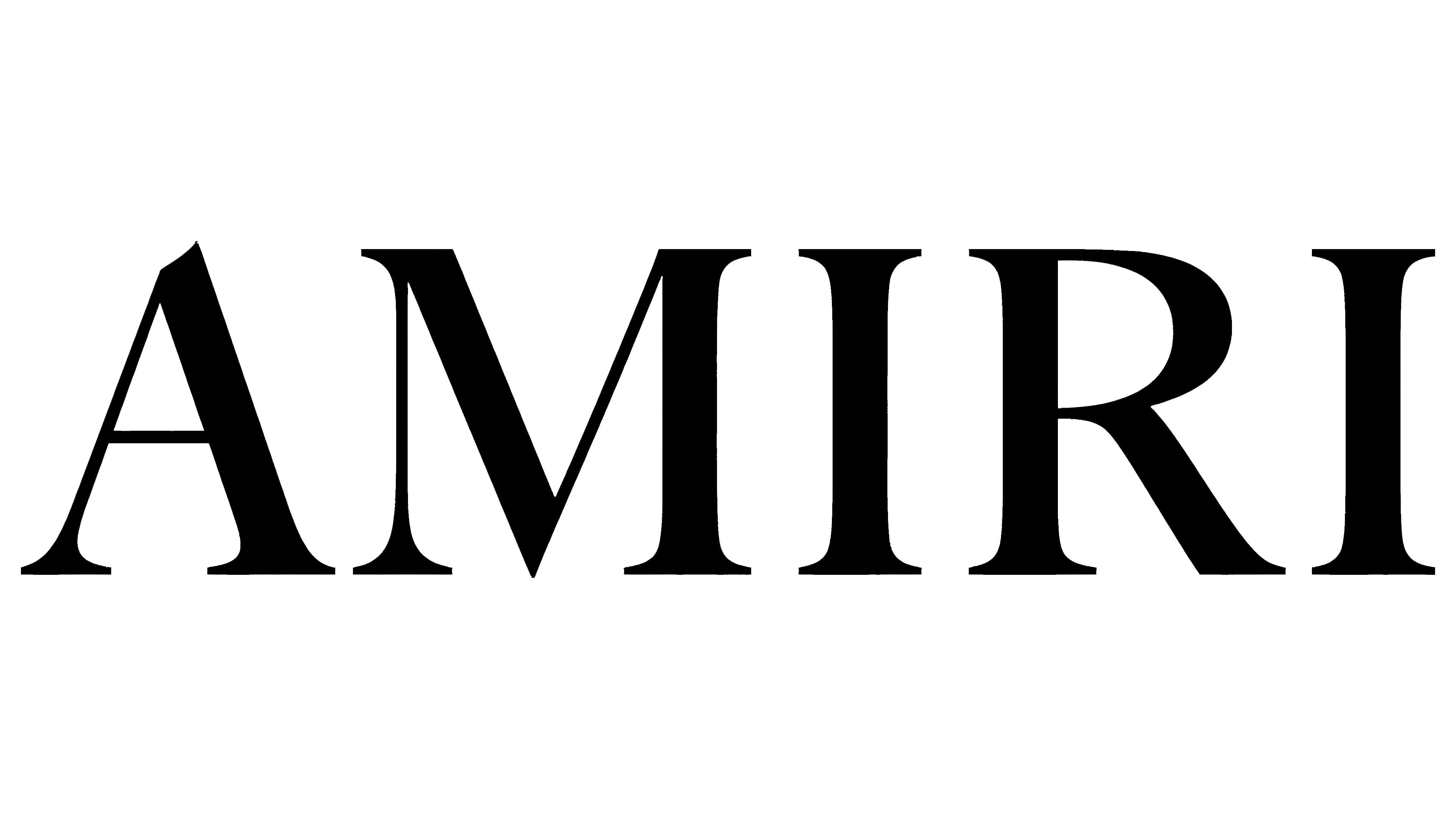
The modern AMIRI logo is an elegant, minimalist depiction of the brand name, rendered in black with a serif font. The logo appears simple yet sophisticated, emphasizing the uniqueness and style of the brand’s products.
The logo symbolizes elegance, quality, and attention to detail. The black color is associated with luxury and refinement, while the serif font gives the emblem a classic and timeless appearance. A notch in the upper part of the first letter “A” adds a unique and contemporary touch to the logo. Most of the prints on the clothing are handcrafted, allowing them to stand out on city streets and attracting celebrities to the brand.
The emblem reflects the brand’s philosophy of combining tradition and modernity, highlighting the uniqueness and exclusivity of its products. Using a simple yet refined font emphasizes the high quality and craftsmanship that underpin the brand.
The logo’s classic serif font is adapted to create a more modern and unique look. It resembles Garamond Clássico Bold or Baskerville Classico Small Caps with minor modifications. The serifs add elegance and solidity to the font, while the unusual notch in the letter “A” adds individuality and underscores attention to detail.
The emblem is black, symbolizing luxury, style, and sophistication. Black is also associated with professionalism and high quality, perfectly aligning with the brand’s image.