![]() Amstel Logo PNG
Amstel Logo PNG
The oldest brewery in the Netherlands is renowned for its product, whose Amstel logo is symbolic and straightforward. The geometry, color palette, and certain graphic elements of the modern emblem symbolize the brand’s commitment to its rich history.
Amstel was founded in 1870 in Amsterdam by Johannes van Marwijk Kooy and Charles de Pesters. The brewery was built on the Amstel River, which provided water and access to transportation. The founders adopted Bavarian bottom fermentation, a method gaining ground across Europe at the time.
In the late 19th century, production grew steadily as the brand competed with numerous Dutch breweries and imports from Germany and Belgium. By the early 20th century, Amstel expanded capacity and entered new markets, gradually building recognition within the Netherlands.
Despite this growth, the company operated alongside a dominant rival, Heineken, founded in 1864. Heineken developed a stronger export network and held a leading position before World War I, shaping the competitive landscape for decades.
In 1968, Heineken N.V. acquired Amstel, ending a long rivalry. The brand was retained and integrated into Heineken’s portfolio rather than dissolved, allowing it to continue under its own name.
After the acquisition, Amstel expanded internationally through Heineken’s distribution network, entering markets in Europe, Latin America, and the Middle East. In many regions, production was licensed to local breweries.
During the 1980s and 1990s, Amstel invested in sports sponsorships, especially in football, aligning the brand with mass audiences. By the 2000s, it had become the second key brand in Heineken’s portfolio.
Variants such as Amstel Light gained traction in the United States, competing with imports like Corona and Beck’s. Today, Amstel remains part of Heineken’s global lineup and is sold across multiple international markets.
Meaning and History
![]()
The brand’s trademark is symbolic but straightforward. The inscription “Amstel,” located inside a white semicircle, immediately catches the eye. The name is rendered in classic bold font with small serifs. The company’s founders chose this title. Johannes and Charles decided to immortalize the Amstel River, on whose banks the first beer factory was located.
The famous red-and-white circle is centered. It also appears on old brewery logos. The bicolor geometric figure represents a billiard ball. This association is not accidental, as the company’s founders enjoyed playing billiards together. Many years have passed, but the circle, as before, continues to symbolize their strong friendship and commitment to tradition.
Over the course of the century, the emblem has changed. For instance, the owners proudly noted their hometown on the trademark when the Amstel factories were in Amsterdam. Later, the production was relocated, and the inscription disappeared.
Designers updated the logo after each rebranding, as the company changed its name several times. From 1870 to 1947, the company was known as Beiersch Bierbrouwerij De Amstel, and from 1947 to 1968, it was referred to as Amstel Brouwerij. All this was reflected in the company’s visual style (logo).
What is Amstel?
Amstel is a Dutch beer brand produced at the Heineken factory since 1968. The history of this alcoholic beverage dates back to 1870, when the first stone was laid for the Amstel Brewery. The lineup features a variety of beers, including light, dark, and non-alcoholic options.
Old
![]()
Amstel beer was named after the river of the same name flowing through Amsterdam. This name, written in black, became the central element of the logo. It is written in bold, short black serifs. Each letter casts a golden shadow on the white semicircle in which the word is located. Just above it, but slightly higher, is the phrase “QUALITY PRODUCT.”
The word “BEER” in white with black outlines is written within a red semicircle. It is framed by a pattern resembling a stylized ear. The emblem is placed in a wide golden ring with the inscription “LAGER BEER BREWED IN THE AMSTEL TRADITION.” At the top is a triangular shield decorated with two ears of corn, hinting at the beer’s ingredients. Inside it, on a blue background, are depicted:
- a small red and white shield with the black letter “A”;
- a ribbon with the word “AMSTEL”;
- two golden horses;
- a stylized crown with three peaks.
This is a nod to Amsterdam’s coat of arms. The city was granted permission by the king to adorn its official symbol with the crown of the Austrian Empire. Of course, this element looks different than the beer brand’s logo. The Amstel emblem features not heraldic lions, like on Amsterdam’s coat of arms, but proud horses associated with agriculture.
before 2020
![]()
This version differs from a three-dimensional design. Designers used gradients to make the logo appear shiny, evoking an award medal. The inner red-and-white circle has a thin silver rim that creates a convex effect. The number of inscriptions inside the circle has been reduced. Besides the black word “AMSTEL” and the white “BIER,” only the number “1870” remains, the year Johannes van Marwijk Kooy and Charles de Pesters created the new beer brewed using Bavarian technologies.
On the golden ring are written the phrases “AMSTEL BIEREN” and “VOLGENS DE AMSTEL TRADITIE GEBROUWEN.” A thin black line surrounds each letter. As for the composition of the upper shield, it has undergone noticeable changes compared to the original version. Instead of two golden horses, there are white heraldic lions with blue outlines. They hold a large letter “A” that denotes the brand’s name. The lions were taken from Amsterdam’s coat of arms.
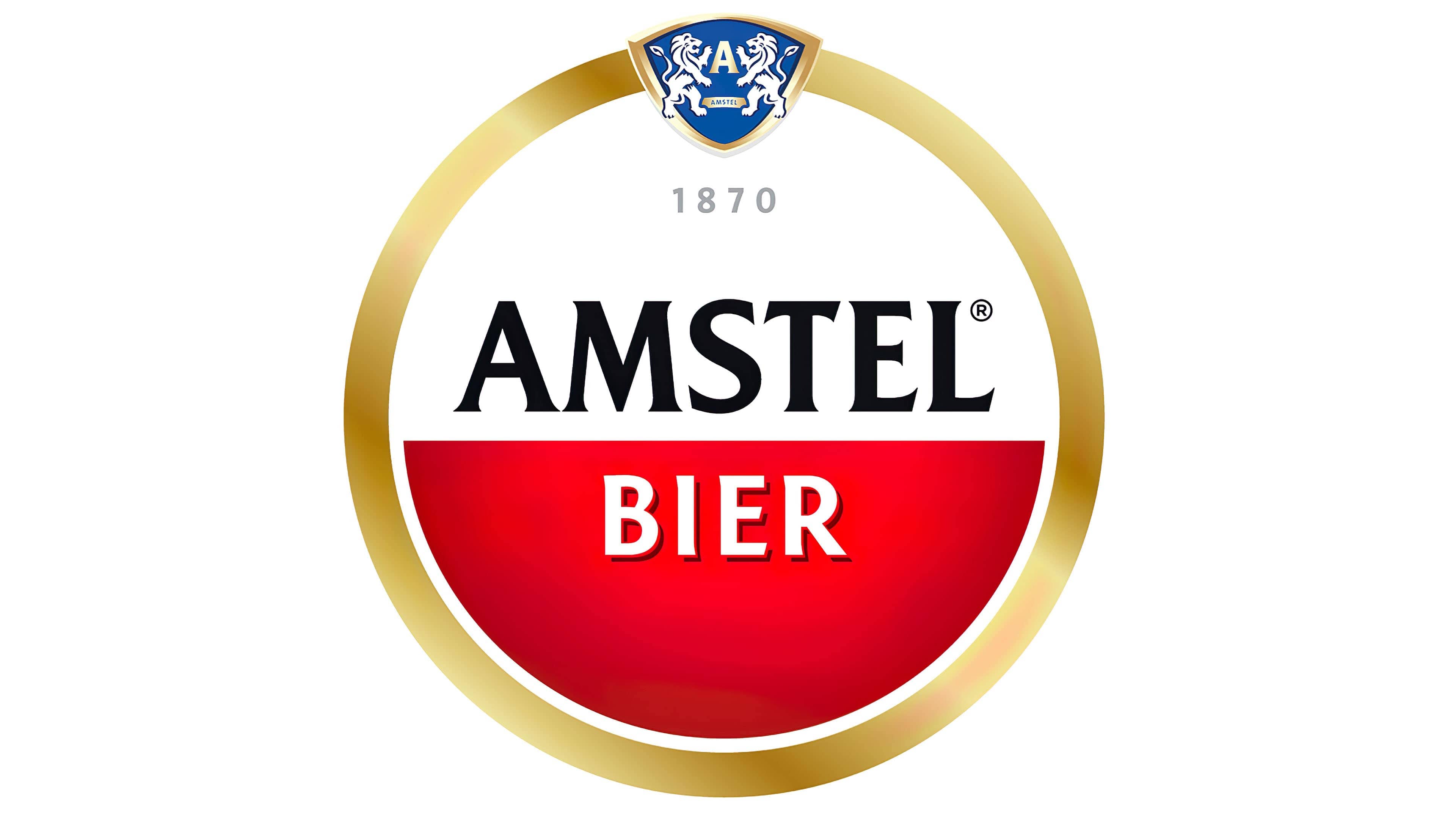
2020 – today
![]()
The round red-and-white logo became Amstel’s main symbol, so the company decided not to make significant changes. But in 2020, the brand had to slightly rework its visual identity to adapt it to the global market. London-based design studio Elmwood took on this task. The main challenge was that Amstel beer is sold in more than 115 countries, each with its own local logo tailored to local consumers. On the one hand, this is beneficial because flexible branding can be tailored to a specific audience. On the other hand, the identity lacked consistency.
Elmwood decided to unify its trademark and make it more comprehensive, while maintaining its red-and-white base. Two semicircles of different colors symbolize the partnership of Johannes van Marwijk Kooy and Charles de Pesters, the founders of the Amstel brewery. And the circle they formed represents a billiard ball because the friends loved spending time playing billiards.
Designers considered about 30 emblem options, experimenting with shapes and palettes. Ancient medals, the architecture of the first brewery, and the founders’ personal signatures served as sources of inspiration. The resulting logo combines classic and modern elements. In the center is a red-and-white circle with the black word “Amstel” and the white word “Bier.” The brand name features triangular serifs, and the letter “A” is adorned with a small protrusion that extends the horizontal stroke.
The company’s founding year is extended to emphasize the importance of history and traditions. Meanwhile, the blue shield with white lions has been reduced; it no longer extends beyond the emblem’s boundaries. The golden frame has become narrower. Additionally, it has lost all inscriptions and decorative rings. The only thing that makes it special is the gradient.
Font and Colors

The current logo is original. In the center is a red-and-white circle with the inscriptions “1870,” “Amstel,” and “Bier.” The latter word uses an unusual font: the letters cast a double black-and-red shadow. The inner circle is enclosed in a silver ring and a wide golden frame. At the top is a blue heraldic shield with two white lions and the letter “A.”