


![]() Anheuser Busch InBev Logo PNG
Anheuser Busch InBev Logo PNG
The symbiosis of several companies to create unique drinks is read in the emblem. The union engraved in the Anheuser Busch InBev logo, mixed in one vessel, creates the gold standard of brewing. The conglomerate’s brands are loved and known worldwide.
Anheuser-Busch InBev grew out of three brewing traditions that came together through major corporate deals. The oldest line began in Leuven around 1366 with the Den Hoorn brewery. In 1717, brewer Sebastian Artois bought it and gave it his name. In 1926, Stella Artois was introduced as a Christmas beer in Leuven, and it became the brand that helped Artois expand beyond Belgium. In 1987, Artois merged with Piedboeuf, the maker of Jupiler, creating Interbrew.
Interbrew’s international turn came in 1995, when it bought Canada’s Labatt Brewing. The deal also brought the Toronto Blue Jays and Toronto Argonauts. At the same time, broadcasting assets had to be sold because of Canadian media ownership rules. By the early 2000s, Interbrew was the world’s third-largest brewer by volume, behind Anheuser-Busch and SABMiller.
The Brazilian branch came from Companhia Antarctica Paulista, founded in São Paulo in 1885, and Companhia Cervejaria Brahma, founded in 1888. After a century of rivalry in Latin America, the two companies merged in 1999-2000 to form AmBev, with Brahma, Skol, and Antarctica in its portfolio. In 2004, Interbrew and AmBev merged to form InBev, based in Leuven. They became the world’s largest brewer by volume, with about 14% of the global market.
The American line began in St. Louis in 1852. It became Anheuser-Busch under the leadership of Eberhard Anheuser and Adolphus Busch. Refrigerated railcars and pasteurization helped Budweiser, launched in 1876, become a national U.S. beer brand. On July 13, 2008, InBev agreed to buy Anheuser-Busch for $52 billion, closing the deal on November 18. AB InBev later bought Grupo Modelo in 2013 and SABMiller in 2016, widening its lead over Heineken and Carlsberg.
Meaning and History
![]()
Anheuser-Busch InBev is committed to building brands that bring people together. The company is confident that its shared love of the drink fosters friendships and connections. The company’s logo embodies the idea of unification, evident across all versions of the sign.
What is Anheuser Busch InBev?
This embodies world-class brewing by managing a broad brand portfolio that captivates consumers globally. Headquartered in Belgium, the corporation oversees an extensive network of breweries. It produces well-known brands such as Budweiser, Corona, and Stella Artois, as well as popular regional brands that lead in their local markets. By perfecting beer production and preserving each brand’s unique history, the company ensures consistent quality across its range, from craft ales and flavored malt beverages to premium beer varieties.
2008 – 2016
![]()
FutureBrand designed the first logo in 2008, during the corporation’s creation. It is the result of merging the main participants’ signs within the conglomerate. The Anheuser-Busch symbol is an eagle in a dainty A. The InBev emblem is a crisp, softly rounded symbol with an exclamation mark instead of an I.
FutureBrand has transformed and combined the two symbols to create an image demonstrating unity, growth, and aspiration for the future.
The letters AB have retained their floridity. They are placed first. This is a tribute to Anheuser-Busch’s long history. Red symbolizes love for one’s work, desire for change, and resilience. After all, Anheuser bought his brewery when it was on the verge of bankruptcy, restored it, and made it an industry leader.
The letters InBev continue to have a crisp, flowing, and upright style, indicating that the firm is the backbone of the corporation. Dark brown gamma is a sign of foundation, experience, and a stable central company that has united other companies around itself.
The design emphasized each member’s individuality while showcasing their teamwork.
The eagle (bald eagle) also remained on the logo, but as a soaring bird at the top right. Its image carries a great semantic load. The corporation considers itself the company of the century and focuses on producing beer that will be drunk for the next 100 years. The sea eagle is one of the largest birds in North America, a long-lived species with strong wings that allow it to soar for long periods. Since ancient times, the bird has been a symbol of power, victory, and glory.
The soaring eagle on the logo shows:
- power and growth of the corporation
- rise above competitors
- movement into the future
- Focus on existence through the ages
- partnership for life
According to Anheuser Busch InBev’s philosophy, beer’s main task is to support the celebration of life. Each bottle should bring pleasure and leave a good impression. This belief is reflected in the bird’s bright, warm colors.
- A white head and the first feathers of the wings are the desire for new beginnings.
- A yellow-orange body is the joy of life, the pleasure of the product produced.
- Red terminal feathers on the wings provide the energy to be in flight for a long time.
- Brown tail and wing rims on the sides of the letters AB, based on experience, allow you to choose the right direction and soar to great heights.
In general, the emblem received a sense of flight and high aspirations.
2016 – 2022
![]()
In 2016, another company joined the giants: SABMiller. This entailed adding the prefix SA to the name and changing the logo.
The eagle has been removed from the image because the bird was related to only one of the three companies in the conglomerate. The new logo has become completely literal, and its symbols have gained more volume and impressiveness. The thickness of the lines showed the scale of production and the company’s position in the brewing market.
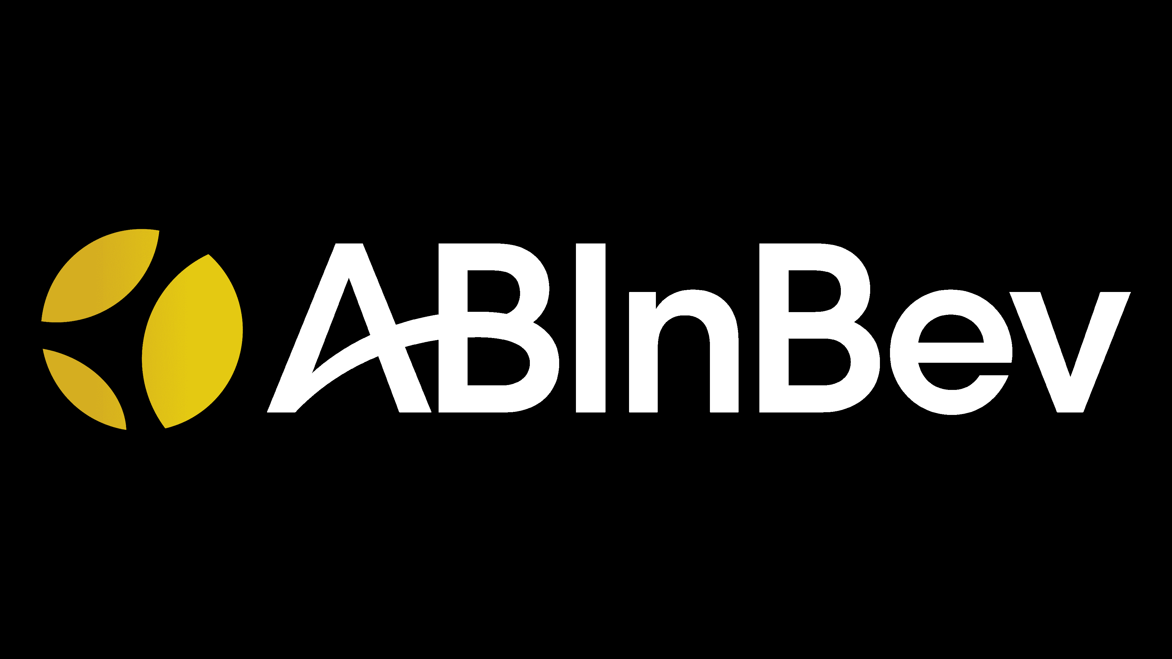
2022 – today
![]()
The new management, which took over the post in 2021, has launched a rebranding. The last sign showed equal participation in all three companies. The emblem consists of an image and an inscription.
Three yellow petals encircling the ball represent the distribution of beer brands from three Anheuser-Busch InBev members across the Globe (the conglomerate accounts for 30% of the world’s beer production).
The change in font and the overall color of the letters gave the name a unified style, showing the giant’s cohesion.
Font and Colors
The main colors of the emblem are black and yellow. Yellow is the color of joy and pleasure that drinking beer should bring. Black indicates the company’s stability and reliability. The simplicity and smoothness of the logo’s lines match the YD Yoonche Medium font. At the same time, the letter A is unusually sequentially connected to the letter B, demonstrating family continuity (Busch married Anheuser’s daughter, and the brewery was passed down from generation to generation until 2008).