 Antena 3 Logo PNG
The Antena 3 logo received a more modern, sophisticated look in 2017 while maintaining the channel’s unique identity. José Jiménez de Pueblo’s design reflects a playful, creative, and forward-thinking approach that aligns well with the channel’s brand image.
The refined emblem consists of three geometric shapes that come together to form the letter ‘A’ in negative space. This ‘A,’ standing for ‘Antena,’ is cleverly integrated into the design, adding a layer of subtlety and sophistication. The use of three shapes can also be seen as a nod to the ‘3’ in Antena 3, hence emphasizing the channel’s name visually and imaginatively.
The chosen color palette of orange and white creates a fresh, vibrant appearance. Orange is often associated with creativity, enthusiasm, and energy, qualities that resonate with Antena 3’s dynamic, varied programming. The use of white conveys simplicity, clarity, and purity, suggesting the channel’s commitment to quality and transparency in its broadcasting.
The refined “Antena 3” inscription, now set in title case again, features the stylish Isidora typeface with its playful lines. This typeface, with its sleek, contemporary design, adds modernity and sophistication to the logo, while its playful qualities mirror the channel’s approachable, engaging character.
The Antena 3 emblem signifies creativity, energy, and sophistication. It mirrors the channel’s commitment to quality broadcasting, varied programming, and a vibrant, accessible brand.
Antena 3 began broadcasting on December 25, 1989, becoming the first private television channel in Spain. Until then, national television had been controlled by Televisión Española, or TVE, through its two public channels. The launch followed the 1988 Private Television Law, which opened the market to three operators. Antena 3 received its license first and went on air several days before Telecinco and Canal+.
In its early years, Antena 3 was backed by regional publishing groups and media structures, including interests linked to Grupo Godó and Grupo Zeta. Its headquarters and production base were built in San Sebastián de los Reyes, north of Madrid. The channel faced financial and editorial instability, with ownership changing several times, and competition with Telecinco for advertising and audience share began in the first season.
In 1997, Telefónica acquired a controlling stake in Antena 3. Under its management, the channel underwent a restructuring, strengthened its news division, and sought to differentiate its programming from rivals’. In 2003, Telefónica listed Antena 3 on the Madrid Stock Exchange through an IPO, making it the first Spanish commercial television network to have its shares traded freely on the market.
Later in 2003, control passed to Planeta DeAgostini. Under Planeta, Antena 3 expanded its role in Spanish commercial television through in-house series such as Los hombres de Paco and Los Protegidos. In 2011 and 2012, Antena 3 merged with La Sexta, forming Atresmedia, which operated Antena 3, La Sexta, Neox, Nova, and other channels. The group competed with Mediaset España, owner of Telecinco and Cuatro. In 2021, El Internado: Laguna Negra was released on Amazon Prime Video in partnership with Atresmedia Studios. In 2024, Antena 3 remained one of Spain’s two dominant commercial channels.
Meaning and History
Antena 3’s brand identity centers on its commitment to delivering engaging, high-quality content for a wide audience. The network’s programming strategy embraces diversity, and this is reflected in its brand identity, which aims to appeal to a broad demographic, from young adults to older audiences.
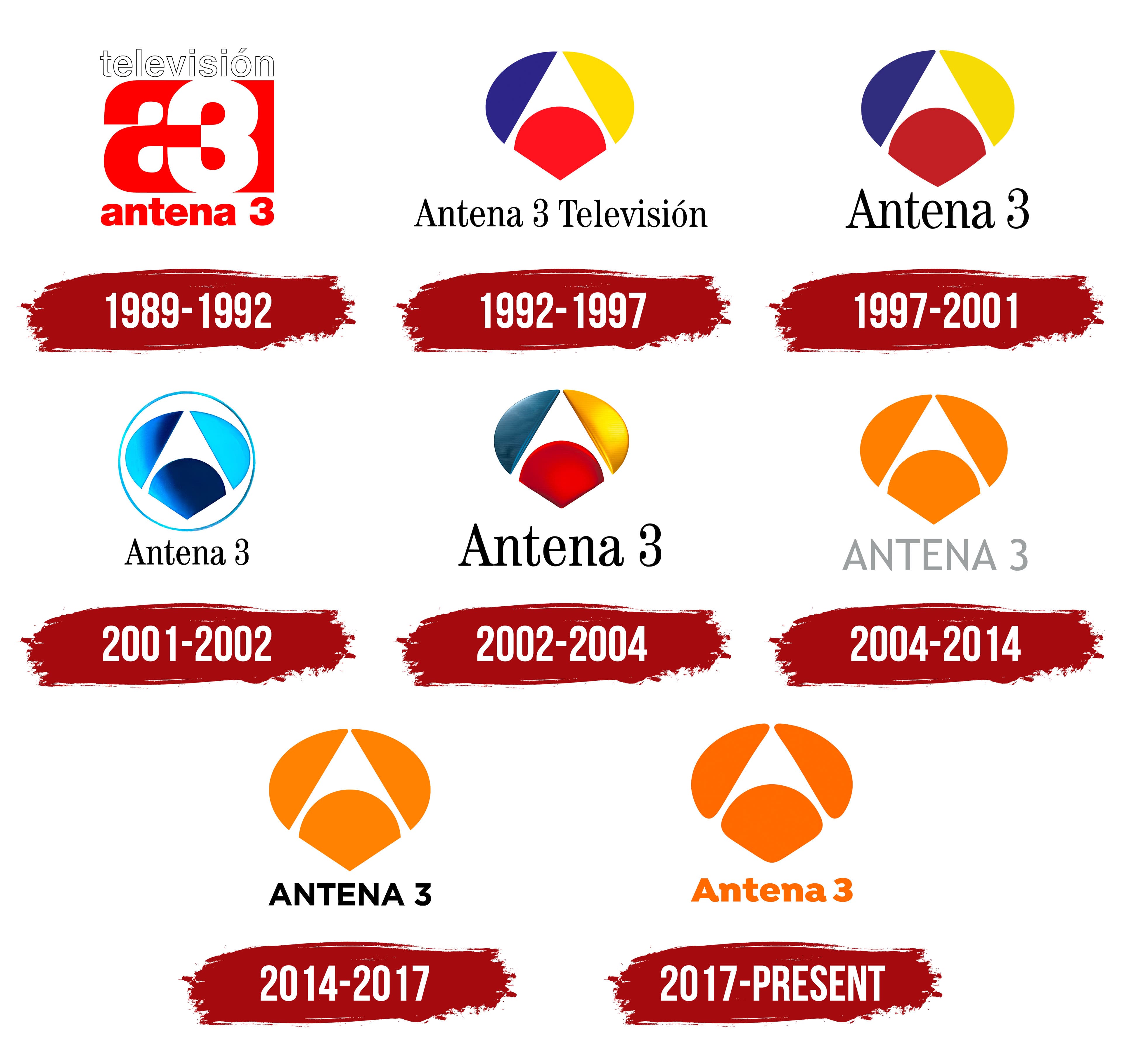
The logo of Antena 3 has seen several transformations over the years, but each iteration has emphasized simplicity and recognizability. The current logo, featuring a butterfly-like motif composed of three curved elements and the channel’s name in sleek, lowercase typography, encapsulates the brand’s spirit of creativity, transformation, and accessibility.
The choice of color in the logo also speaks volumes about the brand identity. The use of orange and white suggests passion, energy, and vibrancy, as well as purity and clarity. These colors reinforce the network’s dedication to delivering content that is both dynamic and trustworthy.
In essence, Antena 3’s brand identity encapsulates a commitment to diversity, quality, and creativity in broadcasting. Through its distinctive logo and programming, the brand communicates its mission to deliver a diverse range of high-quality content to its viewers, maintaining its position as a mainstay in Spanish television.
What is Antena 3?
Antena 3 is a prominent Spanish television channel owned by Atresmedia. Since its inception in 1988, Antena 3 has grown to become one of Spain’s most-watched television networks, delivering a diverse range of content, including news, sports, drama series, reality shows, and movies.
1989 – 1992
1992 – 1997
1997 – 2001
2001 – 2002
2002 – 2004
2004 – 2014
2014 – 2017
2017 – today