The minimalist style of visualization characterizes the logo of the rock band Anthrax, made as the textual name of the group. Its appeal is ensured by an unusual style with broken geometry, reflecting the distinctive features of the band’s playing style.
Anthrax: Brand overview
| Founded: | 1981–present |
| Founder: | Scott Ian, Dan Lilker |
| Headquarters: | New York City, New York, U.S. |
| Website: | anthrax.com |
Meaning and History
The band’s logo depicts its name. Scott Ian suggested using the word “Anthrax,” which he saw in a biology textbook and decided it looked sufficiently intimidating. Lead guitarist Daniel Alan Spitz was responsible for the graphic design of the logo. Drummer Charlie Benante developed the cover designs.
What is Anthrax?
Anthrax is a leader in thrash metal alongside Slayer, Megadeth, and Metallica. The group originated in New York in 1981 when a group of musician friends decided to conquer the rock scene together. They named their collective after disease to reflect the heavy nature of their music. Their topical lyrics address acute political and social issues.
1983 – 1993, 2011 – today
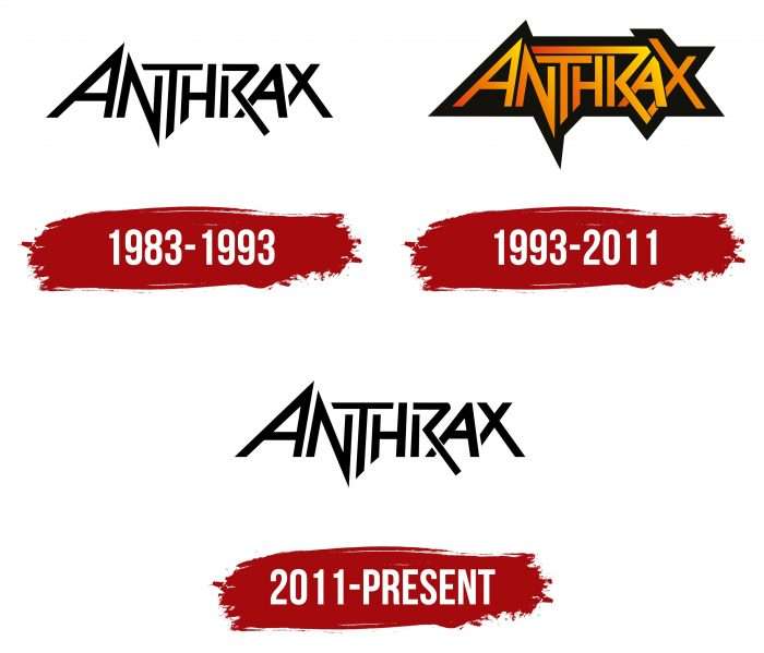
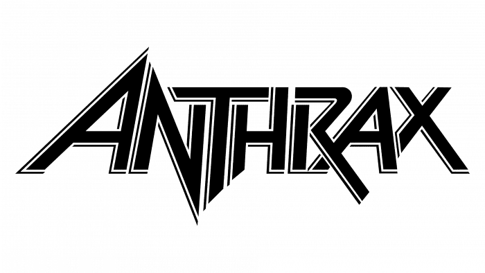
The first Anthrax logo contains the band’s name in an unusual style. Initially, the geometry of the letter heights was violated: their edges extended beyond the boundaries of an imaginary line. Meanwhile, the printed characters were positioned so close that the horizontal stroke of the “T” literally laid on the “N” and “H.” A long line from the top of the “R” covered them from above. The protruding parts of “A,” “N,” “T,” and “H” from the top and bottom form triangles. The palette is black and white; the design is minimalist except for the unconventional shape of the letters.
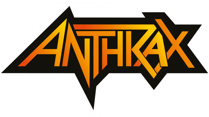
The old version of the graphic symbol returned to the band’s album covers in 2011. Moreover, an unusual version with a yellow-orange gradient and black shadows was used for the Worship Music collection, giving the word a three-dimensional effect.
1993 – 2011
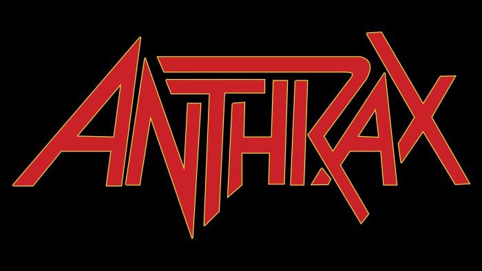
In 1993, an album was released with an updated logo. The rock band’s second emblem also reflects its name. However, it became more complex as designers made the inscription colorful and added a wide black outline. Changes only affected two letters. First, the line going from “R” to “N” disappeared. Secondly, the long stroke of “X” became short.
Anthrax: Interesting Facts
Anthrax is a super important band in thrash metal, known for their energetic shows and a big impact on the music.
- Part of the Big Four: Anthrax is one of the “Big Four” thrash metal bands, along with Metallica, Megadeth, and Slayer. These bands were super important in making thrash metal popular in the 1980s.
- How They Got Their Name: Scott Ian picked the band’s name, “Anthrax,” after seeing it in a biology book. They thought it sounded cool and spooky, even though it’s also the name of a disease.
- Mixing Music Styles: Anthrax was one of the first to mix punk music with thrash metal, creating a new style many bands started to follow.
- Rap and Metal Together: In 1991, Anthrax worked with the rap group Public Enemy on “Bring the Noise.” This was a big deal because it brought together rap and heavy metal music in a way that hadn’t been done before.
- Changing Band Members: The band has had many different members, but Scott Ian has always been part of it. They’ve kept their unique sound and energy through all these changes.
- Love for Comics: The band members like comic books, which has influenced their music and presentation. For example, their song “I Am The Law” is about the comic book character Judge Dredd.
- Grammy Nods: Anthrax has been nominated for several Grammy Awards for Best Metal Performance, showing that people recognize and respect their work.
- In TV Shows: They’ve appeared in TV shows like “Married… with Children” and “NewsRadio,” proving they’re not just about music but have also made a mark on popular culture.
- Sticking to Their Name: When there were anthrax attacks in 2001, there was talk about the band changing its name because of the disease. But they responded with a joke, saying they’d change it to “Basket Full of Puppies” to show they wouldn’t let it bother them.
Anthrax has made a name for themselves by being bold, mixing different kinds of music, and always staying true to their thrash metal roots.
Font and Colors
Anthrax doesn’t have a graphic symbol – the group has always used a logo with its name on numerous album covers, documents, posters, and other promotional materials. Such a minimalist approach is characteristic of many representatives of the rock scene, as they focus on creativity, not on the design of the logo.
The logo uses a custom font with unconventional letters. Some lines are elongated and extend beyond the conventional line. Serifs are absent. The color palette is monochromatic: black and white complement each other perfectly. Moreover, such a classic palette looks good in any visual context, making the band’s trademark universal.
Anthrax color codes
| Black | Hex color: | #000000 |
|---|---|---|
| RGB: | 0 0 0 | |
| CMYK: | 0 0 0 100 | |
| Pantone: | PMS Process Black C |
