The Aperture Science logo is simple yet complex. It encapsulates both the name and the concept of a fictional company that was involved in portal research until it was shut down and put on a continuous testing cycle due to the aggression of the GLaDOS supercomputer. Its two-dimensional design allows images to be clearly displayed on any digital device without distortion.
Aperture Science: Brand overview
Aperture Science is an American company from a fictional world that, according to legend, conducted scientific research in its laboratories. At its headquarters (located in the Center for the Advancement of Science), the company focused on studying portals to develop designs to make it easier to get from one point to another. Eventually, the corporation went bankrupt, fell into disrepair, dissolved, and went into continuous operation. In the virtual world, its headquarters and operating rooms are located in Cleveland, Ohio, and Upper Michigan.
Meaning and History
Portal started out as a manufacturer of high-tech shower curtains. It was founded by Cave Johnson in 1943 and was originally called Aperture Fixtures. The company received a new name in 1947: Aperture Science, which was chosen at random to indicate the hygienic quality of its products. In 1956, the company received a lucrative contract from the administration of Dwight David Eisenhower, as a result of which its owner became a billionaire.
Cave Johnson was actively engaged in portal research, developing various innovative technologies, and involving people in their testing. His team created a super collision button, a magic companion cube, an air slab, an excursion funnel, crushers, various gels (transformation, propulsion, repulsion), and more. Each panel in the center, all products, entrances, and even elevators had their own unique symbol – a logo in the form of a circle.
The successful development of the company continued until Johnson was poisoned, and the advent of the supercomputer GLaDOS, which took over, wiped out almost all employees (high mortality rate among test subjects) and led the company to ruin. All that remains of its former glory are the circular logos left in the rooms of the former operating theater, which has been turned into a continuous testing cycle.
What is Aperture Science?
Aperture Science is a fictional company featured in the computer games Portal and Portal 2. Its creator is Cave Johnson. He uses the corporation to conduct tests conducted in the private laboratories of the Center for the Advancement of Science, an antagonist of the Black Mesa Institute for Experimental Physics. According to the story, the main office is in Upper Michigan, and the operating room is in Cleveland, Ohio.
1943 – 1947
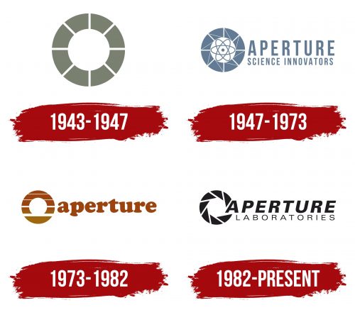
The logo is strictly graphic. It consists of eight curved plates arranged in a circle to represent shower curtains. There are small white spaces between them so that the fabric does not merge into one continuous band. This visually supports the company’s concept and avoids clichés. All elements of the emblem are painted in dark gray – businesslike, practical, and unassuming.
1947 – 1973
The company rebranded itself as Aperture Science Innovators to reflect the new logo. A wide ring with solid gray segments was transformed into a high-tech symbol with an atomic diagram in the center consisting of three oval orbits and a nucleus. All the plates are crossed by a thin diagonal band, turning them into a cogwheel. The title is located on the right side and is divided into two levels. Most prominent is the word “Aperture,” which is constant and primary. The font on both lines is uppercase, although the upper line is bolder than the lower line. There are no serifs in the letters, making the lettering strict and clear.
1973 – 1982
The round Aperture Science logo resembles a portal to another point in space. Many things have changed: the gray color changed to brown with an olive gradient, and lines became longitudinal instead of diagonal. The emblem has both foreground and background. The lettering is reduced to a single word and is in lowercase font with rounded glyphs. Every detail of each letter is smoothed.
1982 – today
The logo is characterized by its formality and business-like style. To enhance the effect of the portal, the designers designed a wide circle in the form of an aperture resembling a real camera. Thus, the emblem is a set of triangles turned diagonally. The inscription is two-level. The first line is occupied by the word “Aperture,” made in italicized sans-serif in upper case. The second line indicates the type of the company – “Laboratories,” executed in thin capital letters. All elements of the emblem are colored black.
Font and Colors
Depending on the period, the lettering in the Science logo is in different fonts: Cooper Std, Cooper Black, and Verdana. Alternatively, the fonts Directors Gothic, Cooper Std Black, Arial (for Aperture), and Univers (for Laboratories) are available. Emblem colors are minimal and limited to black and brown with an olive gradient and two shades of gray.


