


![]() Aquafina Logo PNG
Aquafina Logo PNG
The smooth blue of the emblem is pure, wholesome water, bottled and sealed for customers. The Aquafina logo discusses the need to drink plenty of fluids to feel good.
Aquafina entered the U.S. bottled-water market after several failed attempts to find the right format. By the early 1990s, bottled water was moving from a niche product into a fast-growing drinks category. PepsiCo, created in 1965 through the merger of Pepsi-Cola and Frito-Lay, had already tested water brands, including Ice Mountain in 1987. Aquafina became its fifth attempt.
The brand launched in July 1994 in Wichita, Kansas, a smaller market used to test production and distribution. Its water came from municipal systems, then passed through the seven-step HydRO-7 process, including carbon filtration, reverse osmosis, and ozonation. The brand built its offer around purification, not spring origin.
By 1997, Aquafina had national distribution and 16 purification centers across the United States. In 1999, it led U.S. retail bottled water, with sales up 80 percent, compared with 30 percent growth for the category. By 2000, annual revenue had passed $700 million. That year, J. Walter Thompson created its first national TV campaign.
By 2003, Aquafina had overtaken Coca-Cola’s Dasani in measured U.S. retail channels. FlavorSplash followed in 2005 with calorie-free flavored water. In 2007, the brand faced criticism over municipal sourcing and added clearer labeling. In 2008, its updated packaging won a Global Bottled Water Congress logo award. In 2009, a $1.26 billion claim against the brand was overturned on appeal, while Aquafina held 13.4 percent of the U.S. bottled-water market.
Meaning and History
![]()
Aquafina water is made from tap water by triple purification: ultraviolet, ozone, and forcing through a special membrane. This enables the attainment of a high degree of chemical and biological purity, including the removal of prions, without using harmful chemicals. The company mentions removing contaminants from the bottles left behind by other manufacturers. This idea of cleanliness and safety is reflected in the brand logo.
What is Aquafina?
This is a popular brand of purified water owned by PepsiCo. It is known for its clean, refreshing taste achieved through a seven-step purification process called HydRO-7. The company offers products in various formats to meet diverse hydration needs, from convenient personal bottles for on-the-go use to larger volumes for home or office use. In addition to regular water, the brand has expanded its lineup with flavored options that deliver enjoyment without calories, maintaining the pure taste that has made it popular.
1994 – 2004
![]()
The brand name is written with two capital letters A at the beginning and at the end of the word on the emblem. They look like mountain peaks and show that water is the fundamental ingredient of life. It is used from morning to evening, from birth to death. There is a registered trademark icon at the end of the word. The unusual stroke of the letter Q also reminds us of water. It is made in the form of a wave coming out of O, like from the neck of a bottle.
Above the word, between the letters, the silhouette of snow-capped mountain peaks forms the A, and the rising sun hints at the coolness and crystal clarity of Aquafina. The brand survives its dawn and rises to heights. It will gradually rise above all competitors. The sun’s pale yellow color symbolizes this hope and a promising future.
Water is positioned as healthy, convenient, and germ-free. Therefore, an inscription on the emblem below the name, “guaranteed purity.” The phrase conveys the main features of the new brand and appears under the underlying line as the conclusion.
2004 – 2016
![]()
In 2003, the water became the best-selling water in the United States. By the logo’s tenth anniversary, it was decided to update it to show the development direction for the next few years. The image reflected new energy, vigorous activity, and the struggle for a healthy lifestyle. New fruit varieties have emerged.
An arcuate spelling of the word Aquafina is added to the emblem, with two underlined features in red-orange and blue to create the desired impression. The sun also changes from pale to orange-red. Such changes demonstrated the rapid, active promotion, vigorous takeoff, and flourishing of the brand. The logo’s background changes to white, with emphasis on deepwater purification and environmental protection during this period. The brand name itself becomes blue. The mountain peaks have also been rimmed with blue, indicating clear, cold mountain streams.
Logo changes have become prophetic. After 2004, Aquafina experienced its greatest period of growth. Active efforts are underway to expand the range and win customer loyalty, thereby increasing sales.
Aquafina FlavorSplash was launched in 2005 as a flavored water that contains no calories or carbohydrates. It was produced with grape, kiwi-strawberry, raspberry, lemon, peach-mango, and wild berry flavors. A little later, Aquafina Sparkling appears as a carbonated version of these drinks. In 2007, the company launched Aquafina Alive, a vitamin-enhanced drink. It also had various flavors (orange, mango, pomegranate, lemon). At the same time, they continued to “play” with the composition until 2009. Selectively added caffeine, antioxidants, dietary fiber, and electrolytes. The fortified drink Aquafina plus + was also presented.
In 2009, as part of PepsiCo’s efforts to reduce environmental harm, the size of Aquafin bottles was changed to reduce plastic production. To attract sports fans, the brand sponsors several teams and Major League Baseball. Cosmetic products also began to be developed.
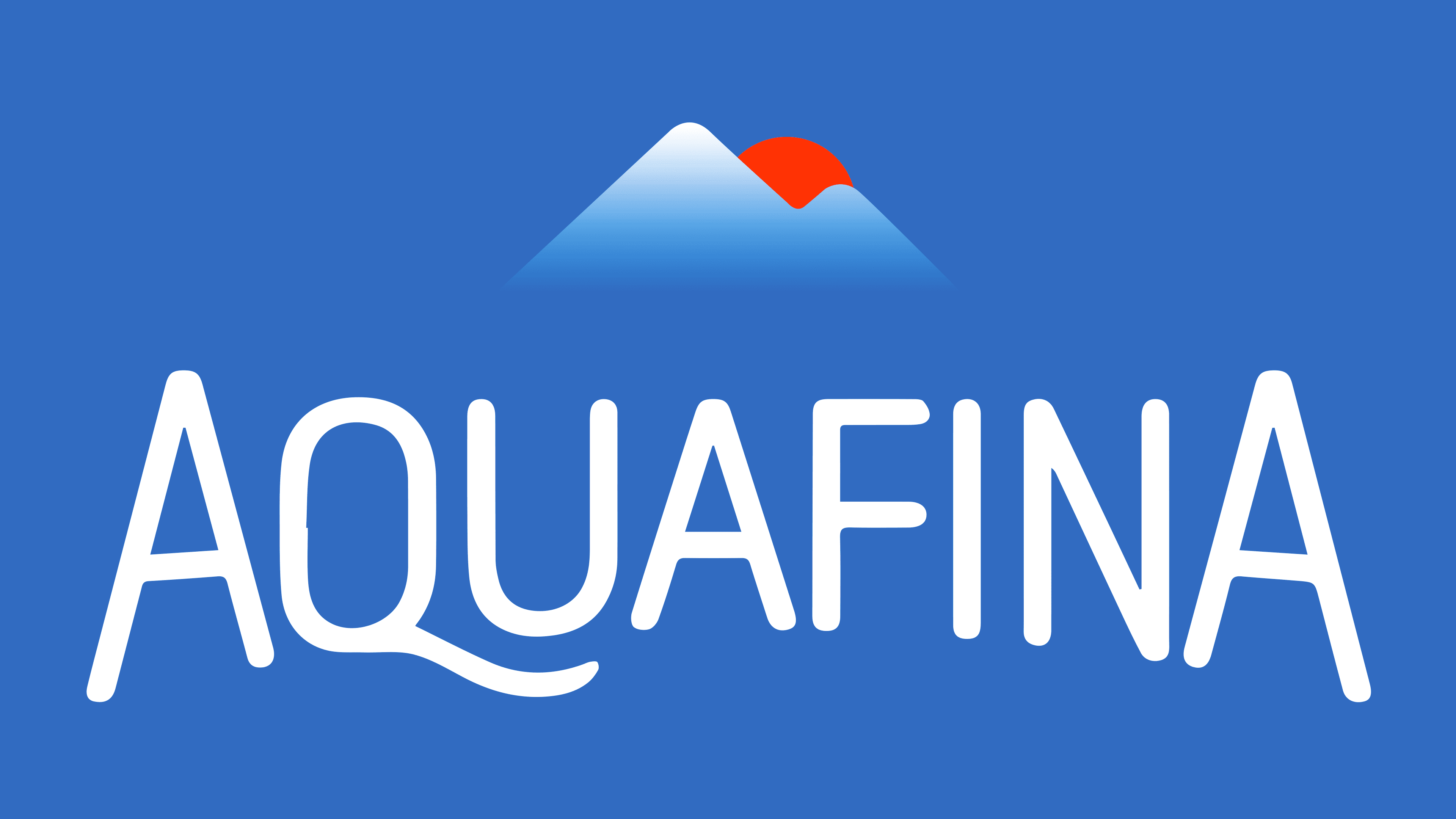
2016 – 2019
![]()
By 2016, Aquafina seemed to “crystallize.” The main direction of brand development was determined. It became smooth and stable, with no sudden changes. All additional products were removed from production, leaving only pure and healthy plain and flavored water.
The trend has also affected the logo. Excessive brightness was removed, leaving only the key elements. At the same time, the main style was preserved.
The style of the name has become more refined, with smoother letter rounding and less curvature in the word itself. The mountain peaks were reduced to two, with one pronounced peak (a hint of two types of products, one of which is in the lead). The peaks have turned white, creating a feeling of cleanliness and crisp, cold snow. The red sun peeks out from behind the peaks. It is an indicator of a stable position and sufficient energy for the long-term survival of the brand’s main products, but without sharp growth.
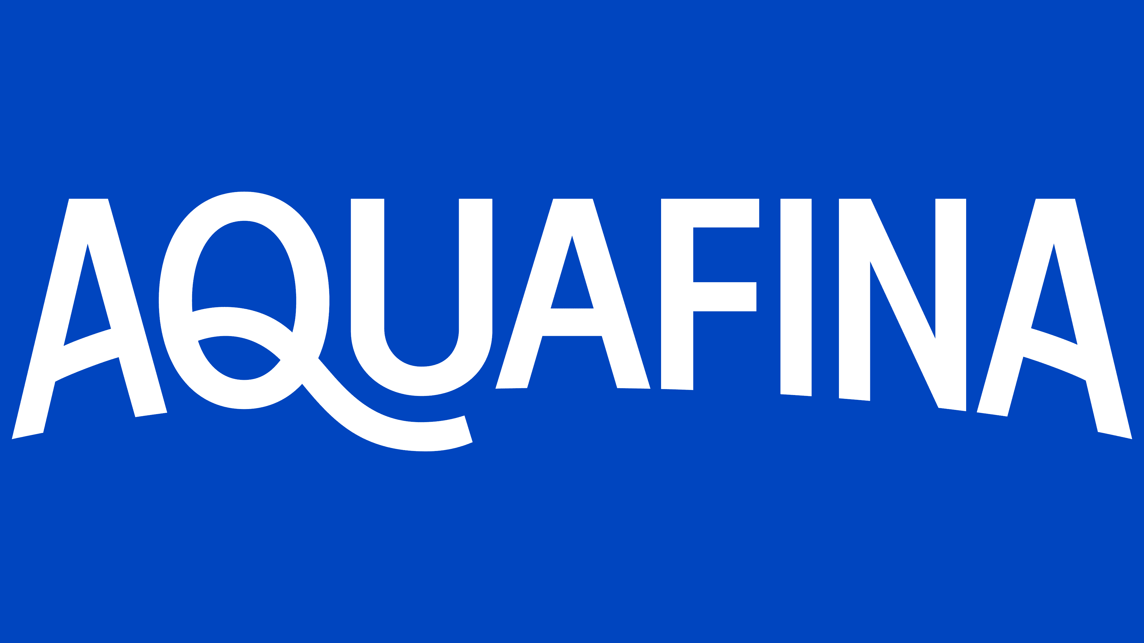
2019 – today
![]()
The new logo has a minimalistic style. Many companies produce purified bottled water. Aquafina no longer surpasses them in purity. Therefore, the visual sign of the mountain peaks was removed. Only the name itself, which is well-known to buyers, remains. It is set in a heavier sans-serif font. But still with a slight twist of the word itself. All letters of the outline became uppercase. After all, the brand already has a significant history and is a leader in its industry.
Font and Colors
The brand’s main colors are blue and white. They are associated with water and coolness. White elements symbolize purity. This gamma perfectly reflects the color of purified cool water.
Logo fonts have changed. The most elegant was Ciudadela, used in the 2016-2019 emblem. The serif variant shown on the first emblem is reminiscent of Georgia. The modern version of the style used Proxima Nova, but with an unusual spelling of the letter Q.