


![]() Aquarius Logo PNG
Aquarius Logo PNG
The drink increases energy and improves well-being; this message is reflected in the brand logo. The Aquarius logo is mountain peaks covered with snow and cool streams. The drink is designed for people who strive to achieve more and are constantly on the move.
Aquarius entered Japan in April 1983 as Coca-Cola’s answer to the fast rise of Pocari Sweat, launched by Otsuka Pharmaceutical in 1980. While Coca-Cola led in carbonated drinks, it had no strong position in the growing sports drink category. Its Japanese research team developed a formula with electrolytes and amino acids, giving it a citrus profile rather than Pocari Sweat’s more saline taste.
The brand name referred to Aquarius, the water-bearing zodiac sign, fitting a drink built around hydration. Through the 1980s, Aquarius remained a Japanese product and became Pocari Sweat’s main rival. By 2000, the two brands together controlled about 90 percent of Japan’s isotonic drinks market.
International expansion began in 1991 with Spain and Portugal, one year before the Barcelona Olympics. In 1992, Aquarius became the official drink of the Games, then entered Belgium in 1993 and served as an official partner of the 1994 Winter Olympics in Lillehammer. In Spain, the brand expanded its flavor range and moved beyond a purely sports positioning; in 2006, it even tested a limited-edition Coca-Cola-flavored version.
By the mid-2000s, Aquarius was sold across Europe, Latin America, Asia, and North Africa, with local adaptations such as Aquarius by Cepita in Argentina. It later appeared at the Beijing 2008, Rio 2016, and Tokyo 2020 Olympics. New launches followed in China in 2014, Thailand in 2015, and the UK in 2019, where it arrived as a low-calorie mineral drink with lemon-zinc and lime-magnesium flavors.
Meaning and History
![]()
The main message of the logo is to replenish electrolyte balance, quench thirst, maintain cleanliness, and coolness.
What is Aquarius?
This is a sports drink owned by The Coca-Cola Company, holding a leading position in many global markets, especially in Europe and Asia. The drink is available in various flavors and contains essential minerals and electrolytes to replenish what the body loses during physical activity. The product’s unique formula combines a refreshing taste with effective hydration, making it suitable for anyone looking to maintain energy throughout the day, not just athletes.
1983 – 1991
![]()
The Aquarius recipe was developed in 1978, five years before its official introduction in Japan. The product was introduced into the Asian market to maintain Coca-Cola’s leading position. In 1980, a similar drink was introduced by the Japanese company Otsuka Pharmaceutical and became popular.
The first emblem of Aquarius was also somewhat similar to the competitor. Both have a blue background and clear white lettering. However, in terms of color saturation, a beautiful gradient, neat lettering, and light italics, Coca-Cola’s visual product mark outperformed Pocari Sweat.
The logo reflected the essence of the product – pure (white) water (blue). They gave the buyer a feeling of refreshing coolness, harmony, and strength. They promised to prevent dehydration on hot days and after physical exertion. Interestingly, when you look at the deep blue color, melatonin production, which is responsible for sleep, decreases. Therefore, the emblem symbolized the return of strength, brought vivacity, helped concentrate, and made breathing more even.
1991 – 2005
![]()
In 1991, the drink entered the European market and was sold in Spain and Portugal. There was no competition from Otsuka Pharmaceutical, and the logo gained a lot of personality. The saturated background faded, and the logo’s letters turned blue, symbolizing water. The central letter A has been transformed into a visual graphic, reminiscent of an athlete jumping from a springboard into the water, evoking a sense of complete immersion in coolness. In the outline of the letter, there are two shades of blue and a light color of the sea wave. After all, seawater contains many electrolytes. Another reading is a distant symbol of Aquarius pouring water from a jug. A white drop icon has been added to the image, a symbol of purity and another hint of water. The letter split the brand name in two, highlighting Aqua’s Latin word meaning “water”.
To promote the brand, campaigns were repeatedly held to distribute this water for free at various sporting events. This had its results – the brand was noticed. Aquarius has been the official drink of the Olympic Games several times (1992, 1994, 2008, 2016, 2020).
2005 – 2013
![]()
The logo of this period further enhanced the feeling of fluidity and moisture, set against an aquatic background with water droplets that seemed to have fallen onto the glass after the brand name “dived.” Such an image immediately arouses a desire to quench your thirst. With an unusual central A, the word Aquarius was given a white letter outline to highlight the name against a blue background. The white drop is gone.
2013 – 2017
![]()
The emblem has lost its background. The logo’s name, inscribed from bottom to top, remained a sign of the desire for victory. The letter A retained a special emphasis. But it became monophonic, the color of a sea wave, which made even more emphasis on electrolytes. Also, the color symbolizes good luck, overcoming difficulties, and restoring the strength that comes from drinking. The pointed outlines of “A” resemble a shark’s fin cutting through the depths or a star emerging from the water. They show how a brand stands out from its competitors.
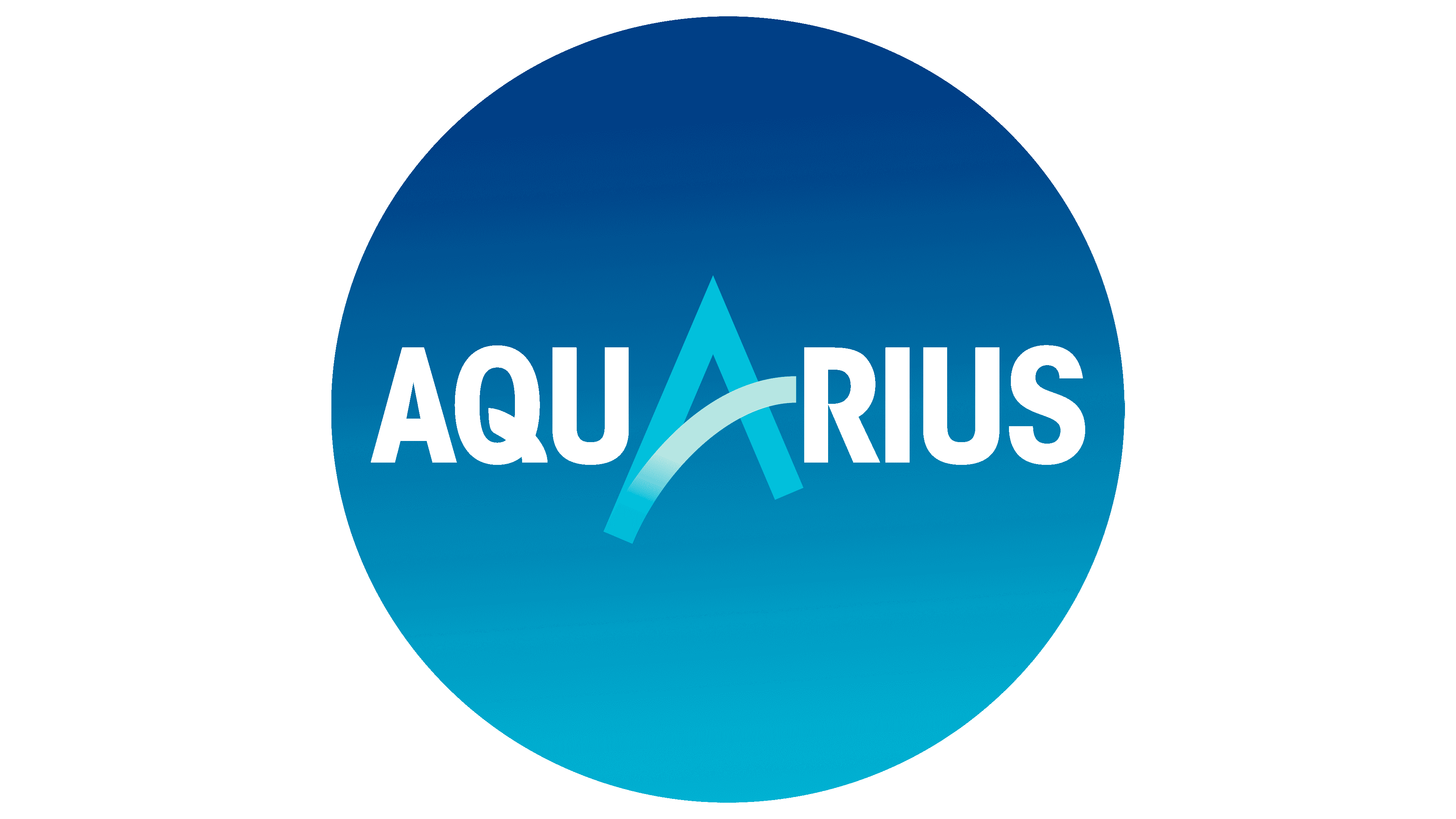
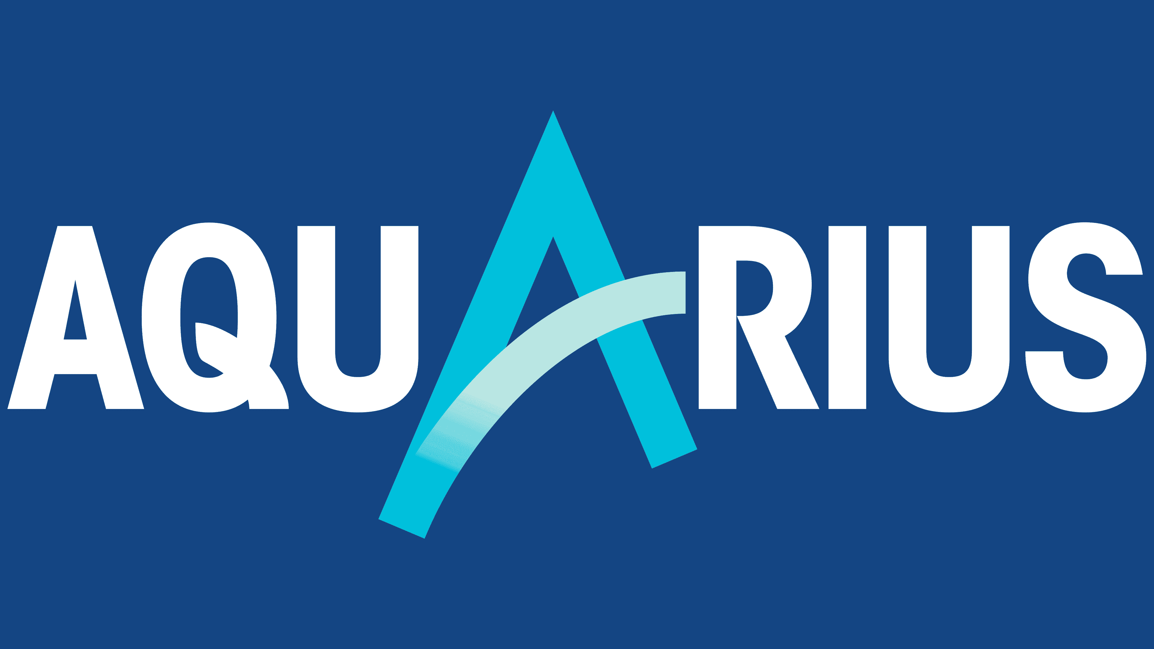
2017 – today
![]()
The logo has been changed again. First of all, they touched the central letter A. It received a direct pointing in the form of a mountain peak. The letter’s jumper resembles a wave. A gradient enhances this sensation from blue to white. Aquarius helps conquer peaks and stay on the crest of the wave. The drink is clean and cool, like mountain streams. The inclination of the word has disappeared. The direct style brings stability and consistency to the logo. In general, the emblem has adopted lighter colors and is aimed at young sports fans.
Font and Colors
The main colors of the emblem are deep blue, aquamarine, light blue, and white. They symbolize peace, recuperation, purity, freshness, and well-being.
The lettering is a straight sans-serif and closely resembles Arial Black and Bahnschrift SemiBold.