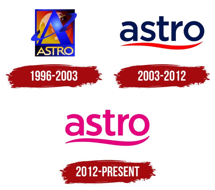
The Astro logo symbolizes the uniqueness of a TV provider that, as its name suggests, loves everything sublime and cosmic. This is an expression of the latent dynamics because it lies at the basis of any development. And TV programs are constantly evolving – they must be varied to keep viewers’ attention.
Astro: Brand overview
| Founded: | 1 June 1996 |
| Founder: | Ananda Krishnan |
| Headquarters: | Kuala Lumpur, Malaysia |
| Website: | astro.com.my |
Astro is a well-known Malaysian provider that provides satellite TV services. The coverage area includes Indonesia, the Philippines, Australia, Singapore, Brunei, and Malaysia. The brand is owned by a large company Astro Holdings Sdn. Bhd and its main office are located in Kuala Lumpur (Malaysia).
The visual identification of the Astro is quite bright and eye-catching. The original coloring can immediately recognize the logo – a beautiful pink color was chosen for the design. It is associated with goodwill, joy, and a positive mood, which is the company’s goal. The management of the TV brand strives to provide viewers with the maximum opportunity to watch their favorite programs without any restrictions.
Meaning and History
The Malaysian satellite operator is not just a broadcasting company but a unique brand with a long history. The idea of its creation was based on providing viewers with a wide variety of television programs and opportunities for their unlimited viewing. The creators managed to achieve this goal. The modern provider Astro offers viewers more than 60 thematic channels.
You can recognize them by the original design of the logo. It consists of the name of the satellite operator and a flowing decorative line at the bottom. The overall concept looks very modern and stylish. Neat letters of the same size symbolize stability and success, and a graphic addition in the form of a line gives the image a special charm. In this design, versatility is also visible, which demonstrates a large number of serviced territories.
1996 – 2003
1996 is the year the popular satellite television and radio service was launched. The first programs appeared on the air already on June 1, but at that time, the company was called Philips ASTRO. Its corporate logo was a bright badge made in shades of blue and yellow. In the center was the main symbol – the letter A, and under it the inscription Astro. The elements were enclosed in a square frame, which was divided into two parts.
In one part, the letter A was placed against the background of the symbol of the globe. Below them was the second part, which was a rectangle. It contained the name of the brand. Such styling made the brand recognizable and memorable. Seeing the icon on the screen, viewers immediately understood which provider provides television services. The color scheme also contributed to recognition.
It included muted shades of yellow and brown, which harmoniously intertwined in the background. For the frame and background of the lower part, a rich blue color was used. Such a palette was distinguished by contrast and symbolized trust. In addition, the yellow color evoked associations with positive and fun. The letters are in thin font with smooth lines. Some of them are even interconnected.
2003 – 2012
Astro’s sustainable development is bearing fruit. In 2003, the list of channels was expanding; the provider began to show blockbusters and also launched paid channels. During this period, rebranding also takes place – cardinal changes occur in the corporate logo design. They were caused by changes and improvements in the brand itself.
The new emblem had the following features:
- simplified format;
- high level of detail;
- clear font;
- stylish two-tone palette.
A wordmark in the form of the name Astro was placed in the center, which was complemented by a neat wave in lower case. For letters, a rounded, balanced font was used, with a high readability level. The inscription itself was made in a dark blue shade, and the lower wave was decorated in bright red.
The overall composition was located on a white base background. He advantageously combined color elements into a single harmonious image. Such style changes symbolized the expansion of the provider’s scope and its desire to improve service. In addition, the new logo was a more stylish version of its predecessor.
2012 – today
Since 2012, the provider’s channels list has been replenished with Disney XD, Chinese and Malaysian channels. The company was not going to stop there. To demonstrate the desire for success and change for the better, the brand again decided to change the logo. This time, the changes were not dramatic.
The color palette has changed, while the font and overall design remain the same. Updates in the corporate style symbolized a new milestone in the company’s development while demonstrating a respectful attitude to the developments of Astro.
Font and Colors
The Malaysian satellite provider uses a modern, stylish logo, a wordmark in the form of a name, and a decorative wave. The inscription letters are made in a soft, smooth font without serifs. They are located at a short distance from one another. This effect adds expressiveness and enhances readability.
The coloring includes only one color – light pink. The shade emphasizes a benevolent mood and openness. It was used for font design and decorative graphic additions. A single color scheme is quite a stylish solution that many modern brands use. A universal white color was chosen for the background as a harmonious addition to the overall concept.
Astro color codes
| Mexican Pink | Hex color: | #e6007d |
|---|---|---|
| RGB: | 230 0 125 | |
| CMYK: | 0 100 46 10 | |
| Pantone: | PMS 213 C |


